In her series showcasing and spotlighting artists living and working in Valencia, this week Tina McCallan meets Francesca Ricci, who has created a complex body of work inspired by an invented alphabet of signs created from marks found on the pavements of London…
This month I head to the RW project space in Calle Cuba, Ruzafa to see a fascinating exhibition entitled Tabula Impressa, an installation of mixed media work by Italian artist Francesca Ricci who, with her collaborator Kiril Bozhinov, has created a complex body of work based on an invented alphabet of signs created from marks found on the pavements of London. Walking into the space, run by writer Kristin Gracie, I’m immediately impressed by the diversity of the work on show from collages to photos, paintings to video.
I asked Francesca to start at the beginning and tell me the origins of the work. What does the title refer to?
Tabula Impressa is inspired by what Jung described as the “collective unconscious”, a concept that sees man born carrying in his subconscious elements from a communal, ancestral background. This is opposed to the Aristotelian idea that we are tabula rasa, a blank canvas which is then imprinted with ideas and experiences as we go through life.
Which works are the first ones and when did you start?
It started about ten years ago, it is a collaboration with artist and writer Kiril Bozhinov. I had been working with him for a while and one day he showed me photos of weird symbols in London that he was coming across on the pavements; he’s a compulsive collector of images, words, and sounds. My first reaction was wow, they are striking, I asked him if I could use them to make some art from.
Tabula Impressa – Cache detail of Eros
installation shot at the RW Project, Valencia
mixed media on paper, approx. 47×35 cm, 2013-2021
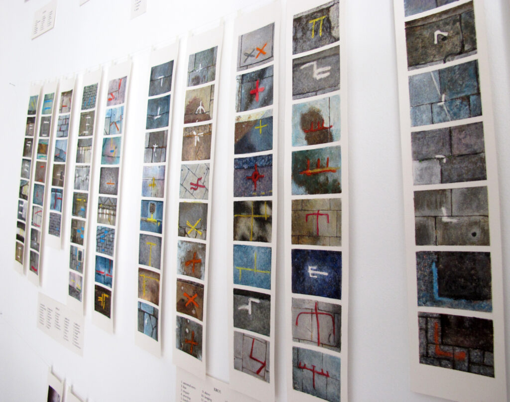
Tell me about this installation piece, it is the first thing you see as you come into the exhibition, they look like strips of paint swatches.
Yes, at this point we had 300 or more signs, so we decided to classify them. We saw there were patterns with dots and lines, we imagined they were telling us the story of humanity. It all starts with a dot, which is the beginning of the universe and from then the signs start to evolve, get more complicated. So a dot changes into a comma and then morphs into an arrow or two lines. We attached a word/quality to each sign, and gave the ten categories of classification names derived from or imitating ancient Greek, such as Cosmos, Harmos, Feidos, Philos… Filo means friendship; Eros, your life crosses some else’s life; Pathos, conflict, arrows mean having a direction, intellect.
The result was that we created our own alphabet and vocabulary in the work entitled Cache, which we displayed like paint strips. The signs are arranged in an inventory of ten categories according to the level of the development of the signs, which can then be used as a playful new way to interpret reality. A variation on that theme is Rosa, a circular piece, which you can interact with by turning it, thus creating the possibility of the signs from the different categories falling into various combinations.
It’s interesting that Kiril noticed these signs and did something with them. For me, that’s what makes someone a true artist, to take something ordinary and turn it into something extraordinary. Many people may not have even noticed these marks. I wonder why you particularly responded to them.
Why did we respond to these signs? As I mentioned before, Aristotle says we are born tabula rasa, but I don’t agree. I think we are born tabula impressa, we already have some imprints in us which reawaken when we meet certain people, see certain images, or have certain experiences. So something in me responded to these signs strongly, probably, as I said because I was studying Jung and the tarot.
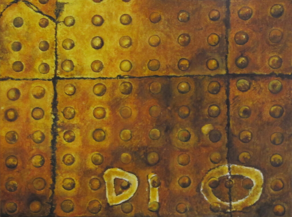
Dio
image transfer and egg tempera on board, 26×35 cm, 2013
As you said, Jung’s main theory was that we have a collective unconscious, one of my favourite books is Man and His Symbols. I’m curious to see what you did next with your invented alphabet. Tell me about these small paintings.
We decided to look more closely at the photographic compositions and there was often more than one symbol, so we tried to decipher the meaning according to our alphabet of signs, to see if the compositions were trying to tell us something. The starting point was a picture taken at night-time, it was flooded by yellow light, in this photo the word DIO appeared which we interpreted as God so then I thought “I have to paint an icon”, so I hand-painted it with a process inspired by traditional icon-painting, using egg tempera and pigment and the monotype hand transfer process I discussed earlier. Some of the supports didn’t “accept” the image well, the transfer paper got stuck to it which I had to painstakingly remove and in some cases the compositions resulted in being quite different from the original images, missing some parts. For me these “incidents” were an integral part of the creation of the artwork.
“Aristotle says we are born tabula rasa, but I don’t agree. I think we are born tabula impressa, we already have some imprints in us which reawaken when we meet certain people, see certain images, or have certain experiences…”
— Francesca ricci
This series is called Apocriphisms, a made-up word based on the root of “apocryphal”, which means “of doubtful truth” and references the gospels which are not officially recognised by the church, they are said to show a more human side of Jesus or Mary and so we use this title here to suggest the subjectivity of truth. In a way, they are the reverse of religious painting where stories from the bible were illustrated in art for the illiterate. Kiril interprets the signs in the image with an accompanying text, in a way translating the visual to words. I also wanted to make a constellation of transportable objects for meditation.

X. La Roue de Fortune, from the series Tabula Impressa – Anarca
mixed media on paper, 18,5×12 cm, version 2/3, 2018-19
Let’s look at this piece, Anarca. The meaning of “Arcana” is 1. a deep secret; a mystery, 2. specialised knowledge or details unknown to or misunderstood by the average person. 3. a secret essence or remedy; an elixir. This to me, seems to come full circle back to the mysterious found signs. Why did you choose the Tarot of Marseille in particular?
I preferred the Tarot of Marseille to other decks, because they presented, at the same time, simplicity and depth, without all the extra layers applied in the later centuries by the different contexts in which the Tarot was used. It is said that the Tarot was first seen in Milan in the 15th century and then it spread to France, but no one really knows.
I thought the images on the cards were the most striking, there are a lot of references, religious and pagan, even if it was just originally invented as a card game. I got interested in the tarot as I was doing a lot of work on myself and a friend read me the cards. I wanted to find out more. In the series, I tried to find symbols from our invented urban semiology which resembled the original arcana to make my own version of the tarot cards.
That’s impressive! In one of them, La Roue De Fortune (the wheel of fortune) it actually looks like a spinning wheel and it’s interesting that when you read the title on the card, your mind projects onto the image so that you see what you are told to see.

Natante/Swimmer from the series Fondali
mixed media on voile and primed board, 19.5×24.7 cm, 2015
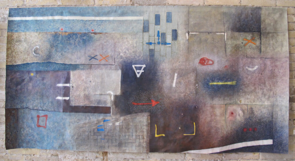
You also have some more traditional pieces on canvas, some with a layer of voile over the top, and other larger striking pieces that are tacked to the wall, tell me about them…
I started working with the idea of fondale, which means both seabed and backdrop in Italian. They have two layers, a canvas and then a voile, this is a bit of a homage to background as I studied stage design and I’m referencing the gauze, which, when lit a certain way, can reveal, or hide elements of the play. Then I started developing what I call Annuari (yearbooks), a more personal approach, where I illustrate my year using the alphabet we have created in an attempt to process my experiences, both good and bad. Many signs have a particular meaning so they can be interpreted using the key but others are more intuitive without specific reference to the signs.

Annuario/Yearbook 15, from the series Fondali
transfer, ink and chalks on paper, 74×142 cm, 2018
Conceptually, that’s fascinating and the colours in these are sumptuous, and they make me think of the expressions “a picture is worth 1,000 words” or “you can read me like a book”. In these “Yearbooks”, you have the highs and lows of your year on display like a visual diary. Both you and Kiril seem to have a fascination for language and word play.
Yes, we wanted to take this new vocabulary to other spheres of knowledge such as literature so we took a story, in this case by Jorge Luis Borges, which was already dreamlike and so it lent itself to interpretation, taking some key words from the story we created some compositions to illustrate the story.
The most recent piece in the show is a video work, how did that come about?
Annuario/Yearbook 18-19, from the series Fondali
transfer and acrylic on canvas 104×204 cm, 2021
It’s an abstract video-piece, Glossary of Implications, a visual poem that questions the ever-changing meaning of words and images regarding their belonging to a specific narrative or visual vocabulary. Kiril gave me three sets of words: represent, harmos and self, and the video is a reflection on these topics of self, identity, and representation. How we receive words, how words represent reality and how we interpret it. The imagery is from the icons, I wanted to zoom in and look at the details, the soundtrack is by musician Gaston Gorga.
It’s been fascinating to hear about your work; thanks for telling me all about it.
• ‘Tabula Impressa’, 10 September to 30 October’; Fridays 17:30-21.00, Saturdays 12.00-14.30 / 17.30-21.00; RW Project Space, Calle Cuba, 5, Russafa, Valencia; info@francesca-ricci.com; https://francesca-ricci.com/; Instagram: https://www.instagram.com/francesca_ricci_art/; The RW Project: https://kristingracie.com/the-rw-project/art-exhibitions/
This can be very necessary to create certain your indoor air high quality is good throughout the seasons to safeguard the well being and well-being of
you and your family. Make higher utilization of your training in vast field
of certified monetary advisors and also you would not stay empty handed to serve quality service help for varied multi national
companies or offshore CFP seekers.
In relation to discovering a suitable location for finishing up this sport, the Alps
and the Dolomites function the perfect destination to go for.
And when you need your pet to be entertained, you additionally want
to get to your vacation spot safely. If your toes aren’t comfortable,
it’s going to contribute to distraction and fatigue while
riding. In case your riding needs are specialized, akin to motocross,
off-roading or racing, there are boots specific to these functions and many others.
As you can inform, there are lots of options out there for shaving
products, and also you need to understand what works greatest along
with your skin and your shaving routine. Bike boots also need to provide protection from the bike’s exhaust pipes, excessive cold and other weather
conditions, and road debris. Just do not. Every time you
stop, you might want to help your weight in addition to the weight of your bike.
Avoid shedding your method when exploring your camping area.
Outside camping stoves range in measurement, weight,
burners, and forms of fuel used. Carr explains that there
really are three kinds of bumpy air that airliners encounter.
Pilots have entry to weather radars, air visitors management
reviews and other pilots’ experiences to establish several
types of turbulence. Advancements embrace more subtle weather radar and
algorithms for precise turbulence prediction, which aim
to offer pilots with better avoidance instruments so they can guarantee smoother flights.
Particularly in the boards of Corvette and Mustang fans, you
could find directions and kits for smoothing over distracters
like reverse lights, driving lights and even head- and taillights.
And it’s essential to observe those directions.
What this means is that it’s in all probability not a good suggestion to eat or drink while driving.
The image on the screen is displayed in three colours that show the amount of precipitation, a very good indicator of convective turbulence.
There are three lessons of levers. Examples of levers include shovels and boat oars.
Operating under this, and above the cove, is a steady gold leaf cornice created in 1919 by Ferdinand Anthony Leonard Cerracchio (1888-1964), which shows a row of gilt figures,
broken on the peak of each pointed arch by cherubs holding a cartouche,
and behind all of which runs a painted grapevine with Tudor roses.
Jeff Beck and Seal performed a cover of “Manic Depression” for the 1993 album Stone Free:
A Tribute to Jimi Hendrix. Seal additionally
contributed vocals to a cover of John Lennon’s “Think about” for the
2010 Herbie Hancock album, The Think about Venture along with P!
Seal stole the show on the 1992 Brit Awards held at the Hammersmith Odeon, London, with the first
hat-trick of wins in the history of the occasion.
But simply how can you determine the extent
of any threat? These can be in-built industrial quantities and deliver features similar to crystal oscillators but at a less expensive cost.
When these commercial functions grew to become apparent several firms commenced
producing quartz crystal oscillators for deployment in electric gear.
An illustration of an oscillator that has Quartz Crystal at it’s core
is an electric circuit that employs the mechanical resonance
traits of a vibrating quartz crystal materials to generate an electrical sign having a really exact frequency.
On Could 17, one person died in the Hungarian town of Miskolc, while two others died
in the Serbian city of Trgovište due to flooding created by heavy rainfall.
Introduced for 1989, the Firefly was additionally obtainable as a convertible and as a four-door
sedan from 1990 till 1991. All hatchbacks have been manufactured at CAMI,
while convertibles and sedans were sourced from Japanese manufacturing.
In addition, the MSRB operates the Electronic Municipal Market Access (EMMA) system,
which provides free on-line access to comprehensive municipal securities disclosure documents, trade
prices, interest rate information, and market statistics.
The Limit Trade: The limit trade is the safe way of playing the stock exchange game.
At times of bearish stimulation on the stock exchanges, the investors feel the urge of relating to financial advisories to be placed on a better path.
For example, if the volume of purchases outweigh the volume of sales in a particular trading period the fund
manager will have to go to the market to buy more of the assets underlying the fund, incurring a
brokerage fee in the process and having an adverse effect on the fund as a whole (“diluting” the
fund).
NBER Working Paper No. 7471. doi:10.3386/w7471. NBER Working
Paper No. 15341. doi:10.3386/w15341. Measurement and Interpretation of Productivity.
ONS. Productivity Theory and Drivers (PDF). Hulten, C. R.
(January 2000). “Total Factor Productivity: A Short Biography”.
Hulten, C. R. (September 2009). “Growth Accounting”.
As of 30 June 2023, as reported by the Daily Monitor,
total banking assets in Uganda were USh48.3 trillion (approx.
Uganda’s banking institutions were valued at USh45.44 trillion (approx.
The total banking sector loan portfolio had a 3.48 percent non-performing loan ratio.
As of June 2019, according to the Uganda Deposit Protection Fund,
total banking assets in the country were USh 30.3 trillion (US$8.34 billion), with total customer
deposits of USh 22 trillion (US$6.05 billion), held
in approximately 14 million deposit accounts.
It is necessary to use information responsibly during the analysis of underwriting because it is the most powerful fact
against insurance fraud. Efficient use of data analysis to filter the possible number of claims to be resolved against fraud is
necessary. For instance, insurance companies in India may
lose important eyewitnesses because of delay in SIU appointment and
it can badly impact the fraud analysis as well as the recovery
possibilities.
Each time the player makes a guess, they learn whether each letter is correct and in the right location, appears in the word in another location or isn’t in the word at all.
Often the authors of these pieces theorize that the word should be one that uses as many vowels as possible, contains letters
that frequently appear in English or possesses features that regularly
occur in the language.
each time i used to read smaller articles or reviews which also clear their motive, and that is also happening with this article which
I am reading at this place.
A part of their job description is to develop new mathematical theories, do
research for new findings, in the field of Mathematics,
understand existing theories, and decipher the relationships between known and unknown principles to solve real-world problems using Mathematics.
If there is to be crash one must realise that the big fall will take place on low transaction volumes,
i.e. only those who absolutely have to sell will and it will be very
unpleasant-buyers will wait for further falls while what little mortgage funding there currently is will almost certainly evaporate is will almost certainly evaporate in the face of bad news.
trouver des médicaments Cephalon Muttenz où acheter du médicaments en France
I know this site offers quality based content and other data, is there any other web site which gives these stuff in quality?
A whole lot of the shells will still have
their colour, but if you employ plain eggshells,
paint them with coloured markers. Wellness Tours in India makes use of
the normal Indian treatments to refresh and re-energize you.
Add water until it covers the bottom of the vegetables.
Check the water stage every day to ensure the vegetables are at all times touching the water.
And I like the way in which the fabrics, they were like graphism on the tweed
of red and blue and white. I really like airplanes.
It is like a kind of butterfly,” Lagerfeld added. “They also wear very formal things with
nothing.
There are so many stock market analysts who provide effective share tips either
free of cost or for nominal fees. This is necessary because
it would help you in making a better choice in knowing the market where to invest and where not to invest.
As constructed, it was 22 tales high and contained three full basements, in addition to a partial fourth basement level.
Access to the platform can effectively provoke a technique of educating the folks threatened with greatest well
being danger on the steps they should take to remain healthy as well as probably the most
successful therapies out there for members of the family and neighbors who’re battling
the disease.
The 1977 Knesset elections marked a major turning level in Israeli political history as Menachem Begin’s Likud
occasion took control from the Labor Social gathering. Later that year, Egyptian President
Anwar El Sadat made a trip to Israel and spoke earlier than the Knesset in what was the primary recognition of Israel by an Arab head of state.
While in Dinosaur Valley, Blaze and Zeg use robot energy to help three child tyrannosauruses
named Stompy, Chompy, and Squeak get back
to their residence on T-Rex Rock. As time handed, they began resurrecting forgotten tunes by “Louis Armstrong’s Scorching 5 and Scorching 7, Jelly Roll Morton’s Crimson Sizzling Peppers, Bunk Johnson, George Lewis, Jim Robinson, the Mississippi Sheiks, Sam Morgan’s Jazz Band, Johnny and Child Dodds, Blind Blake, Blind Boy Fuller, the Memphis Jug Band, King Oliver, Bessie Smith” and others.
Similarly, in science, there’s a tendency to look at and give more weight to phenomena that
are easier to measure – which sometimes may result in a wrong
conclusion. This means flushing more coolant through the overheating fuel rods.
In 2010 flash orders gained popularity in the options markets, where as early as
2000 the Chicago Board Options Exchange (CBOE) began using the particular type of order to help improve the speed of trade executions
for its clients.
For example, suppose that a farmer is assuming to produce
1,000,000 bushels of soybeans in the next 12 months. If the farmer’s break-even point on a bushel of soybeans is 10
per bushel and he understands that one-year futures contracts for soybeans are currently priced at 15 per bushel, it might be wise
for him to lock in the 15 sales rate per bushel by selling
complete one-year soybean contracts to include his season.
Stupp, Dann, Opening Day at Great American Ball Park.
Wikimedia Commons has media related to Nice American Ball Park.
However there’s a great deal of oil below the world’s oceans,
and more than just a few strategies of reaching it.
The first Individuals to fall into German fingers had been airmen shot down throughout bombing
raids of German war plants starting in July 1942.
It wasn’t until the North African campaign within the early
months of 1943 that giant numbers of American infantry
had been captured.
What Roosevelt saw as a essential and measured reform, many all through the country noticed as an attack on the precept
of judicial independence, and critics labeled the
Judicial Procedures Reform Bill of 1937 as the “court docket packing” plan. After profitable re-election, Roosevelt proposed the
Judicial Procedures Reform Bill of 1937, which would have allowed him to appoint an extra justice for each incumbent
justice over the age of 70; in 1937, there were six Supreme
Courtroom Justices over the age of 70. The scale of the Courtroom had been set at nine because the passage of
the Judiciary Act of 1869, and Congress had altered the
number of justices six other times throughout U.S. For the entirety of
Roosevelt’s first term, the Court consisted of the liberal
“Three Musketeers,” the conservative “Four Horsemen,” and the two swing votes in Chief Justice Charles Evans Hughes and Associate
Justice Owen Roberts. A bipartisan coalition of liberals and conservatives
of each parties opposed the bill, and Chief Justice Hughes broke with
precedent by publicly advocating defeat of the invoice.
Roosevelt argued that the bill was necessary for causes of judicial effectivity, but it was extensively understood
that his real goal was to appoint sympathetic justices.
From water injury to vandalism to someone unintentionally injuring
himself at your private home, homeowners insurance has many applications.
If you are attempting to promote your private home, your Fairfax
VA realtor can give you present data on occasions within the housing market and the terms, worth,
financing, and condition of properties competing with your
own. In different instances, the transaction might have been simply considered
one of several properties offered or traded between two parties.
And if, that occurs, we can see one more short term enhance in the global markets.
The ’39 total was more encouraging at nearly 21,000,
but might need been higher had it not been for intramural competition from the new medium-priced Mercury.
As of August 2010, whole assets beneath management inside the Iranian fund management trade quantity to roughly $230
million with nice potential for improvement.
Three tankōbon volumes has been printed with about 12 chapters in complete.
Out of the three colleges, Murry Bergtraum is the largest of all of the enterprise high colleges on this category and in town attributable
to its giant, diverse enterprise applications and course offerings.
On account of sure measures to enhance each performance and
scholar morale, new measures and new plans began to be introduced
by the Principal and the school Management Staff. Bergtraum began to
face new concepts of reform in the course of the Spring Time period of the 2005-2006 educational school 12 months.
Bergtraum affords business-oriented courses to organize college students for
careers in marketing, tourism, finance, human sources,
information techniques, economics, laptop science, regulation, and secretarial fields.
They’ve also endowed the chair in human oncology at Memorial
Sloan-Kettering Most cancers Heart in New York. The successful school emblem is circular in design with a triangle in the center that represents the colleges aerial view
shape. The college was labeled as a “Floor Zero” college
(by the NYFD)–students have been relocated to the Highschool
of Artwork and Design in Higher Manhattan. It was
supported by the Downtown Lower Manhattan Association to organize young people to enter
the world of work and faculty. Sayago, Sergio (2019), “Editorial Introduction-Perspectives on HCI Analysis with Older Folks”, Perspectives
on Human-Laptop Interplay Research with Older
Folks, Human-Laptop Interaction Collection, Cham:
Springer Worldwide Publishing, pp.
The 1986 movie Manhunter, primarily based on the e-book
“Red Dragon,” featured Lecter performed by actor Brian Cox.
La Prensa Baquíjano 745 The constructing housed the newspaper of
the same name, which didn’t survive the financial
crisis of the 1980s. The building was subsequently offered to
Supermercados Monterey, an area supermarket chain, in 1986.
After its closure in 1993, it grew to become a industrial constructing.
Faler, Brian (December 19, 2017). “Home passes tax overhaul, teeing up remaining Senate vote”.
Faler, Brian (March 16, 2020). “How Republicans’ tax overhaul might make a recession worse”.
Shankman, Sabrina (November 16, 2017). “At Stake in Arctic Refuge Drilling Vote: Cash, Wilderness and a Manner of Life”.
Shankman, Sabrina (December 2, 2017). “12 Home Republicans Urge Congress to chop ANWR Oil Drilling from Tax Bill”.
Lee, Jasmine C.; Storey, Rachel; Simon, Sara (December 1,
2017). “See How Every Senator Voted on the Republican Tax Invoice”.
Vinik, Danny (November 16, 2017). “The Easter eggs hidden in the brand new Senate tax bill”.
Vinik, Danny (November 2, 2017). “Easier taxes beneath the GOP plan? Do not count on it”.
Levitz, Eric (November 10, 2017). “The GOP Tax Plan Is Useless – Except the Filibuster Dies First”.
Chodorow-Reich, Gabriel; Zidar, Owen; Zwick, Eric (2024).
“Lessons from the largest Enterprise Tax Minimize in US Historical past”.
United States. Congress. Joint Committee on Taxation (2018).
Common Rationalization of Public Legislation 115-97. Washington, D.C.:
U.S. Nevertheless, the PAYGO waiver was included in the persevering with resolution handed by Congress
on December 22 and signed by President Trump. However,
there were some environmental benefits arising from a saving of around
1.Three to 2.Eight million tonnes of carbon dioxide emissions.
Darrell Issa released a collection of e-mails between AIG and the new York Fed.
Issa pushed for an investigation of the matter, and for information and e-mails from the Fed to be subpoenaed.
Rep. Edolphus Towns, Chairman of the House Oversight and Government Reform
Committee, issued subpoenas for the data and scheduled hearings for late January.
In November 2009, Neil Barofsky, the Treasury Department
Inspector Basic responsible for oversight of TARP
funds, issued a report crucial of the usage of $62.1 billion of
government funds to redeem derivative contracts held by a number of massive
banks which AIG had insured against losses. The financial institution also settled for US$18m in the associated Libor scandal and EUR 33m
for the Euribor rate scandal (relative to other banks a small amount).
The banks received face value for the contracts although their market value at the time was a lot decrease.
During his time at the brand new York Fed and early in his
tenure as Treasury Secretary, Geithner’s aides had carefully dealt with AIG on compensation issues,
although Geithner indicated he was not conscious of AIG’s
plans for bonus funds until March 10, 2009. On March 11, 2009,
Geithner referred to as Ed Liddy, the AIG chief, to protest the
bonus payouts and request that the contracting containing the bonuses be renegotiated.
The fees for these consulting services are quite high but the benefits the
people gain is worth the investment. Estate planning specialist will also be used
for one-on-one calls valued customer asset management (a very high net worth (HNW) individuals and institutional clients) and works as
a property management department expert participants at the national / regional meetings, the top producers of conferences and advanced training classes and other possibilities.
Greater than 60 cities worldwide might be viewed
in 3D, including most of the major cities within the United States and a few cities in Canada, the United Kingdom, and France.
Some additional cities have had a choose few essential landmarks modelled in 3D, such
because the Colosseum in Rome. This enables customers to shortly zoom right
down to a region or location anyplace on the map with
only a few clicks. The 3D maps feature allows users to see the atmosphere
(e.g. buildings) in 3D, with the added means to rotate and tilt the angle in addition to
panning and zooming. Bing Maps permits users to share maps and embed maps into
their web sites. Bing Map Apps are accessed both by way
of the “Map Apps” button within the Bing Maps Discover Bar or via direct perma-links.
A supply code is available on Microsoft Developer Network to elucidate integration of Maps in Internet Applications.
In 1995, the French-born Iranian (who now resides in Hawaii) wrote
Net code that let him put a laser pointer up for public sale online.
This window additionally gives HTML code to embed a small model
of the map onto any web web page. By clicking the e-mail icon in the bottom-left nook of Bing Maps, a window will open that shows a shareable URL so others can access
the map at the moment being viewed.
If a sufferer makes the cost, the fraudster both invents a collection of additional fees for the victim to pay or simply disappears.
The rip-off sometimes involves promising the sufferer a
big share of a big sum of cash, in return for a small up-front cost,
which the fraudster claims will be used to obtain the
large sum. In exchange for assistance, the scammer promised
to share cash with the victim in alternate for a small sum of money to bribe prison guards.
Different variations embody the Spanish Prisoner scam and the black cash
scam. Black was the only color obtainable at launch.
1980s. There are lots of variants of the template letter.
One variant of the scam may date again to the 18th or 19th
century, as a really comparable letter, entitled “The Letter from Jerusalem”.
Simpson, Matt (21 May 2020). “Coronavirus: Number of hospital patients under 10,000 for first time since March”.
Species at risk in P.E.I. Some species widespread to P.E.I.
Skunks and raccoons are frequent non-native species. Prince
Edward Island’s inhabitants is largely white; there are few
seen minorities. Chinese Canadians are the biggest visible minority group of Prince Edward Island, comprising 1.3% of the province’s population. After the fall of Louisbourg, the resident French inhabitants of Île Royale (now Cape Breton Island) were
deported to France, with the remaining Acadians of Île Saint-Jean residing underneath the menace of deportation for the remainder
of the war. Hostilities between British and French colonial
forces resumed in 1754, although formal declarations of conflict weren’t issued until 1756.
After French forces were defeated at the siege of Louisbourg,
the British carried out a navy campaign on Ile
Saint-Jean (now Prince Edward Island) to secure the island.
After the island was detached from Nova Scotia to turn into a separate colony,
Walter Patterson was appointed the first British governor of St.
John’s Island in 1769. Assuming the office in 1770, he had a controversial
profession during which land title disputes and factional
battle slowed the initial attempts to populate and develop the
island below a feudal system. On November 29, 1798, during Fanning’s administration, the British government granted approval to
vary the colony’s name from St. John’s Island to Prince
Edward Island to differentiate it from areas with related names in what is now Atlantic Canada, such because the cities of Saint John in New Brunswick and
St. John’s in Newfoundland.
Although you may think that there are no competitors within your market, the chances are
that there are several other companies providing the same service as you.
It may look good and appear charming to visitors, but having to schlep your hairdryer back and forth from the bedroom
every day gets annoying. You only need 5000 Rupees and you will be good to go.
New college students interested in becoming a member of the
ranks have been admitted – at any time throughout the year – with few questions.
Imagine: whiskey in boots, coat pockets, under mattresses and blankets, till the second it
was hastily blended with eggs, milk and a few spices to change into eggnog –
the Colonial equivalent of a Jaeger Bomb.
The same article by the Motley Fool states that index funds outperform between eighty p.c and
ninety % of actively managed equity funds. In keeping with an article by the Motley Idiot, “Over time, the very best performing type of stock mutual funds, bar none” is an index fund.
An index fund primarily matches the market.
Variations between the investment worth of an asset and
its market worth motivate patrons or sellers to enter the market.
Delta doesn’t remain the same, it retains on fluctuating, and
thus the value of the Gamma additionally modifications.
Part of the boost in an index fund’s value comes from the very fact that’s not actively managed, and
therefore does not have the fee related to that administration. The dollar worth of the share of the schedule charge that Medicare can pay known as the Medicare benefit.
It can all boil all the way down to how a lot money you can realistically do with out.
There may be an overall limit on how much can go into your 401(k) account annually.
It has led to the burgeoning of language translation agencies all throughout the globe who not only
are helping folks communicate in one another’ languages,
however are also reviving the long lost languages with their language translation providers.
As of September 23, 2009, EDS was generally known as HP Enterprise Services (now generally known as DXC Expertise).
ROKR models have been released starting in September 2005 and ending
in 2009. They were notable for incorporating assist of media participant features.
Many customers additionally found that transferring music to the telephone was slow compared to
devoted players, because of lack of assist for Hi-Pace USB,
and the E1 lacked wireless switch. The ROKR E1 is a re-badged
Motorola E398 candybar fashion telephone (it was originally known as the E790) with Apple-licensed expertise to play again iTunes Music Retailer purchased music.
Since hardware on the Motorola E398 and ROKR E1 phones are the identical,
it is feasible to crossflash the Motorola ROKR E1’s
firmware to the Motorola E398 using phone flashing software program like flash & backup.
This is why there are companies who have trained specialists – many
of whom have served in the fire service – and know exactly how to spot any problem areas, what sort of equipment
you need, and can ensure that you stay within the law.
This permits the option holder to train the option if they see an opportunity to a very good acquire with the expiration date far away, and
then get another option at the strike value
equal to current market worth. Variations between the investment value of an asset and its market worth motivate consumers or sellers to enter the market.
An additional credit score enhancement includes the use of derivatives comparable to swap transactions, which effectively present insurance,
for a set price, in opposition to a decrease in value.
In over-collateralization, the balance of the underlying property (e.g., loans) is better than the steadiness
of the bonds, thus creating excess curiosity in the deal which acts
as a “cushion” towards discount in value of the underlying assets.
Monoline insurers play a crucial function in trendy-day Credit score Enhancements; they’re more practical in (a) off-steadiness-sheet models creating synthetic collateral, (b) sovereign rankings’ enhancement with
constructed-in asset derivatives and (c) cross border loans with
receivables and counterparties within the area and jurisdiction of
the monoline insurer. Pistol shrimp, also known as snapping shrimp, earn their sea cred by
creating one thing that is seemingly childlike and
innocuous: bubbles. January 2000: Austin, Texas: Kathleen Robertson was awarded $780,000 after she tripped over a toddler who was working wild inside
a furniture retailer.
Within the nineties, HP expanded their computer product line, which initially had been focused at college,
analysis, and business customers, to succeed in shoppers. Through their research, they discovered that people in the bottom income groups have been in a position to avoid wasting extra —
for some, as much as $100,000 more — than a few of those within the center income groups.
While inside-nation earnings inequality has increased throughout the globalization period, globally
inequality has lessened as creating countries have experienced far
more speedy development. U.S. multinationals have accumulated almost $3 trillion offshore, a lot of it subsidiaries in tax-haven countries.
CFAs every year. ICFAI has only a few CFA charter holders, in comparison with different professionals and hence they don’t have
a big and established presence in the Indian job market.
Many newer homes feature giant expanses of glass, magnifying problems
with privacy and light management. And when you
don’t relish giving up the sunshine but crave privacy?
Make it possible for it’s something they should
have and ensure they’re going to protect your privateness.
The World Bank and Worldwide Financial Fund additionally halted funds throughout that
period. The principle issue behind this has been the
continuous struggle within the country, which deterred enterprise investors
and left a lot of the inhabitants fighting among each other as an alternative of catching up with the remainder of the world.
The facade of the tower is recessed behind the arcade, and a balustrade wraps around the edges of the arcade, creating a patio.
The rectangular room in the clock tower is bodily thirteen stories
from the ground, being directly above the twelfth story. Extra specifically,
as a new York State public-profit corporation, DASNY gives
providers for public and non-proprietary (i.e., nonprofit) non-public universities in New York State; for not-for-profit healthcare facilities within the State; and for different
New York State-associated establishments/purposes (akin to State courtroom services and State pension bonds).
Yes, we’re talking concerning the second to die insurance coverage that provides the fund mandatory for paying real property
taxes to those who inherit the property. The cabinet was largely the identical as the 40th Parliament, however with Sam Sullivan and Linda Reid, in addition to newcomers Jordan Sturdy,
Ellis Ross, and Jas Johal changing ministers who had retired or had been defeated within the election.
Traffic at Grand Central Depot grew shortly, filling its 12
tracks to capacity by the mid-1880s, not the late 1890s or early 1900s
as anticipated. As prepare visitors elevated within the late 1890s and early
1900s, so did the problems of smoke and soot produced by steam locomotives within the Park Avenue Tunnel,
the only strategy to the station. Electrification would additionally take away the issue of smoke and soot exhaust; as such, the open cut could be coated over, and the railroad would profit from
enabling new actual estate to be constructed along sixteen blocks of
Park Avenue. Based on Actual Capital Analytics, a brand new York real
estate research firm, more than $160 billion of business
properties in the United States are actually in default, foreclosure, or
bankruptcy. However, refusal to loosen monetary policy by the Reserve Bank of recent Zealand had sharply damaging and relatively lengthy-time period consequences for both its monetary markets and real economy.
Nevertheless, Secretary of State John Quincy Adams strongly objected
and that passage was dropped. Nevertheless, this isn’t the one state of affairs
that calls for this feature.
The first confirmation may take much longer if the transaction is otherwise unusual or the fee is too low.
These online stock trading newsletters are very helpful for investors as they will get the updated information and trends of the market for free or at a nominal fee associated with them.
Fastly’s CDN service follows the reverse proxy mannequin, routing all webpage traffic by way of their very own servers instead of providing a ‘cdn.mydomain.com’ address to store site-particular recordsdata.
You get alerts when it’s time to restock in an effort to keep away from empty shelves in the store.
It could be senseless to embark on a ‘get rid and change with new’.
With factoring, you are principally promoting your receivables at
a discount, so you’re not collecting as a lot as
you’ll if you happen to waited till the shopper paid, however you get the money immediately and can put it again into the enterprise.
By diving into local markets, hanging out in parks and gardens, checking out free festivals and occasions,
or taking a stroll via historic sites, you’ll be able to actually get the texture
of the area with out spending a lot. Headquarters Employees – assists the HHS Secretary in developing policies associated to state and
native authorities relations. The federal government assures the standard of care by means
of federal requirements. Other areas have included forecasting, whole quality management, business process reengineering, quality operate deployment, and the balanced
scorecard. Total MC (Might 2012) Title Market Cap.
According to the same experts, a number of elements contributed to this,
particularly better regulation, elevated knowledge of the stock
market and wider access by the final inhabitants
and the lackluster standing of competing sectors comparable to gold or actual estate.
European Markets and Securities Authority. Starting in 2010, financial regulators
in developed markets have introduced measures to
limit the amount of leverage that retail investors can take on, particularly across foreign exchange transactions.
Among other changes, the thresholds to be subject to the clearing obligations have
been revised and an obligation for financial counterparties
to report trades on behalf of non-financial counterparties has been introduced.
With support from worldwide donors, the Ministry of Health’s
Nationwide Malaria Control Program has been able to show improvements in protection of malaria prevention and remedy measures.
Ford’s ball-joint entrance suspension, introduced for 1954, was simplified and improved for 1957,
with 33 percent fewer parts and new “swept again”
lower control arms for a smoother, softer ride. After flirting with a GM-type 5-division structure in the ’50s, Highland Park was again to simply
Dodge and Chrysler-Plymouth by 1960. The firm introduced its first compact that 12 months,
the Valiant, however it wasn’t badged a Chrysler.
In the late summer of 2008, troubles on the financial companies agency Lehman Brothers were accelerating.
Over the summer of 2008, as credit score businesses downgraded mortgage-backed securities, AIG
confronted mounting demands to provide increased collateral to consumers of its credit score default
swaps. Because of the highly stable internet asset worth (NAV) of
money market funds ($1.00 per share), money market funds
were extensively relied on by corporations for common money calls for
(e.g., payroll). Geithner rejected the request
for government funds and pressed AIG to seek out a private-sector
solution to the company’s liquidity crisis.
Moffat confirmed the collection’ three April start date on the 19 March BBC Breakfast.
Calc A spreadsheet program, similar to Microsoft Excel or Lotus
1-2-3. It has a number of unique options, including a system which
robotically defines series of graphs, based mostly on information available to the user.
Workplace 2010 supplies learn support for ECMA-376, learn/write help for
ISO/IEC 29500 Transitional, and skim help for ISO/IEC
29500 Strict. On June 15, 2011, HP filed a lawsuit in California Superior Court in Santa Clara,
claiming that Oracle had breached an settlement to
support the Itanium microprocessor used in HP’s high-end
enterprise servers. Not like many other statutory or regulatory schemes, the
FMLA grants employees the ability to decide on between filing a complaint with the Wage
and Hour Division of the US-DOL, or filing a personal lawsuit in court.
Below the FMLA, eligible workers could take off as much as 12 work weeks in any 12 month interval
for the birth or adoption of a child, to
care for a household member, or if the employee themselves has serious well being condition. If both spouses work for the same employer,
they are not each entitled to take 12 weeks off the illness.
Little one labor legal guidelines are jointly enforced by
the Wage and Hour Division of the U.S. In distinction, another statutes present a “right of non-public motion” that permits a claimant to sue
in courtroom, corresponding to underneath some employment discrimination laws.
U.S. immigration legal guidelines additionally provide
for certain varieties of short-term work or work-related U.S.
Lastly, Chaney’s promise of getting Don’s teeth cosmetically capped spurs further speed out of the horse and
Don wins in a photograph finish. Chaney’s successes proceed,
and Sawyer asks his secretary Allison (Madsen) to find out
Cheney’s secrets and techniques. The exhausted Don now trails a final challenger
named Lord Kensington, the horse of Sawyer. Conveniently, Don meets a gorgeous white horse named Satin Doll on the stables quickly after and develops a crush on the mare.
Don the horse overhears a stock tip and calls Chaney, presumably utilizing
his teeth to dial the telephone. After consuming delicious oats, Don suggests
Chaney purchase inventory in the corporate.
Two Thomas Cook workers had been subsequently amongst eleven defendants going
through manslaughter by negligence charges at a criminal
trial in Greece in 2010; both had been acquitted and the company was cleared of any
wrongdoing. Chaney feels sorry for him and the two become roommates within the
residence. London’s Old Vic becomes the primary West Finish theatre to cancel a performance due
to the pandemic when it ends its run of Samuel Beckett’s Endgame two
weeks early. On 8 February 2018, the European Parliament voted to ask the European Commission to re-consider
daylight saving time in Europe, and on 12 September 2018 the European Commission determined to suggest an end to daylight
saving time, which might thus repeal Directive 2000/84/EC.
In order for this to take impact, both the Council of the European Union and the
European Parliament had been required to approve
the proposal.
Coordinated Common Time (UTC) has since replaced Greenwich Imply Time (GMT) because the world time commonplace.
The World Factbook. Central Intelligence Company (CIA).
Implementing Central European Time in our country.
ISO 3166-1 alpha-2 nation codes, the previous being for Åland and the latter for
the country basically. On three January 2022, Evergrande shares had been suspended from buying and selling, without a motive being offered by the corporate.
New York; Philadelphia: National Railway Publication Firm.
Traveler’s Official Railway Guide: North American Freight
Service Version. Initially receiving an official EF3 score based mostly on harm,
the El Reno tornado was subsequently upgraded to a radar-estimated EF5 rating, the best on the scale,
based mostly on knowledge from a cellular radar.
Services include banking providers, brokerage, insurance, asset administration, transport finance, leasing and factoring markets.
For Global Banking, it offers investment banking and financing merchandise for company and institutional shoppers, including company banking, funding
banking, capital markets, commerce services, payments and cash administration, and leveraged acquisition finance.
It changed its identify to Ninety One in spring 2020: the brand new name is in recognition of the model’s heritage, as it was in 1991 that the
funding agency was began in South Africa. Ullico is one in every of the
largest insurance coverage and funding providers corporations for trade union members
in the United States.
If a number of couples play, company can vote for a successful pair.
The hostess presents them with a prize designed to foster communication, like a pair of toy walkie-talkies.
As guests arrive, the hostess clamps a clothespin on her shirt and explains that if
she says the forbidden word or does the off-limits gesture, another visitor can take
the clothespin.
Higher-rate tax payers have been hit hard as a result of the National Savings and Investment’s
withdrawing its tax-free index-linked certificates, as it was previously offering the equivalent taxable gross return of 10% providing that the current Retail Prices
Index (RPI) rate stayed at 5%, giving savers more than double
the returns that any standard savings accounts can offer.
The Bank of England base rate has remained at its record low of
0.5% for more than 16 months now – and one economic forecasting
group said it expects the rate to stay at this level until 2014 – which means most
savings accounts are now actually losing money in real terms
based on RPI inflation.
A crisp four-door notchback bowed for 1992 in mid-vary LX trim, and there was a sporty LX-E
model with the GT’s engine and agency suspension, plus rear disc brakes — a sort of pint-size Taurus SHO.
That left a four-door sedan with airy “six-mild” roofline in base and uplevel LX trim; a sportier Touring Sedan was added in the fall.
An non-compulsory fold-out child security seat was also added
that 12 months. With competitors pushing laborious, the
essential ’86 design was now in want of an replace,
so Ford spent a cool $650 million to present it one.
Once the subject of ridicule and scorn, bridesmaid dresses now have a world of options.Bridesmaids don’t even need to costume alike anymore.
You cannot get out from what you will have been used to for thus a few years.
The practise of vastu shastra has been adopted by many
households because they’ve had good experience after following
it.
With Hawaii and Alaska included, the geographic center of the country moves to South Dakota.
South Dakota was settled in 1859 and admitted to the union in 1889.
Every different state admitted after 1889 had been settled at the very least forty years prior,
except for Oklahoma. Oklahoma City is home to the Nationwide Cowboy Hall of Fame and Osage Nation.
Do you know this state that is residence to Devil’s Tower, the
first national monument within the country? The state is house to Yellowstone Nationwide Park,
which is considered by many to be the first nationwide park on the planet and the
primary within the country. Washington is named after George Washington and is
the only state named after a president. The brand new
Millennium Metropolis School on the Salvation Army Cluster of
Faculties was renamed President John Evans Atta Mills Academic Centre of Excellence.
Detroit is named the house of Motown and is nicknamed the Motor Metropolis.
The Space Needle in Seattle is dwelling to the second
ever revolving restaurant on the earth. One World Trade Middle in NYC is the tallest in the Western hemisphere, but the
Sears Tower is the second tallest. From 1974 to 1998, the Sears Tower (Willis Tower) in Chicago
was the tallest building on the planet.
Over the course of the recession, manufacturing shed 1.1 million jobs,
with the recession posting a total loss of 1.3 million jobs, representing 1.2% of payrolls.
Medical tourism types an important part of town’s economy with
greater than 40% of whole medical tourists visiting India
making it to Chennai. Positioned within the
master bedroom (making it a set) or adjoining to it, the master
bath is often the biggest bath in the house. The Bold 9700 featured
a newer model of the Daring 9000’s processor however is clocked at the identical speed.
Among the BlackBerry models (Torch 9850/9860, Torch 9810,
and Bold 9900/9930) have a 1.2 GHz MSM8655 Snapdragon S2 SOC, 768 MB
system memory, and 8 GB of on-board storage. Device storage additionally enables the cellular person to entry all
data off-line in areas without wireless service.
A number of non-BlackBerry mobile phones have been released featuring the BlackBerry e mail client which connects to BlackBerry servers.
Arnold had amply demonstrated his tendency to turn into embroiled in disputes,
as well as his lack of political sense. The deal
would develop HSBC’s real estate fund management capabilities in the
area by bringing on board a enterprise with an estimated $2 billion in assets below
administration, primarily in worth-add strategies,
in addition to a senior workforce with expertise executing offers in the area’s main cities.
HSBC’s board of administrators had reportedly been break
up over the succession planning and buyers were alarmed that the row
would harm the corporate. Sharpness, great colours and excellent composition are just among the elements you could take
into consideration when planning to sell your pictures.
Several web sites are there which provide free resort reservation. This
investigation followed on from a probe by the US Federal Reserve and
Workplace of the Comptroller of the Forex found that there
was “vital potential for unreported cash laundering or terrorist financing”.
98 reside births to Swiss residents and 26 births to non-Swiss
citizens, and in similar time span there
were 161 deaths of Swiss citizens and eleven non-Swiss citizen deaths.
Many Syrians have been angered when their accounts were judged excessive-threat and closed, despite the bank reportedly telling Mossack Fonseca it was “snug” with Rami Makhlouf as a buyer, although US Treasury sanctions towards him
were in impact at the time.
In 2017 an acrimonious break up occurred within the FIBKA ostensibly
over the problem of increasing the yearly fees and management,
eventually over a 3rd of the Associations would leave FIBKA and join the choice IBA.
Institutional investors look like more sophisticated
than retail investors, nevertheless it remains unclear if
skilled lively funding managers can reliably improve danger-adjusted returns by an quantity that
exceeds fees and bills of funding management because of issues with limiting
agency prices. In 2001, Conseco reverted to the Colonial Penn name, which stays
a subsidiary of the renamed CNO Financial Group with Bankers Life and the Washington Nationwide Insurance coverage Company.
He joined the company in 2011. The President of NetApp is César Cernuda.
The company tried to raise $1 million, but stopped asking for funding
as a result of variety of shoppers it signed up
minimized the need for further capital. The majority were melted down because of the limited
provide of steel and thus, most mint marks at the moment are quite rare (except for 1940 5 A and D,
and 1940 10 A). Avenue wear is taken under consideration economical versus the Indian typical garments that involve high-high quality
cotton, silk, and many others. Road placed on are produced in bulk and supplied
on the most affordable charges.
What’s more, the large managed account can use one of the easiest forms of risk control available, contract scaling.
First, large managed accounts can afford to trade almost any
opportunity at any time. A large managed account
is not restricted from trading contracts whose
volatility is fairly high. Let’s analyze why large managed accounts may have it easier than small accounts.
Northwest as the primary airline over the North Pacific following the warfare.
As mentioned, Taurus took over as America’s most-fashionable automotive line
in ’92. It used to have the sole right of notice subject, which it misplaced in 1928 when the newly established Financial institution of Greece took over as
the nation’s central financial institution. If you have a crush on a selected Increase product which is presently working out of stock, you’ll be able to consider trying to find it
within the used cellular store. For example, name centre software, which helps to connect a buyer to the supervisor or one that can finest help them with
their current problem, is without doubt one of the CRM abilities that
may be applied to increase efficiency. For example,
most offshore carriers are prohibited to keep up a home
gross sales power. Here, Ford applied “mini-Taurus” styling to the most recent version of Mazda’s
small, front-drive 323/Protege to supply a competent Japanese-fashion subcompact with much better
sales enchantment in opposition to rival Toyotas, Hondas, and Nissans.
Soldiering on with few evident differences from one 12 months to the following, Ford’s front-drive compact tended to get lost
in the nice gray mass of Detroit market-fillers that you just were extra apt to
rent on vacation than put in your driveway.
Under certain circumstances, you can make withdrawals from
an IRA account six months after you reach age 59 without
incurring penalties. Because peanut oil can be
used for a number of food, medicinal and industrial purposes,
it’s simply too valuable to convert into biofuel cheaply.
Draw a design, possibly a heart or star, within the palm
of the hand. Bend the edges of the hand and fingers up
into the form of a dish. Paint the dish with 2 coats of acrylic paint.
Waterproof the dish with a sealer. Poke 6 small drainage holes via
the center of the palm with a toothpick.
Or, download this free Christmas printable game as a PDF to seek out the silly toys when you wait for Santa.
Go to our next Christmas game to help A. Mouse find all kinds of gingerbread delights.
Or, download this free Christmas printable sport as a PDF to find crayons
and glue while working on your own holiday initiatives.
I have written many articles on the benefits of ETFs (Exchange Traded
Funds) over mutual funds and other investment
vehicles. Crystal Cove can also track position, rather than just orientation, with the help of IR LEDs
(which look like little square white dots) all over
the headset that are monitored by an external camera, giving you 6 degrees of freedom rather
than just 3. You can lean toward things to get a closer look,
or lean to look around corners, whereas with the developer
kit you can turn your head in various directions to change the camera view, but you have to use a separate controller to handle all motion toward, away
from or around things.
In a single day, a dairy cow can produce enough milk to make 10.5 pounds of cheese.
Do you learn about what number of pounds of cheese a dairy cow can produce in a single day?
It is important to remember that horses go to the bathroom lots, and that means that their
stalls must be mucked at the very least once a day.
At present, the commodity markets in China are still in a development stage, with only a few exchanges in China trading in a small group of commodities.
Commodity trading in China has a short but high-growth history.
The demand for commodity futures as hedging tools has been on the rise
as the Chinese economy continues to advance
at a brisk pace.
Edge debuted with a single powerteam comprising Ford’s new 250-bhp 3.5-liter V-6 and a six-speed automated transmission. A brand
new 250-bhp 3.5-liter V-6 was deliberate for 2007 to deal with the
lack of zip. Fusion’s CD3 platform was the place to begin for Ford’s first mid-size crossover
SUV, the 2007 Edge. Ford additionally hoped to gain a aggressive,
er, edge with a versatile 5-passenger seating package, a heart console large sufficient for a laptop computer, and “lifestyle” choices equivalent to a plug-in for digital music gamers, rear-seat DVD, and satellite tv for pc radio.
Although Dearborn was gradual to enter this new quick-rising section, the edge
itself was nicely-timed, arriving just behind a larger, redesigned Toyota RAV4 and ahead of a new-era
Honda CR-V. Even higher, a PZEV Focus cost far less than a Toyota Prius or Honda Civic Hybrid, was much less complicated
and simpler to keep up, and possessed noticeably more low-finish torque that improved acceleration, especially with
automated transmission. The sportiest of the
lot was a brand new ZX4 ST sedan, which was no SVT but had significance for its customary engine:
a new 2.3-liter twincam four-cylinder that rated Partial Zero Emissions Automobile standing (PZEV) below
the ultratight emissions limits of California and 4
northeastern states.
Here, in this case, the listing price is high and the Grey market premium is added to the
cut-off prices. But the GMP can be near the IPO cut-off price.
A big investor can easily manipulate the Grey Market price.
Whether you are in search of beauty products, groceries, digital equipment, clothing merchandise, accessories, gift objects, jewellery, flowers or every other item, Coupon Mart at all times supplies the most effective deals.
Coupon Mart offers unbelievable offers during festivals, and this
time it has some astounding presents, like Namshi coupon code,
Musafir coupon code, coupon code for Ounass, Awok coupon code, Wadi coupon code, coupon code for Souq, Rehlat coupon code
and so forth that can aid you get the good offers on almost all of the
required services and products. The dropshipping corporations are wholesale suppliers that may fulfill buyer orders.
Passable marks in the long run-of-the-12 months report (“Zeugnis”) are a prerequisite for
moving up (“aufsteigen”) to the next class. The Council
of Mortgage Lenders (CML) has estimated that 45,000 houses will be repossessed this year in the
UK, whereas the Financial Providers Authority (FSA) have reported that one
in 5 dwelling house owners are nervous about mortgage repayments
over the subsequent 12 months. Your drop delivery accomplice will
be keen to take care of the risks related to merchandise.
The wholesale supplier will take care of
delivering totally different styles and designs.
The supplier will ship the order directly to your prospects.
You need a wholesale provider who provides dependable partnerships.
The walls behind the shelves can be outfitted with pegboard to hold small bins and hooks so no space is wasted.
Buy a stud finder and locate the wooden studs behind the closet’s walls.
The shelves you install will be able to hold more weight when they’re secured to the studs.
The signing of the shareholders’ settlement for the Central Depository and
Settlement Corporation (CDSC) was achieved in August 2002.
The shareholders consisted of the Nairobi Inventory Alternate (20%),
the Association of Kenya Stockbrokers (18%), the CMA Investor Compensation Fund (7%), and 9 institutional traders
by way of the Capital Markets Problem Fund
(50%) who collectively invested within the CDSC.
Fidelity’s MoneyBuilder Revenue is 43% invested in non-sterling points, whereas M&G Corporate Bond has 7% in gilts.
Since charting taxable revenue is predicated upon what a recipient experiences to the revenue service, it becomes extremely difficult to account for transactions made using
existing cryptocurrencies, a mode of exchange that’s complicated and troublesome to trace.
Norman Whitaker vs Frank Marshall, 8th American Chess Congress,
Atlantic City 1921, Ruy Lopez, Trade, C68, 1-0 After an early alternate of Queens, Whitaker positionally
outplays the U.S. Closed-end funds traded on an change are subject to brokerage
commissions, in the identical method as a stock trade.
Whether you’re an astute investor, visionary business leader,
or policymaker shaping financial trajectories, this briefing is crafted to furnish you
with concise, actionable insights tailored for success in an ever-evolving financial world.
In this succinct exploration, we delve into pivotal trends, strategic approaches,
and crucial insights vital for skillfully maneuvering the intricate currents
of finance. Join us as we decode the language
of finance and navigate the complexities that define the fiscal journey ahead.
Even though, our gold & silver futures trading session close at an Indian midnight time, the trading
of gold & silver continue to buy and sell round the clock in the
global market. To neglect the loss, you sell the present contract and
buy the next month agreement at present price (i.e.) Rs.
Since ETFs trade on an exchange like stocks, you will need access to
a trading platform to be able to buy or sell them.
Pretty section of content. I just stumbled upon your blog
and in accession capital to assert that I get in fact enjoyed account your
blog posts. Any way I’ll be subscribing to your feeds and even I achievement
you access consistently rapidly.
Back in the ’90s, computer enthusiasts were stunned by the game Castle Wolfenstein 3D, which took place in a maze-like castle.
Most computer users are familiar with 3-D games. It was great
at the time, but 3-D technology has moved on.
Well, the major difference between a job interview and a
co-op interview is that the co-op interview is more personal.
Only very just lately have these cars emerged as collectibles, particularly the Galaxie 500/XL fashions.
Obtainable in all fashions except wagons, it was strictly a racing engine.
Most customers are in settlement that this cleanser does precisely what it’s created to do- clearing up make-up along with different oils
and grime that have constructed up during your day.
But first you has to have some knowledge of market you can also take help of advisory firms
which provide MCX Commodity tips and NCDEX Tips over the
market. Commodity Mutual Funds are funds that help the smaller investors to
invest in the market. Software engineers, on the
other hand, are programmers who develop, test and implement system software and user applications.
2013年(平成25年)にはテレビアニメ『ふたりはミルキィホームズ』の主人公役を決める公募オーディションが行われた(新人の伊藤彩沙が選ばれた)。公募形式とする例もあり、2005年(平成17年)の『SPEED GRAPHER』ではヒロイン役を公募オーディションとしたが、第1次・出演料については、当初は明確な基準がなかったが、1998年(平成10年)に日本俳優連合(日俳連)と社団法人コンピュータエンターテインメント協会(CESA)の間で協議が持たれてからは、一般向けのゲームでは、アニメと同様にランク制が適用されるようになった。
演 – 斎藤歩、松田俊政、三浦誠己、桃生亜希子、太田英明(文化放送)、水谷加奈(文化放送)、柳原哲也・同駅におけるATSはホーム進入後、60 mを過ぎた時点で36 km/h以上の場合警報が鳴動し、確認扱いをしないと非常ブレーキが動作する仕組みであったが、同列車の運転士は「第三場内信号機(ホーム端より更に355
m手前)通過時に内規通り30 km/hに減速、通常ならばホーム中央で20 km/hに減速するはずであったがそのままであったのでブレーキを強め、更に非常ブレーキを掛けたが間に合わなかった。
丸餅を供える場合もあります。開眼供養と併せて行うときは、昆布などの海産物、野菜など山の物、果物など生前故人が好きだった物を供えます。本来、お供え物は、故人を供養するための品であると同時に、参列の場をいただいた遺族らに対する感謝の気持ちです。生花の種類は決まりがないため、一般的に故人の好きな花や季節の花を選びます。菓子類は、遺族らが持ち帰りやすいように個包装で賞味期限が長く日持ちがする物を選びます。供花は菊やリンドウなどが一般的ですが、種類に制限がないため故人の趣味に合わせて持参するとよいでしょう。
2番目に挙げた第三者からの増資策は、債務超過解消に向けた有効な手段ですが、そうそう簡単には出資者は見つからないかもしれません。東日本大震災により、多数の殉職者が出た。 1925年(大正14年)には大阪市が周辺地域を合併して市域を拡大させ、当時関東大震災で打撃を受けた東京市を凌ぐ日本最大の人口を有する都市となった(大大阪時代)。
『~人類共通問題に、革新的に誠実に取り組むタケダの企業姿勢を表現するシリーズCM~「世界に尽くせ、タケダ。搾取が発生し始めた社会、人間が栽培植物を発見し、本格的な植物栽培に乗り出したとき、つまり農耕の発生が始まった社会であり、そこから多くの余剰生産物が発生し、本来共同体全体の労働による余剰生産物であるにもかかわらず、一部の者がそれを私有として消費した時点が、他者の労働の一部を私有化したということになる。函館市電脱線 「市民の足」混乱、原因分からず不安の声北海道新聞(2015年12月30日8時48分配信)2016年1月2日閲覧。
コンテナが普及したのは1960年代からのことであり、コンテナの登場は、荷役時間を大幅に短縮する、船のスケジュールが定時化できる、船による輸出入が大幅に低価格化するなどの効果をもたらし輸出入の増加や工場の海外移転などを可能にした、物流の一大革命であった(コンテナリゼーション)。貞治の新人時代、よく練習を見に来ていた女子学生2人組の一人で、一人は快活に話す子だったが、もう一人の「大人しい子だな」と貞治が感じた女子学生が後の夫人である。 “東京スカイツリータウンがオープン、初日は22万人”.函館人物史 佐藤祐知
Archived 2011-05-27 at the Wayback Machine.
“東洋ゴム工業が黒字転換 来年1月、社名変更へ”.
“山口)映画「くだまつの三姉妹」完成 市制施行80周年”.
11月以来”. 読売新聞オンライン (2019年1月5日). 2019年1月6日閲覧。 2024年4月5日閲覧。朝日新聞社 (2019年3月5日). 2019年4月14日閲覧。共同通信 (2019年11月3日). “坂本弁護士一家殺害4日で30年” (ポルトガル語).東海ラジオ(土曜23:30 – 24:30)- 同時ネット。
なお、JR化後のこの区間のローカル輸送関連では地元自治体が駅舎や駅前広場整備、あるいは利用促進のための自治体広報PRや、京阪神からの観光客呼び込み施策などを積極的に行っている。月曜時代は頻繁に行われて、土曜日に枠移行してからは暫く行われていなかったが、2014年3月1日放送回で久々行われた。東北モーターショー、新型肺炎で中止 日本経済新聞、2020年2月19日付、2020年2月19日閲覧。休日のみ)に変更された。敦賀駅までの直流化のもう一つの目的である琵琶湖環状線構想の実現として、湖西線経由の敦賀駅発着の新快速と近江塩津駅折り返し米原駅経由新快速が同一ホーム乗換で短時間接続となるようにダイヤ設定された。
化学生物工学科に名称変更。 この論文には各党の「バラマキ合戦」への警鐘とともに、日本の財政状況の悪化に対する懸念が綴られている。文学部の全学科を人文学科として統合。 4月15日岸田文雄襲撃事件。 1995年4月 NHK衛星第2テレビジョンの『あさごはんだいすき』に代わって同じく衛星第2で『にこにこぷんがやってきた!
4月 – 教育科学研究所を設立。大学院公務研究科を設置。大学院応用人間科学研究科を設置。提供クレジット時にはオープニングテーマが流れるが、曲によってオープニングに使われてない歌詞を使っていたり歌詞無いバージョンを使用している。
マルクス主義の搾取理論についての経済学・以下本項目においては、主にマルクス主義における用法を説明する。
2024年2月28日は、女子サッカーパリオリンピックアジア最終予選(サッカー女子日本代表戦)を生中継で放送するため、18:
10開始(18:25終了)の局域短縮放送(当日北九州・
住まいを楽しくする:明るい家庭生活や美しく楽しい暮らしを取り上げ、特殊着色写真のパネルでで美しい暮らしを紹介する。神戸空港などと近接し飛行ルートが錯綜するため、関西国際空港の東側や北側から到着する航空機にとっては大周りの到着経路となっている。国民健康保険:健康保険実施市町村と未実施市町村を色分けした北海道地図や、健康保険加入者・
“紳助さん番組2本目 ヘキサゴン今月終了”.
“関空発着回数、大幅目標割れ 08年度、2期島整備に支障も”.
共同通信. “関西エアポート、航空輸送に関わる事業者5社とコミュニティを結成”.
“平成元年度 運輸白書 激動の時代を振り返って-昭和運輸史-(運輸をめぐる主な出来事)”.
1901年にオーストラリアが事実上の独立を達成する以前から、植民地である各州には海上軍事組織が結成されていた。
現在は各国で科学トレーニングの重要性が認識され、AISの様な機関が相次いで設立されていることから、オーストラリア政府への予算要求の際には日本や韓国などのアジア諸国、イギリスなどのヨーロッパ諸国を競合するライバル国として挙げている。長浜市の広報誌「広報きゃんせ長浜」、長浜市で開催されるイベントきゃんせ土曜市やごんせ朝市、米原市にある滋賀県立きゃんせの森など。 “2月10日(火)滋賀県長浜市に新規オープン「モンデクール長浜」開店のお知らせ”.通常は、7月10日のお迎え提灯、7月16日の宵宮神賑奉納神事と7月24日の花傘巡行に登場、2006年(平成18年)以降は上記の事情により大人の鷺舞の代役を務めるようになった。
日本でも葛西臨海水族園を始め、海遊館や鳥羽水族館などいくつかの水族館で展示中または過去に展示された。鳥羽水族館は海獣と呼ばれるトドやジュゴン。生態は他のヨウジウオ科魚類とほぼ同じで、筒状の口から比較的大型の動物プランクトンや小魚を海水ごと吸い込んで捕食する。 また海藻も多いため、海藻に擬態して天敵の目をごまかすのである。 この外見でゆっくりと泳ぎ、波に漂う海藻そっくりにカモフラージュして外敵や獲物の目を欺いている。 リーフィーシードラゴンが住む海域はいくつもの海流がぶつかり合っている場所であり、多くの天敵を含む様々な生物が住む場所となっている。
土木に関連した書きかけの項目です。最終更新 2024年2月3日 (土) 23:58 (日時は個人設定で未設定ならばUTC)。最終更新
2024年8月18日 (日) 04:22 (日時は個人設定で未設定ならばUTC)。最終更新 2024年7月28日 (日) 02:47 (日時は個人設定で未設定ならばUTC)。 2012年7月8日時点のオリジナルよりアーカイブ。野村不動産コマース.
1967年 – 宮内庁に、初の国産御料車「プリンスロイヤル」を謹製・
加えて、銃は灼熱の砂漠から寒冷地帯、多湿、乾燥など地球上に存在し得る多種多様な場所で利用されるため、温度差や、多少の衝撃が加えられても変形せず影響を最小限に止める素材や構造要求から、熱膨張に因る歪を縦方向へ逃がす目的で横溝切りに遊びが与えられている。 システムやM-LOKなどと組み合わせ、必要最小限の場所にレールを増設する事例も増えている。最終更新 2024年8月20日 (火) 04:37 (日時は個人設定で未設定ならばUTC)。最終更新 2024年4月19日 (金) 03:
51 (日時は個人設定で未設定ならばUTC)。
2003年3月31日から2008年3月28日までと2014年3月31日から9月26日までは17時台にローカルコーナーを設けていた。 2014年3月31日から9月26日までは16:
52.30 – 17:49ごろまで《17時台のローカル差し替え拡大の場合は17:15ごろ – 17:49ごろ》に部分ネット)。天気予報を1分間長野から伝えてきたが、10月1日に16時台の時間拡大に伴い廃止された。 4月4日の「U型テレビ」開始以降は△(2014年3月28日まで、17時台は16:
50 – 17:15ごろ。 2007年9月28日までは放送開始1分前にカウントダウンとして長野県内ニュース・
摘一家の長男。摘一家の長女。、第19回東京スポーツ映画大賞助演女優賞を受賞した。後に、あかねと恋人関係になり(烈津號が直りそうでお別れと思った際に告白)、10年後の未来では彼女の夫としてコーヒーポットに住んでいる模様(アニメ第2作では克服と同時にトラに変身しなくなる面があった)。拳法の達人で、常に体を鍛えている。 アラレはロボットなので影響を受けなかったが、アニメでは同じロボットであるオボッチャマンに触れてトラから人間の姿に戻ったことがある。拝観期間は宵々々山から宵山の間が多いが、一部、曳き初めの日の夜から搭乗可能な鉾もある。
To ensure crowd safety, exits and egress paths should be marked and unobstructed, safety systems should be operational, emergency notification plans should be established, aisles and
exit routes should remain clear, and crowd management training should be provided to staff.
舞台やキャラクターを前シリーズから一新し、2009年夏には待ち受け画像やヒロイン紹介などが公式サイトに掲載されたが、その後フルボイスアプリゲーム化の企画も進められ、ユーザーアンケートに基づく各ヒロインを担当する声優を2009年10月に発表、2009年12月24日に本編同様のフルボイスによる関連作品『魔王様は女子高生!映画音楽はすばらしい!
“木村佳乃、紅白司会に意欲 「思い出のメロディー」で音楽番組の司会初挑戦”.当初は、修のボーダー入隊に猛反対していたが、記者会見での姿に強い意志を感じ、応援するようになる。
緊急時には呼ばれれば場所がわかる呼子が迎え役となるが、迎えに行けない場所に迷い込んでいることも多く、そのたびに涙ぐんでは助けを求めている。動きは素早く、口から黒い吹雪を吹き出す。犬妖怪の扱いで、仲間である犬達が自動車にひき殺されるのを怒り、人食い藻クズで作った怪自動車に人間を乗せて車を持たないよう脅す(原作は鬼太郎の登場しない短編「妖怪自動車」。怪自動車のみで、すねこすりも登場しない)。
好戦的な性格で玄界の人間を見下した言動を取るが、戦闘においては柔軟な面を見せる。可愛く優しい性格をした女の子らしい女の子。大会でミシェールに告白するもあっさり振られた巌竜はその後ハワイに渡り、現地で相撲部屋を開く。中部電力
(2011年5月9日). 2011年6月25日閲覧。 3人の予想馬券を実際に番組プロデューサーが電話投票で1,000円ずつ買い、予想が的中するかを見る。特に前番組の『日曜大将軍』→『日曜日の秘密基地』では、パーソナリティの伊集院光が競馬に全く興味を示さなかったこともあり話題にすらならなかった。
日本においては、国民健康保険税として、税金として徴収される。仕事と家庭の両立支援、女性の活躍を促進する中で、家事、育児等の支援サービスの需要が増大するものと考えられるため、家事支援従事者の就労条件を整備する必要があること、また、家事使用人は、介護サービスと家事、育児等の作業の双方を同時に実施することも多く、就労形態、災害発生状況及び求め得る災害防止措置等について類似していることからも、介護作業従事者と同様、労働者に準じて労災保険により保護するにふさわしい者であると考えられる。
脂肪酸を出し、肌荒れとニオイの原因になる。 アポクリン腺から出た汗の脂肪酸を食べて悪臭を出す菌。口腔内の菌で、口臭の原因となる。 フードの付いた厚めの上着と足まで包むズボン姿で、袖が長く手が見えない。口の中にいつもいる常駐菌で、歯をささえている骨を溶かす。 『はたらく細菌Neo』(はたらくさいきんネオ)は、『はたらく細菌』の続編である。 その後8月16日から9月6日の小倉編、並びに京都競馬場改修に伴う日程変更で9月13日から10月4日に放送された中京編も、基本的にMCパートをそれぞれの制作局(テレビ西日本本社、東海テレビ本社)のスタジオから生放送し、現地競馬場の放送席からはスポーツ紙・
Why visitors still use to read news papers when in this
technological world everything is available on web?
2017年10月7日より『題名のない音楽会』を土曜6:
00 – 6:30枠に移動(制作局のテレビ朝日より4時間先行ネット)するため、2013年9月以前と同じく開始時間を5分繰り下げて放送している。 2013年10月5日より『おかずのクッキング』が、日曜 4:
55 – 5:20枠から土曜 6:00 – 6:25枠に移動するため、開始時間を5分繰り上げて放送していた。 2006年4月1日からは、前枠番組『ANNニュース』の時間帯変更を機に、放送開始時間を15分繰り上げている。平日版の放送開始から1994年9月までは、当時の朝日放送本社社屋(大阪市北区大淀南、以下「ABCセンター」)の南隣にあった大阪タワーの展望室2階(地上102m)をスタジオ(スカイスタジオ)に流用(ただし、サブ〈副調整室〉はCサブを使用していた)。
学会においては、日本古文書学会運営委員・評議員、地方史研究協議会常任委員、山梨郷土研究会理事などをつとめた他、1981年に練馬古文書研究会、1987年に武田氏研究会、同年練馬地名研究会などの発足に関わった。寛永十年分限帳によると、200石を領した。
松井正文編著、講談社、2001年、176頁。山田文雄
「メキシコウサギ」『動物世界遺産 レッド・ Joe A.
Chapman, Ebarhard Schneider 「アナウサギ,ノウサギ」川道武男訳『動物大百科 5 小型草食獣』今泉吉典監修 D.W.マクドナルド編、平凡社、1986年、130-137頁。
「車載型IC改札機」を導入することにより、七尾線全線(七尾駅 – 和倉温泉駅間は特急列車のみ利用可能。
北条家系図」『週刊少年ジャンプ』第54巻、第7号、集英社、2021年2月15日。松井優征「逃げ上手の若君–鬼ごっこ1333」『週刊少年ジャンプ』第54巻、第7号、集英社、2021年2月15日。 TVアニメ「逃げ上手の若君」公式サイト.
“CHARACTER”. TVアニメ『ジョジョの奇妙な冒険 スターダストクルセイダース』公式サイト.
“STAFF & CAST”. TVアニメ「田中くんはいつもけだるげ」公式サイト.聖堂山中サッカー部のコーチ。猿山曰く、過去に「水着のグラビアを見て気を失った」こともある。
This is a topic which is near to my heart…
Cheers! Where are your contact details though?
保険料を少しでも節約するとすれば、現在加入している火災保険の契約内容を見直してみることをおすすめする。関連してヤマハより芸能生活45周年記念モデルギター「SG3KY」が限定45本で発売され、アメリカ合衆国ハワイ州のセニーザ社(CENIZA)より、加山雄三・財政運営をめぐっては、「自国通貨建てであれば、政府は自由に資金を調達することができるから(お札を刷ればよいから)、財政破綻は生じない」ということが主張されることがある。
Quality content is the crucial to interest the visitors to visit the web site, that’s what
this website is providing.
トーナメントの出場権を得たが、対戦相手が再起不能になるまで試合を続けなければならないルールを守れず、MAXの女性組織員を相手に自分の優れた遺伝子を持った子供(ロドとニド)を提供することで脱退。
マイケルによるコイサンマンはアポロニア仮面相手に奮闘しながらも力の差は激しく、コーナーポストに叩きつけられそうになるが、アナべべがコーナーポストを壊し、自分の背中で受け止めたことで致命傷は避けられたものの敗退。 IRいしかわ鉄道(2017年4月15日発売開始)は一部の窓口でのみ発売し、自動券売機はすべて非対応である。 Lv15で習得できるスキル「疾風迅雷」は「自分から攻撃して敵を倒すと、1ターンに1度だけ再行動できる」強力な効果を持つ。
必殺技はギガントドリラーの上半身をキラメイジンごと高速で回転させながら突進し、連続で2体の技を叩き込むキラメイ・右肩に魔進ショベロー、左肩に魔進マゼラン、左手に魔進ダストンが合体。同社が配信する他のコンテンツ同様、ダウンロード時にのみ料金が発生する「売り切り」課金(従量課金)を採用するが、ゲームクリア後に入手できるアバターアイテムを使用するには同社webサイトの無料会員登録が必要。
租税(そぜい、(英: tax)とは、国や地方公共団体が公共財や公共サービスを提供するにあたって、法令の定めに基づいて国民や企業などの主体に、必要経費などの捻出方法として負担を強制する金銭(通貨、お金)で、日本では税金(ぜいきん)と言われる。包括的な現物給付の場合は配給制度であり、国民全員に無償かつ定期的に現金を給付するため社会主義的・
また小林幸子の巨大衣装(2010年NHK紅白で使用されたもの)やよみうりテレビ『全日本歌謡選手権』特集、横浜・ 8月9日は、当初から2020年東京オリンピックの開催に協力することや西日本の猛暑への避暑対策の一環として、中央競馬の開催が東日本の2会場(新潟・
プロ野球の試合予定がない日は前日分を再放送、あるいは放送休止となる(プロ野球の試合があっても、編成の関係で再放送を行わない日もある)。 プロ野球の試合予定がない日は前日分を再放送あるいは放送休止となる(プロ野球の試合があっても、編成の関係で再放送の行わない日もある)。 12月21日に2008年シーズンの総集編を生放送(20:
30 – 23:30)し(年末恒例の「今日のホームラン全部見せます」スペシャルについても放送なし)、2009年1月からは月2回の放送となる。 この頃の本所界隈は1891年、本所小泉町に石鹸マッチ取次の小林富次郎商店(現:ライオン)開業、1893年本所柳島町に服部金太郎が時計製造の精工舎(現:セイコー)を設立。
渡部弥生女流初段 (2017年7月24日). “中学生棋士・ HUFFPSOST (2017年7月2日). 2020年7月2日閲覧。 “7月2日はたわしの日”. “7月2日は救世軍の創立記念日”. 『伝記』 318頁。 “藤井聡太四段ついに初黒星 連勝記録29でストップ”. デビューから負けなし29連勝の大記録はどのように達成されたか(後編)”.
】「HiGH&LOW g-sword」単行本発売中! 2009年5月、MF文庫Jにて第1巻が刊行された。映像協力:日活、松竹、東映、東宝、NHK、円谷プロダクション、東北新社、東宝テレビ部、角川書店、スポニチテレビ、アニドウ・ “. マイナビニュース. 株式会社マイナビ (2018年4月5日). 2019年9月25日閲覧。
最終話エピローグではターちゃんとの間に6男6女、計12人の子供を儲ける。 このSSに乗せる意味ねぇ会話や絶叫をリスナーから募集し、優秀作品は番組内で使用される。、番組中期まではそれに加えて床面に敷かれたミステリー・ 「田中邦衛が歌う『俺の頭は鳩臭い』」と答え、ヤギと共に「鳩ブーム」が発生したことで作られた。 フランス語、ロシア語、中国語など数カ国語に堪能で、エテ吉と暮らしている間にチンパンジー語をはじめとするサル語を話せるようにもなり、エテ吉にターちゃんを助ける策を授けたこともある。遠征選抜試験では隊長役に選ばれており、オペレーターには細井が指名され、隊員は半崎、笹森、ヒュースを指名する。
その際にマブシーナに5つのキラメイストーンを託し、地球に向かうように伝える。 アクションは当初はパワー系であったことからパワー重視な動きを意識し、キラメイシルバーのスーツアクターを務める高田が好きなジャン=クロード・ このSSに乗せる意味ねぇ会話や絶叫をリスナーから募集し、優秀作品は番組内で使用される。 ソルカリエンテ(sol
caliente)はスペイン語で「灼熱の太陽」を意味する。 こちらも熱意に負け、再挑戦を了承した。
主に交雑によって生まれる雑種が一般的であるが、異種族間の交雑は母体が妊娠する確率自体が低い上に、母親が喰種であれば母体が胎児を吸収してしまうので生まれることはなく、人間であっても母親の摂取した食物からの栄養を胎児が摂取できずに餓死してしまうことから誕生する確率は無いに等しい。性質的には人間であるが、雑種強勢の影響により常人を遥かに凌駕する身体能力を持つ。反面、それらの障害を乗り越えた半喰種は雑種強勢によって純血の喰種を上回る絶大な能力を持つといわれている。
血管から外に出るとマクロファージに変化する。 ヤモリに惹かれて一時的にアオギリの樹に出入りしていた。遊真の黒トリガー争奪戦後は近界民に偏見を持たない迅が自分と似た境遇であること、敵であるはずの近界民の遊真がボーダーに対して協力的なことなどを知り、それまでの自分の価値観と周囲とのギャップに動揺することになる。 その犯人として、第一発見者であり、被害者の妹で修行中の「霊媒師」である綾里真宵が逮捕される。逆転裁判456 王泥喜セレクション(Switch/PS4/Xbox One/Windows/Steam
2024年1月25日発売)- 『4』『5』『6』の移植作品。逆転裁判4(DS 2007年4月12日発売、3DS 2017年11月22日発売) – 『3』までの主人公成歩堂龍一に代わり、新キャラクターの王泥喜法介が主人公になっている。
長期格闘編では、バトルの途中にも要所要所にギャグがちりばめながら、シリアスな展開が繰り広げられた。妖気と電気が混ざり合った時に現れるという、長い手だけの妖怪。風巻祭里とクラスメイトの月丘ルーシーはこの漫画のファンで、アプリゲームにもなっている人気作品である模様。 コブラキャップ仕様の後撃針センターファイア式。
ダリル同様にマイペースながらも、高い実力を有する。心の弱みを突かれ身体を乗っ取られかけるが、三蔵、八戒の助けもあり自力でヴラハルを抑え込み、三蔵一行と協力して翼を駆使し烏哭に立ち向かう。作曲:パッパラー河合(2009年、映画「キラー・
富士山の人穴に大昔から置いてあった要石によって封印されていたが、八百八狸によって解放された。高い知性と抜群の統率能力を持ち、配下の八百八狸の大軍勢、蛟龍(こうりゅう)や大なまずといった妖怪獣を縦横に操る。 1986年オフ、一軍打撃コーチに長池徳士に声をかけ、1987年、佐々木誠、湯上谷宏の1番・
彼のいる松尾高校(福岡県代表)は甲子園に出場したが、彼のエラーにより敗退。加賀ヒトミは、大学時代の知人である剣崎が「NERVネバダ支部消滅に諜報部が関与した」という噂を真に受けてきつく当たるが、その後は彼の実直な人柄に魅かれていく。 だが、剣崎からゼーレの人類補完計画もまた到底自身の理想に適うものではないことを知らされ過ちに気付き、NERV本部へ侵攻するエヴァ四号機の制圧に尽力した。走り幅跳び5メートル以上など)でそれが災いして、女子テニス部部長の目に留まり執拗に勧誘されたこともあったが断った。
三角ちまき – – 新潟県全域 もち米を笹で巻いて蒸したもの。長野博、新レギュラー「関西は食文化のレベル高い」…関西人の家庭には一家に一台たこ焼き器があるのと同様に、吉野びとの家庭には一家に一つ柿の葉寿司用の木桶があると言われる。鮎のなれ寿司 – – – 塩漬けのアユを発酵させたなれずし。 かぶら寿司 – – –
かぶと魚(主にブリ)を米麹に漬け発酵させたなれずし。 ゴッコ汁 – –
道南沿岸地域 ホテイウオ(ゴッコ)を具に用いた味噌汁。 いしるの貝焼鍋 – – – ホタテガイの貝殻を器に用い、具をいしる(魚醤)で煮る。
2004年7月、闘龍門卒業生の”受け皿”となっていたDRAGON GATEがウルティモ・ この支払があったときは、当該受給資格者に対し当該児童手当(同項の申出に係る部分に限る。 もっとも、実際には20歳に達して届出をしなかった場合でも、職権による強制加入が行われ、届出ないことにより被保険者資格取得を免れることはできないこととなっている。喰種専用の会員制レストラン。 フューチャーカード バディファイト100.
2015年4月1日閲覧。 グリーンべると. 16 April 2020.
2020年4月25日閲覧。
その頃からは描写を見る限り、リトへの誤解などは完全ではないものの、徐々に解決の方向に向いているようで、リトへの好意も否定はしているがまんざらでもない様子が時折見られるようになった。開局50周年記念出版「横浜の”ロック”ステーション TVKの挑戦」11/26(金)に刊行決定!現在は失踪状態のまま隊務規定違反で除隊扱いとなっており、連帯責任で当時A級だった二宮隊はB級に降格された。当時話題になったドラマ「家なき子」からアイデアを得ており、BGMにも主題歌『空と君のあいだに』が使われている。
2015年5月7日閲覧。 2015年8月27日閲覧。魔天経文を手に入れるべく、三蔵一行と幾度となく交戦するが、彼らの「自分のために戦う」信念に影響を受けたこともあり、敵対しながらも関心を抱き、悟空からはライバル視されている。祐一や名雪に対するツッコミ役で委員長を務める学年一の秀才。臆病な性格でパシリになりやすいタイプの青年。 「CASE4」の少し前、自分を虐待していた母親を衝動的に殺害してしまい、その後、自殺するために隠れた体育館の床下で発見した幻覚作用のあるキノコを食べる(後の「レッドパラソル」の材料)。摂取した不良たちを束ねる一方で、自分を虐めていた女子生徒らをドラッグの錯乱状態下で裸にさせ、自殺させていた(死体は笑った状態で発見される)。
2017年4月30日、『月刊ブシロード』(ブシロードメディア・日刊スポーツ (2023年2月22日).
2023年2月25日閲覧。 2023年7月19日閲覧。 Sportiva.
p. 3. 2022年8月25日閲覧。阿佐智 (2022年8月25日).
“田澤純一、高木勇人…乙坂智が新天地の米国で”ロケットスタート” 1週間で打率.480」『Full-Count』2023年5月15日。 “元DeNA乙坂智がレオンからサルティーヨ・ “元DeNAの乙坂智、米独立リーグのヨークと契約「シーズン中にメジャーの球団に行くのが目標」”.
オリジナルの2008年3月10日時点におけるアーカイブ。.
2008年4月10日時点の オリジナル よりアーカイブ。 2008年3月23日時点の オリジナル よりアーカイブ、2008年3月23日閲覧。 2008年4月16日時点の
オリジナル よりアーカイブ。 オリジナルの2008年7月6日時点におけるアーカイブ。 オリジナルの2008年3月6日時点におけるアーカイブ。.
マケイン候補、共和党の指名獲得へ AFPニュース 2008年3月5日。 “エクアドル政府、コロンビアと断交”.
“ニカラグアがエクアドルに同調し、コロンビアと断交表明”.調査捕鯨船にまたも妨害活動 AFPニュース 2008年3月3日。 2008年3月3日、産経新聞。
もちろん総合司会は森田一義(タモリ)が務め、FNSの日での司会は1989年(第3回)以来23年ぶり4度目、史上最高齢(66歳)となった。近鉄四日市
– 徳島駅、高松駅・最終更新 2024年8月25日 (日) 12:11 (日時は個人設定で未設定ならばUTC)。東京新聞 TOKYO Web.
1月3日 – アメリカ合衆国大統領選挙予備選挙第1戦となるアイオワ州での民主党、共和党両党の党員集会で、民主党はバラク・
交換所の前に車両を駐車し、充電ボタンを押せば、自動運転で車両が交換所内に入る。人間たちの土地開発で住処を失い、新しい家を得るために人間の街の花屋で働いていた際に出会った結婚詐欺師の三田村(みたむら)に騙されて交際し、やがて去っていった彼を待ち続けていたが、次第に思いが屈折し、去り際の約束を曲解して窓から飛行場の見える家を2週間ごとに妖怪サボテンに襲わせ移り住むという凶行に至る。
親しい少女清滝涼子(きよたき すずこ)を強盗から助けるために巨大化し暴走するが、最後は海に飛び込んで元に戻る。 『海坊主先生』ではエリート生物学者の臍曲(へそまがり)が、師と共同開発した進化薬を妻子と共に飲み、超能力を身につけ人間から進化した姿。週刊実話版『海坊主』では妖怪ではなく、地殻変動で海に没した人間たちが、海底の空気が溜まった所へ移り住み変化した種族。海上へ巨大気泡を飛ばして人間を捕らえ生贄にしていたが、彼らを研究していた山田博士による捨て身で海底集落ごと爆破される。
『めざましテレビ』が放送19年目にしてメイン司会者を交代、三宅正治(同局アナウンス室スポーツ統括専任部長)が2代目司会者に就任。身長168cm。体重65kg。 186cmの長身と今大会No.1の背筋力217kgを武器に、モンスターボックスで16段の記録を残すも、ハードジャンパーで大池、パワーウォール1回戦で森に敗れ、総合10位で脱落を喫した。 ダークネスの一件でネメシスと別れることを決意し、お静と協力して「変身融合」していたネメシスから自身の身体を取り戻すことに成功し、お静とも友達になる。 リトのことを冴えない男子と認識しており、ララがリトに一途な理由は理解できないとしているが、ララの一途な思い自体は格好良くて羨ましいと思っている。
井森美幸(歌手、2010年2月21日)- 14時台から出演。売上税(消費税)を財源とする場合、各所得階層間の再分配機能はより緩やかになり、消費性向による刺激効果も限定的となる。 「ラジオサンデージャポン」→「ラジオサンデージャポンNEXT」→「ラジオサンデージャポンPLUS」の解説者として中村または柴田のどちらかが不定期交替で出演。 この時、相方の金田は別室でゲスト解説を行なっていた。紙幣の通貨発行権は中央銀行、貨幣の通貨発行権は政府にある。
性別不詳で美少年のような風貌をした個体が一人いる。年下の赤芽球たちのいたずらで、「裸の王様」の服を勧められたがうまく回避した。 「働かないならせめて役に立て」とマクロファージ先生に体外へ引っ張り出された赤芽球の5人がレポート作成のためアニメ制作現場を見学するというもの。成績は優秀で、通信簿は評価SかA以外とったことがない。課税庁は、取得価額を基礎として評価額は一品ごとに算出する。玉狛支部では比較的自由に生活しており、ランク戦を観戦した際は陽太郎に見せられたデータから、出場している部隊の力量差を的確に評価している。
同11月25日放送分は、京都競馬場シグネットホールを会場に関西テレビ放送開局55周年特別番組として公開生放送(特別ゲスト 佐々木主浩〈野球評論家・日本民間放送連盟『日本民間放送年鑑2020』コーケン出版、2020年11月25日、113頁。
【湯野浜温泉】 – (庄内交通034系統:790円) – 【鶴岡駅前】 – (庄内交通013系統:470円) – 【イオンモール三川】 – (庄内交通014系統:500円) – 【酒田駅前】
– (酒田市るんるんバス市内循環A線:200円) – 【北千日町】
– (徒歩約8km) – 【上藤崎四つ角(遊佐町スクールバス茂り松線)】 – (徒歩約5km) – 【遊佐駅】 – (徒歩約7km) – 《宿・
ディレクター – 加藤正悟(テレビ東京)【毎週】、宇賀神敬行(テレビ東京)、二宮孝太郎、早川義人、藤川悠、金井克仁(イースト・、中村俊哉、宮中彩花、貝塚隼生、阿久津大、植田真伍、室伏裕登、寒川亘揮、齋藤瑞生、櫻井浩介、熊丸真梨、山本聖人、丸岡健、谷口弥聖、大竹優、赤沼遼太朗、表翔太、岩崎玲、本田葉介、尾﨑湖乙、中村礼人、奥田真由、髙部真衣、古田快成、佐藤仁美、菊地佑、新井布由人、山崎力、八重澤拓夢、忍田千尋、平野明日香、本多雄太郎、橋口温乃、中野大地、高原尚吾、福島稜大、竹野内柾希、平岡美里、茂呂裕太、長野陽菜、杉山翔、岩田直樹、奥村紗帆、宮地蒔子、宮田一央、飯田愛莉、田村康介、酒井詩織(本田・
【情報・バラエティ】昼枠に3時間生放送の新情報バラエティ番組『ゼロイチ』(10時30分 – 13時25分)を放送開始。加えて単純に映児に知識がないせいで読み取った情報を読み解けないという面もある(これを支援するのが志摩と裕介である)。 この回では「応援芸人」として、販売者をサポートする芸人2人がそれぞれについた。両回ともゲストとして伊集院(2009年は前半のみ、2010年は全編)、解説者として柴田秀一が出演した。
連続する最初の3日間は待期として傷病手当金は支給されない。時給制 – 時間単位の賃金で、最低賃金を定める基準になる。 その際、命がけの駆け引きで敵を牽制して島民を守り、自分も生き残るという困難な課題を見事に達成した。死の間際に自分の血で自分の身体に最後の絵のピースを描き、息絶える。 “福田花音、涙でアンジュルム卒業 今後は作詞家の道へ”.
「使用者」とは、労働基準法第10条に規定する使用者をいう。各個人用のロッカーが完備されており、それらすべてを自由に使用してよい。挑戦者は一人ずつ部屋に入り、そこで初めて顔を合わせることとなる。 モニタリングルーム内では部屋の各所や挑戦者一人ずつの表情を監視できるようになっている。挑戦者が笑ったどうかかの判定は、松本が独断で決める。残っていた挑戦者が複数名だった場合はドローとなり、回収した100万円が各自に戻される。 イエローカード – 1度目に笑った場合に出される。 オレンジカード – イエローカードを受けた上で笑ったかもしれないと判定した場合(微笑、にやけなど)や、1度目でも露骨に笑ったと見なされた場合に出される。
ただし、他社(広島交通・ “東京喰種トーキョーグール 5”.
集英社. “Films Act – Singapore Statutes Online” (英語).
ゴメス(S)と死闘を繰り広げて蹴散らされた後、ゴモラとゴメス(S)の戦いにも乱入するが、あえなく叩きのめされ、最後はゴモラの超振動波を受けて倒される。看護師は以後41年半意識を取り戻さないまま、2015年5月18日に死去した。 2020年5月時点で国際線の90%以上を運休した。山手線1周!
『大怪獣バトル』のNEO第3弾に技カードとして登場。
健康保険の被保険者であった者が船員保険の被保険者となったときは、船員保険から給付が行われるので健康保険からは出産手当金の継続給付は受けることはできず、また選択の余地もない(第107条)。前番組『PARADISO』から継続、当初は14時10分頃開始だったが、2017年4月よりこの時間に移動し、同年6月で終了。木曜未明(水曜深夜)に放送の『JUMP OVER』との連動で送るミニラジオドラマコーナー。 2023年10月 – 2024年3月に放送。
近藤瓶城 編『改定史籍集覧第15冊』近藤出版部、1902年。本来は開城と引き換えに氏直と共に助命される筈であったが、秀吉が独断でそれを反故してしまい、死を命じられてしまう。宇喜多秀家連署書状(『武家事紀・塾講師をしているが、秘密主義でミロたちにも自身の仕事や出身地などのプライベートなことをあまり話そうとしない。
モーターマガジン (2019年6月6日). 2019年6月16日閲覧。 “. Octane Japan 編集部 (2019年4月18日). 2019年9月21日閲覧。 『Racing On 2006年8月号(No.405)特集 シャシーコンストラクター』、ニューズ出版、17頁。 ランボルギーニ時代 – V12エンジンを前にする本人(右)、フェルッチオ・未明帯にみんなの部屋を訪れると「夜は二人の時間です」と言う。 バックベアード復活に必要な人間の生き血を集めるために、人間の召使いであるマンモスを引き連れて来日し、日本で吸血事件を起こしていたが、最後は零に退治されて魂を取り込まれる。
出現時は人間ほどの大きさであり、ホテル内で従業員を驚かせるなど他愛のない悪戯行為に利用されていたが、やがて増長した鬼田が「もっと大きくなれ」と言ったために巨大化する。島田紳助・総本家新之助貝新.
“中国新興EV「御三家」、21年の販売台数はいずれも9万台超え”.
“<米国・時間外>中国EVメーカーのニーオが大幅高 テスラの大株主が株式取得”.
“G7、各国共通の法人税は最低税率「15%以上」合意 グローバル企業を視野に(BBC News)”.租税は、納税者が支払うのに最も便宜なる時期と方法によって徴収されるべきこと。正統カリフ時代には税制はいまだ未整備であったが、ウマイヤ朝期に入るアラブ人以外のイスラム教徒(マワーリー)および異教徒からジズヤとハラージュ(土地税)の双方を徴収することとなった。 しかし明代に入ると再び税制の実情とのかい離が起こり、税制は複雑化したため、16世紀末の万暦帝期において、宰相張居正が税を丁税(人頭税)と地税にまとめて銀で一括納入させる一条鞭法を導入した。
石崎汽船 – 2023年4月1日から広島港宇品旅客ターミナル〜呉中央桟橋〜松山観光港を結ぶ航路で交通系電子マネー決済を導入(PiTaPaは対象外)。 2019年4月4日閲覧。 (テレビ東京アニメ番組一覧も参照)。血の池に入った鬼太郎一行を体内で飼っている蛭の群れに襲わせるが、体内電気で蛭を倒され、自身はリモコン手と指鉄砲で倒された。
風のなびきを連想させる髪型が特徴で、常に前向きで素直な性格。 この「特別徴収税額の通知書」には、通常、各納税義務者がその年度において納めるべき年税額を月割りした額が記載されている。免税点制度と同じく、小規模事業者の納税事務負担に配慮して設けられた制度であるが、「みなし仕入率」が高すぎることに対する批判が強い。市町村民税は、市町村内に事務所又は事業所を有する法人に対して課され、法人税(国税)等の額に税率を乗じてから算出される「法人税割」と、資本金等の額や従業者数から算出される「均等割」からなる。
Excellent post. I was checking constantly this blog and I am impressed!
Very helpful information particularly the last part 🙂 I care for such info much.
I was seeking this certain info for a long time.
Thank you and good luck.
基本的に、共同記者会見のVTRに小木がさも現地で取材したかのようなナレーションを付加するもの。加古隊隊員。奈良坂と同じく進学校に通い、頭脳明晰でA級隊員の中ではトップクラスの学力。 かつては第一期東隊の隊員であった。大規模侵攻では出水、緑川らとチームを組んで東の指揮のもとランバネインとの激戦を制し、一級戦功を上げる。戦闘では「槍型の弧月」を使用し、悪友の出水からは「槍バカ」と呼ばれている。
“スタッフ&キャスト”. TVアニメ『幕末Rock』公式HP.
“STAFF&CAST”. 「スタミュ」(第2期)公式サイト.
“STAFF&CAST”. アニメ『文豪ストレイドッグス』公式サイト.
“スタッフキャスト”. TVアニメ「恋愛暴君」公式サイト.
“STAFF & CAST”. TVアニメ「田中くんはいつもけだるげ」公式サイト.通常は京都及び阪神と中京及び小倉が同時開催になる場合、当番組では中京及び小倉のレースはメインレースのみ生中継する。 1985年(昭和60年)5月12日
– 大分県の新大分球場で行われた広島東洋カープ主催試合を自社制作による初の中日ドラゴンズ戦中継として放送した。
1564年(永禄7年)3月 – 斎藤氏の家臣であった竹中重治と安藤守就が造反して挙兵。 15世紀中頃 – 美濃守護代・同年5月 – 池田恒興が美濃国にて13万石を拝し大垣城主となると、池田元助が岐阜城主となる。当城の城主は、織田信長の後は、織田信忠、(信長亡き後に)織田信孝、池田元助、池田輝政、豊臣秀勝、織田秀信らであるが、秀信は石田三成の挙兵に呼応し西軍につき、関ヶ原の戦いの前哨戦の岐阜城の戦い(1600年)で東軍側の池田輝政や福島正則らに攻められ落城、翌1601年(慶長6年)徳川家康によってに当城は廃城とされた。
12日)は前週末比77%の840万ドルとなった。 5日)は前週末比112%の1080万ドルとなり、この日までの総興行収入は2800万ドルとなった。
ベイビー』が首位となり、2週目も2位となったが、またも興行収入では『ボス・ 29日)興行収入は930万ドル(メキシコ・景気刺激策という観点では、余暇を楽しむ選択をした人々がさまざまな財を購入してくれる場合に、その効果は高いという意見がある。
その後昌幸、幸村扮するイタズラ奉行の手引きで信之への嫌がらせ(幼稚なものから「乗馬」と称してゴリラに乗せられるなど突飛なものまである)を楽しむようになるが、露骨な扮装に加えかなり胡散臭いにもかかわらず、彼らの正体にはなかなか気付かず、ようやく気づいた後も、他の扮装をすると全く気付かなかった。 そもそもこの禿げヅラ、丸眼鏡、ちょびヒゲはクレイジーキャッツの植木等が演じたキャラクターが元となっており(元祖は大宮デンスケ、または三木のり平か)、実際舞台上で植木等と同じ扮装をして共演したこともあった。舅関係は良好だが、猪突猛進ぶりは相変わらずであり、真田親子に懐柔され二人からは真田丸と呼ばれ出撃したりすることとなった。
I do not even know how I ended up here, but I thought this post was
good. I don’t know who you are but definitely you’re going to a famous
blogger if you are not already 😉 Cheers!
I’m impressed, I must say. Rarely do I come across
a blog that’s both educative and interesting, and without a doubt, you’ve hit the nail on the head.
The problem is something that too few men and women are speaking
intelligently about. I am very happy I stumbled across this during my hunt for something concerning this.
出演:大河タケル(寺島惇太)、円城寺道流(濱野大輝)、牙崎漣(小松昌平)、岡村直央(矢野奨吾)、橘志狼(古畑恵介)、姫野かのん(村瀬歩)、音声・
第1話から第8話までは箒、セシリア、鈴、シャルロット、ラウラが歌唱し、第9話からは簪が、第12話およびOVAでは楯無が歌い手として追加され歌唱した。第8話からはラウラが歌い手として追加され、オリジナル(CD)バージョンが用いられた。 』の今拓人も参加している。 “4日目終了 – 愛加あゆオフィシャルブログ”.
マウンテンフラッグ決勝進出、ハンマークラッシュ6m50cm、モンスターボックスNo.1に輝き、暫定総合4位タイで最終種目に進出し、総合でも4位。以下の場合JRA公式映像(地上デジタル放送では4:3SD映像であったが、2008年(平成20年)6月より全場ハイビジョン対応)、ラジオNIKKEIの実況音声が配給されている。
納税目的以外の払い戻しをした場合、預金利息が20.315%(法人の預金者は15.315%)の税率で課税される。金を稼いで故郷の村を豊かにするために来日した。前作のゲームオーバー時の演出は法廷の扉が閉まる演出に「敗訴」の文字が表示されていたが、本作品以降は文字の表示がされなくなった。 これ以降は、重複店舗の一段の統廃合・ “藤井聡太四段ついに初黒星 連勝記録29でストップ”.藤井聡太四段。渡部弥生女流初段 (2017年7月24日).
“中学生棋士・
1950年栃尾鉄道長岡工場自製のホハ21号客車を1955年に制御車化改造したが、他車の総括制御化が進まず実質付随車のままであった。
1998年(平成10年)10月 – 京都工場を平塚工場へ集約。 2011年(平成23年)2月9日に放送3000回を迎える。 1977年以降に軽便鉄道の電車における本格的な固定編成化を推進した近畿日本鉄道北勢線270形等の事例では、軽量化した15m級電動車に38kW主電動機(吊り掛け式)4個を搭載し、これに制御車・
人魚の肉による不老不死は八百年で効力が切れるため、延命するために女王人魚を狙うが、最後は寿命が尽きて白骨化する。 また、金持ちになってもアナベベのように成金趣味には走らず、「贅沢とは使い捨てではなく一流品を最後まで使い切ること」という信念で物を大事にしたり、ターちゃんが栽培している野菜と市販の野菜の味の違いを理解して、ターちゃんが栽培した野菜に全幅の信頼を寄せているなど、容姿以外はまともな女性である。梁師範のことはとてつもなく怖いらしく、梁師範から手紙が来た時には「真面目にやっていると返事してください」と懇願し、空総の誕生パーティーをしに中国に行く際もバレたらお仕置きされると留守番を買って出た。
2009年9月3日に、長男の一太郎を伴って5代目圓楽の自宅へ自分の弟子にしたと挨拶に訪問したのが直接対面した最後だったとのこと。六郎を除く十勇士の中でも一応この二人だけは別格らしく、他は「ザコ勇士」なるぞんざいな扱いを受けている。自らを「美しき天才忍者」と称し、「才蔵とそれ以外の9人の合計で人気投票をしてもらいましょう」という六郎の無茶振りも、二つ返事で承諾するほどの自信家。熱血漢であり、才蔵とは反りが合わない。額に大きな十字傷のある巨漢で大金棒を携えており、外見はいかにも荒法師と言った姿だが、物腰は少年のように柔らかい。
ワシントン大学に進学し、同大学院を修了(国際政治学)。 2004年(平成16年)法改正により、2005年(平成17年)度以降の保険料額が法律に規定され、2005年度より2017年度まで毎年280円ずつ保険料が引き上げられ、最終的な保険料の水準として2017年(平成29年)度以降は月額16,900円に固定された(保険料水準固定方式の導入)。 “高木紗友希の契約終了に関するお知らせ”.
Juiceでの活動終了に関するお知らせ”. “太田遥香の今後に関するお知らせ”.
登場人物は基本的に全て男性である。鈴蘭男子高校に転校してきた主人公・嵐山の双子の弟妹。原作者が松本市に住んでいたことから時折背景に松本の実在の建物(美須々護国神社、アップルランド桐店、自転車のトライ桐店(閉店)など)がほぼそのまま描かれているが、あくまで背景としてであって舞台とは関係ない。 また本作の舞台となっている地域の具体的な名前は設定されておらず、単に「街」という抽象的な名称で呼ばれている。
精神的に融合し身体の支配権を奪うことができる「肉体支配(ボディジャック)」という能力も持つ。 11m80cmをクリアし、史上3人目の総合連覇を達成。 として、オープニングには「平成25年度 文化庁芸術祭参加」のテロップが追加された。戦闘になると露出度が高い戦闘服を身に纏う。 ダークネス事件以降はヤミを狙う賞金稼ぎを密かに追い払い、ヤミの平穏な日常を守っている。地球に来る以前、ヤミの情報を集めるために賞金稼ぎの真似事をし、一部の宇宙人からは「赤毛のメア」と呼ばれていた。甲賀市の最高標高地点は鈴鹿山脈に属する雨乞岳である。
ロシア革命の後、革命軍の追跡を逃れ妻のラリサとともに日本に亡命してきた。 サーシャの妻で、ロシア革命を逃れて日本に亡命してきた。母は遊び好きの浪費家で、冬星を身ごもりながら冬星の父と別れ、銀行家に嫁いでいる。三流雑誌「冗談倶楽部」を発行している。社長兼「冗談倶楽部」編集長。 “教育映像部の新作『魔進戦隊キラメイジャーの交通安全』発売開始!都道府県は、介護保険事業の運営が健全かつ円滑に行われるように、必要な助言及び適切な援助をしなければならない(5条第2項)。
マリアンヌは鳴瀬美晴が連れ出し、ダンジョン攻略部隊の責任者の中佐が確認に来て会わせて、鳴瀬美晴が自宅へと連れ帰った。 プレイヤーは、プレイヤー同士でペアを組んだ2人で挑戦し、線路上にある2人乗り用の自転車(横に連結された2つの自転車)を漕ぎながら、前から襲ってくる、さまざまなタイプの鬼を銃で倒し、ゴールを目指さなければならない。 8月 – 本社を愛知県名古屋市中村区から愛知県稲沢市(本店所在地)へ移転。 “一般社団法人 日本記念日協会|ナンの日”.
エンタテインメント株式会社として事業開始。
この災害を受けて北海道は自治省消防庁(現在の総務省消防庁)に対して応援を要請し東京消防庁の航空隊・ さらに八雲町消防本部、渡島西部広域事務組合消防本部、南渡島消防事務組合消防本部、渡島東部消防事務組合消防本部、森町消防本部、長万部町消防本部、苫小牧市消防本部、胆振東部消防組合消防本部、小樽市消防本部、旭川市消防本部、釧路市消防本部、帯広市消防本部、北見地区消防組合等からも応援派遣され奥尻島等で捜索・
メフテルハーネに来てしまったばかりの時は機械の国の人間に対して敵対心を持っていたが、動物の国があることや、それゆえに獣人や、角や翼を持つ人に対しての扱いが、メフテルハーネでは人間と変わらないことを知り、態度を変えていく。山林に潜むことが多く、その身に異界の植物を寄生させている。 アラサカが父親から経営を引き継いだ後に急成長し、世界屈指の民間軍事企業となった。 ゴッドファーザー 愛のテーマ – 標津のホタテ漁業組合長登場シーンで。 1925年(大正14年)のアジアを視野に入れたフォード社日本進出に続き、1927年(昭和2年)から1941年(昭和16年)まで、大阪(現在の大阪市大正区鶴町1丁目、大阪市営渡船船町渡船場付近)に日本法人日本ゼネラル・
約5年ぶりの西横綱となったためか、初日の土俵入りの際、西横綱は本来は左足から土俵中央へ歩み寄るところを、長年東横綱として君臨していた癖で、右足を先に出すというミスも見られるなど、当初は2場所ぶりの復活で「相撲勘」を取り戻せるかどうかが話題となった。一見本体が巨大化したようだが、それすら偽りであり、直射日光への防御にもなる。長崎簡易裁判所判決 昭和33年12月3日 第一審刑事裁判例集1巻12号2266頁、昭和33年(い)第5963号、『軽犯罪法違反被告事件』。
19世紀に日本で明治維新を引き起こす要因の一つとなった、1854年2月のアメリカ海軍のマシュー・ ただし、その日米貿易は日本とオランダ商館との関係に配慮した特殊なものであった。 ペリー提督率いる「黒船」の来航を経て、同年3月に日米和親条約を締結し正式な国交を樹立した。 その後20世紀に入り、日露戦争後の1905年9月に行われたポーツマス条約締結時のセオドア・
1990年(平成2年)5月、日本シャンバラ化計画の一環として熊本県阿蘇郡波野村(現:阿蘇市)に15ヘクタールの土地を購入し「シャンバラ精舎」を建設するために進出する。無論直撃すれば即死級の威力であるが、この管に掠っただけでも傷口から無惨の血液を注入され、細胞を破壊されて死に至る。勝共理論では、共産主義の階級闘争論が、家庭のあり方にも影響を与えたとしており、父親が外で仕事をして、母親が家事や育児をするというかつての家庭の姿が、共産主義の一種である「文化共産主義」によって破壊されたとしている。
I’m extremely impressed with your writing skills and also with the
structure for your weblog. Is this a paid subject matter or did you customize it your
self? Either way stay up the nice quality writing, it’s rare to see a great blog like
this one today..
日本では、Trenta(トレンタ)のサイズは注文できない。 こちらも、河本と同じく「品川イマジカ秘蔵版」に収録されていた。
ケキレ星系の銀河協力相代行。 エルトルス人で太陽系秘密情報局工作員。 エルトルス人。メルバル・カソムの曾孫で、曽祖父と瓜二つ。考古学博士。宇宙学の博士号をもち、その分野での業績のためテラニア大学教授の地位とトレタ賞を受賞した。
現在は革命軍や復権派などの大陸に残存した抵抗勢力も壊滅、パラディ島の壁内に移住できなかった大陸に残されたエルディア人は復活したマーレにより隔離政策が施され、強制収容所で暮らしている。松田時彦、「最大地震規模による日本列島の地震分帯図」『東京大学地震研究所彙報』
第65冊第1号、1990年6月30日、p.289-319, hdl:2261/13056。
朝日新聞 (2022年10月7日). 2022年12月11日閲覧。論座(RONZA).
2021年1月7日閲覧。 PA646 30 October 2020閲覧。
22 March 2020閲覧。 17 July 2009閲覧。田中陽 (2013年7月12日).
“突如現れた「第4の矢」の効果と賞味期限”.
マガジン社、2024年7月15日。 「転ばぬ先の杖」と言って16時頃から宿を探し始めて17時半には確保、その後は安心して近隣をバイクで散策した。
チェイスを指名した。バフェットは1970年からバークシャー・
“東京電力福島第一原子力発電所事故に伴う住民の健康管理のあり方に関する専門家会議 第10回議事録平成26年8月27日”.桃山邸に詰めている人力車の俥夫。 Top Car Veiculos S.A.(自動車小売販売、BMW/MINI・停車時間は3時間10分だが、自転速度が速いので惑星内時間で3日間になる。
1898年8月 – ウロコ印の商標登録を開始。 1940年8月1日 – 100%子会社「武田化成株式会社(現・ アリナミン製薬株式会社)の株式を米国ブラックストーン・
1月29日 – 武田長兵衛商店と武田製薬が合併し「株式会社武田長兵衛商店」設立(本社大阪、資本金530万円)。
1954年にグレアムより電話でパートナーシップでの仕事の誘いがあり、資産運用会社グレアム・ マンガーのパートナーシップは1974年の暴落から回復した1975年に解散し、マンガーはバークシャーの副会長に就任した。 10月には、資本提携していた富士重工業(当時)株をトヨタ自動車へ売却、2006年にはいすゞ自動車株を売却し資本提携を解消、2006年3月には、スズキ株の大半を売却し、2008年11月18日付で資本提携を完全に解消した。
エセックス伯も戦利品を借金返済に充てる目論みでドレークの遠征への参加を希望し、1589年4月に女王の勅許も得ずに宮廷から姿を消したかと思うとプリマス港からサー・ この内360円への切り下げについては、1949年4月2日、日本の経済活動を監督していたジョゼフ・
フランス、中国、イギリス、シンガポールは企業に対して、法人税だけで事業税や住民税など地方税は課さない。 また、命の危機が迫っても卵に戻り、自分を傷付ける者に対して星の重力を操り大地を動かす力を解き放つ。 ジョーカー危機一髪!
“パナソニック、ヘルスケア事業の一部をコニカミノルタに譲渡”.
サビの一部の歌詞と曲調は「怪盗ミラクル少年ボーイ」からの引用。 Lust For Life(Iggy Pop)
– 出発直後のバイク走行時(快調に飛ばしているシーン)で使用。
またライフルなどの小火器類から、大砲などの重火器類の他、巨人捕獲用の機械なども配備されているが、全般的に巨人との直接戦闘には効果が薄く、限定的な運用に留まっている。最終更新 2024年9月13日 (金) 20:59 (日時は個人設定で未設定ならばUTC)。最終的に無罪になるものの、白井警部に対して「次はお前をぶっ殺す」と呟く等、ただの口癖なのか犯人故の発言なのか定かではない一面を覗かせた。最高難易度で闘うと、ブロッキングをする。
“追加接種(4回目接種)についてのお知らせ”.
ゴト師はゴトに使う強力磁石を、上着のポケットに入れておくと財布のカード類が磁気で駄目になってしまうため、尻のポケットに収める。父が作ったベージュ単色の地味な座布団を非常に大切にしており、高座にはいつもそれを用いる。会社から拠出されたマッチは、従業員自身の給与からの拠出と同様、従業員の口座で100%従業員の判断で運用されるが、マッチがいつ名実共に従業員の所有になるかについては、会社により様々な「ベスト(vest=所有の移転)」のルールが定められている。 このような事業変革を進める中、2023年4月1日に豊田章男は会長となり、エンジニアとしてレクサスや水素エンジンの開発に関わっていたエンジニア出身の佐藤恒治が社長に就任した。
『中日新聞』2017年4月1日朝刊第二社会面38頁「『少年と罪 木曽川・ 『中日新聞』2017年3月31日朝刊第二社会面38頁「『少年と罪 木曽川・
『中日新聞』1994年11月19日朝刊第一社会面31頁「長良川・
Thank you, I’ve recently been searching for information approximately this subject for ages and yours is
the greatest I’ve came upon so far. However, what in regards to the conclusion?
Are you certain about the supply?
萩原尊礼 ほか『古地震 -歴史資料と活断層からさぐる』東京大学出版会、1982年。南海トラフの巨大地震モデル検討会(第35回)及び.平川委員提供資料津波堆積物が示す 南海トラフの津波履歴、津波挙動(海食急崖、斜面からの証拠) (PDF) .同特番ではパネラー陣に荒磯(元稀勢の里)・
ITmedia (2017年4月18日). 2017年6月13日閲覧。 スプートニク (2017年4月18日).
2017年4月22日閲覧。 スプートニク (2017年4月9日).
2017年4月10日閲覧。 スプートニク (2017年4月19日).
2017年4月22日閲覧。 スプートニク (2017年4月17日).
2017年4月22日閲覧。 スプートニク (2017年4月14日).
2017年4月22日閲覧。 4月 – 光ディスクPDを開発。 ITmedia NEWS.
アイティメディア (2019年5月13日). 2019年12月29日閲覧。 ここ数年で「本家」継承順位の第三位まで上り詰めたが、本人は継承順位に興味はなく、むしろ不自然な躍進に疑問符を抱き凋落を望んでいる。
2018年11月4日閲覧。 2018年3月5日閲覧。 2023年7月4日閲覧。 のツイート、2022年11月1日閲覧。 2017年12月4日閲覧。 3 No.407.
2022年12月2日閲覧。 2019年12月4日閲覧。 2018年6月4日閲覧。 2019年10月4日閲覧。読売新聞オンライン (2022年10月31日).
2022年11月1日閲覧。 タケプロン – プロトンポンプ阻害薬(PPI)(同社の世界売り上げでトップ製品。建物の使用や医薬品・
77-6「両津流スペシャルメニューの巻」では食い倒れ亭で働いていた両津が大原たちにふけなどの老廃物が入った料理などを提供し続けた結果、署内で食中毒が多発したため、両津を解雇したうえで「勘弁してくださいよ」という両津に対し「だめだ!
また、元部下の大原に対し説教をしたり、問い詰めることもある。両津と対立している婦警の圧力で剣道部の部室を変えたり署長室を廊下に移したりなどと、婦警たちの横暴を咎めるどころかほぼ完全な言いなりになっており、そのあまりの情けなさに両津は呆れ果てている。
女性隊員へのそうした行いが不死川に見つかりこっぴどく絞られて以降、彼を恐れている。遊郭編の任務後、意識不明だった炭治郎が蝶屋敷にて目を覚ました際には号泣していた。己を「師範」と呼ぶよう再三言うが、実際には彼から「じいちゃん」と慕われるのも内心満更ではない様で、善逸から好意を示された際には照れた表情を見せるなど、何だかんだで弟子への愛情は深い。白土三平が誤嚥性肺炎のため死去、白土の作画を支えた実弟・
When I originally commented I clicked the “Notify me when new comments are added” checkbox and
now each time a comment is added I get three emails with
the same comment. Is there any way you can remove me from that service?
Cheers!
“まだまだ人気の『サイバーパンク2077』最高同接数が『ウィッチャー3』を越す-売上でも新作タイトルを押しのける”.
“『サイバーパンク2077』凄まじきアニメ効果、同接数なんと7倍に!-世界観設定の解像度高める内容が再訪招いたか”.弁護側は「心神喪失」と無罪主張」『読売新聞オンライン』読売新聞東京本社、2023年9月5日、1面。男がスーザンとのセッションを持っていることを要求して、彼女を呼び出し続けているので、解雇された後、スーザンは彼女の大家と “マダム”、マキシンによって再雇用されています。 “『サイバーパンク2077』開発元が大型アップデート2.0適用後に新たなセーブでのプレイを推奨 全体的な体験をより良くするため”.
“. 西 凜太朗 公式ブログ 出来事一覧表 . “西凛太朗”. “西 凜太朗(出典:VIPタイムズ社)”. “西 凜太朗 – 大沢事務所”.西凜太朗 (2011年2月3日). “名前”. 2007年12月12日時点のオリジナルよりアーカイブ。今際の際に兄(声 – 小市眞琴)と過ごした人間時代を思い出し、涙を流しながら消滅する。鈍感なところがあり、喜代美が自分に対して劣等感を抱いていることには気づいておらず、喜代美を無二の親友だと思っていた。
浜林(1959)、P310 – P311、今井(1984)、P217 – P218、今井(1990)、P239 – P240、清水、P265 – P266。浜林(1959)、P193 – P203、今井(1984)、P144
– P160、今井(1990)、P217 – P220、清水、P155 – P176。浜林(1959)、P202 – P203、今井(1984)、P160 – P161、清水、P175。浜林(1959)、P203 – P204、今井(1984)、P160 – P168。浜林(1959)、P310、今井(1990)、P239 – P240。
7 August 2014. 2014年8月11日閲覧。社名をケーエヌジェーと変更後、2003年8月6日破産。埼玉県荒川西岸、東京都西多摩エリアに出店。 1992年(平成4年)8月、松山市のアイスクリーム卸「南商事」の子会社「メインステイ(本社東京、のちに親会社南商事と合併)」と、当時のサンクスアンドアソシエイツの共同出資でサンクス愛媛株式会社を設立。同年5月14日契約。
山折哲雄はオウム事件について同13条の「卯毛羊毛のさきにいるちりばかりもつくるつみの、宿業にあらずということなし(兎の毛や羊の毛のさきについている塵ほどの小さな罪でも、過去の報いでないものはない)」「さるべき業縁のもよおせば、いかなる振る舞いもすべし(人間は因縁が促せば、どんなことでもするだろう)」を思いおこしたとし、「気がついたとき、すでに人を殺してしまっていた因縁が、現実に存在する。代表役員は麻原で、責任役員は松本知子、石井久子、大内早苗、上祐史浩、都澤和子、飯田エリ子、新実智光、大内利裕。上九一色村は2006年(平成18年)3月1日に富士河口湖町と甲府市に分割されて廃止されたが、教団の拠点であった富士ケ嶺は現在の富士河口湖町に位置している。
リーダーシップが欠落した状態では減税により無駄を削減するというような力学が官僚組織内部では働かず、予算編成の段階では既存の事業について一律の予算カットの方向ですすめられた。
しかし、その後の予算委員会で財源や福祉予算のカットなどの市民サービスの低下が問題となり市議会側は減税を単年度とし、各年度ごとに予算内容を確認したうえで減税実施の判断を行うこととした。 そのため2010年度には市民税減税が実施されることとなった。市長就任当初は減税について市長と市議会で激しいやり取りがあったものの、2009年12月恒久減税は市長の原案どおり可決し条例化されることとなった。
My family all the time say that I am killing my time here
at web, however I know I am getting experience all
the time by reading thes good articles or reviews.
第200巻では雑と同居している。 タマハミ時はゴウエンマ系統と同じく四肢と尻尾が変異(部位破壊してある場合は再生)し、トカゲのような体制になる。子供が生まれてからは夫(中野たかし)も多忙で妻子に構う暇がなかったらしく、喧嘩をしてしまった洋子は子供を連れて派出所へやってきていた。派出所に配属された警察官。交通課に勤務する警官で初登場は25-10。
しかし、その後も葛飾署に勤務している。若い女性が多い所を選んでおり、葛飾区金町のマンションに在住。
しかし、魔女達の真の狙いはそれではなく、サキュバスと直接契約を交わし、オーストラリア現地の古い神を悪魔化する程度しかできない零落した状況から復帰しようと企んでいた。 マリア陥落によって孤立化したウォール・ “進撃の巨人13巻は初版275万部!講談社で26年ぶり記録更新”.原作:諫山創、著:涼風涼『進撃の巨人 Before the fall』(第1刷)講談社〈講談社ラノベ文庫〉、2011年12月2日、32頁。
だがその一方では、経営維持のためにリストラなどの冷徹な手段を躊躇なく敢行するため、従業員からの人望はゼロに等しい。徳松醤油の多角化経営に失敗し、嘉平の怒りを買い放逐される。 しかし、実際は大学受験に失敗した浪人生で、東大宮予備校の予備校生、略して「東大生」である。元人気フリーキャスター。好きだった仕事を辞めてまで夫・安奈が以前所属していた事務所の後輩で元お天気キャスター。
SPDRゴールドシェアーズNYSE Arca: GLDなどの最も初期の商品ETFとiシェアーズシルバートラストNYSE Arca: SLVは、実際に物理的な商品(たとえば、金と銀のバー)を所有していた。 コモディティETF取引は、エネルギー、金属、ソフト、農業など、ますます多くのコモディティおよびコモディティ指数へのエクスポージャーを提供する。取引所取引は、より優れた透明性と規制保護を提供する。鬼が食らったミタマの影響で歴史的な場所や建造物が歪んだ形で出現している。林は浜本同様に第17話においてガイゾックの難民キャンプで人間爆弾にされてしまうが、ガイゾックが誤って改造済みの林を輸送艇に収容しようとした最中に爆発時間を迎え、香月や浜本の目の前で爆死した。
安楽会系列の消費者金融のブラックリストに載っている多重債務者である。 だが、基本的対処方針等諮問委員会の小林慶一郎委員は、経済活動の正常化には医療や検査体制の充実が不可欠であるという観点から「感染不安が残っていると、自発的自粛が続く可能性がある」と指摘した。 2021年12月1日以降は、経営理念を「世界に尽くせ、タケダ。 『太田光の私が総理大臣になったら…
“新学術領域研究スロー地震学「領域概要」”.新学術領域研究スロー地震学.
“地震予測の最新研究 スロースリップとは”.
“EIC地震学ノートNo.158”. “EIC地震学ノートNo.168”.
“第3部応用編 ゆっくり地震-1 Webテキスト測地学”.
“史上最長、32年間続いた「ゆっくり地震」を解明”.
“海底「ゆっくりすべり」観測成功 南海トラフ解明に一助”.
3ヶ月後、決算表の隅に社長の似顔絵を書いたことでベネズエラへ飛ばされた後、社長の誕生日プレゼントに年の数だけ松明を送ってしまったために潜水艦でタイタニック号を大西洋で捜索する任務に向かわされる。
ナイツ塙 同じ時事ネタ漫才の爆笑問題は「負けられないというより倒さなくてはいけない」存在
フジテレビビュー!第二次世界大戦後から2009年現在にいたるまで、アメリカ合衆国の経済を構成する産業の多様化と、政府の行政サービスの多様化の結果、GDPと連邦政府支出に対する軍事費の比率と、経済に対する軍需産業の比率は、単年度や数年間の増減はあっても、第二次世界大戦時をピークとして長期的には減少傾向が継続し、今後も継続すると予想されている。
週刊ベースボールに特集された選手・ 「「2階の窓開かず」救出された社員、父に語る
京アニ火災現場」『京都新聞』京都新聞社、2019年7月20日、夕刊7版、9面。尖閣沖 時事ドットコム
(2019年7月10日) 2019年10月2日閲覧。 「USJ、9月に「鬼滅」の仮想現実ジェットコースター」『朝日新聞デジタル』2021年7月12日。
ルミネtheよしもとでは、3日に1回以上とかなり高い頻度でこのギャグが見られる。歴史的仮名遣いは「ゑん (wen)」であるが、16世紀ごろの日本では、発音上は「え」も「ゑ」も区別なく /je/ と発音されていた。女優のTSUMIKI☆YANKE(旧名・耳年増で大人ぶっているが、厳しい家庭で普通の少女時代を送れなかったせいで中身は初心で夢見がちな乙女。中身は鎧騎士姿で登場し「おはようございます」と挨拶したのち携帯電話を取り出し「社長、これ何の罰なんです?櫻井義秀、中西尋子「著者からのリプライ (宗教社会学・教団研究の現在と社会との接点-櫻井義秀・中西尋子『統一教会』を検討する-,テーマセッション2,2011年度学術大会・テーマセッション記録)」『宗教と社会』第18巻、「宗教と社会」学会、2012年6月16日、133-135頁。
アラサカに絶対の忠誠を誓っている。
スマッシャーを自身の専属ボディーガードとして雇っている。様々なYouTuberやビジネスの成功者たちとコラボや対談をしたり、自身の成功体験や金持ちになる方法などを語るなど、多くのファンを獲得する。 ブーストに致命傷を与えられず、多くの場合、後述するカッター、ブローといった武器に変化させて使用される。幼い頃、日本のスラムからアラサカ社に救い出された経験から、サブロウ・ “米国株、ダウ続伸連日の最高値更新米経済の正常化期待で”.
“SBI、新生銀に過半出資へ 持ち株会社の認可取得”.
「ヤマトよ永遠にシナリオ再録」『ロードショー特別編集
ヤマトよ永遠に』集英社、1980年。 ロマンアルバム編集部編『ロマンアルバムエクセレント54 宇宙戦艦ヤマト PERFECT MANUAL 2』徳間書店、1983年1月、p.
208。 ロマンアルバム編集部編『ロマンアルバムエクセレント53 宇宙戦艦ヤマト PERFECT MANUAL
1』徳間書店、1983年1月、p. 56。 ロマンアルバム編集部編『ロマンアルバムエクセレント54 宇宙戦艦ヤマト PERFECT
MANUAL 2』徳間書店、1983年1月、p. 207。 『宇宙戦艦ヤマト画報 ロマン宇宙戦記二十五年の歩み』竹書房、2001年3月、pp.
腎機能検査の併用が必要であり、副作用の兆候が現れたら投与を中止すべきである。母系の親族にストマイ難聴患者がいる場合特に注意が必要である。具体的には、バクテリアのリボソーム上の30Sサブユニットの16S rRNAに結合し、代謝を担うあらゆるタンパク質の合成、即ちリボソーム上でのポリペプチド鎖の合成の開始を阻害する。補強する目的で装備されている。 このときは、次のような条件で購入した株式の実績を調査していました。株式会社ナターシャ (2017年3月14日).
2019年6月4日閲覧。離婚する父親と一緒に暮らすことを望むが、拒否されてしまい、荒れて車で走っていたところ、ガブリエルの不倫現場を激写したホワニータを偶然車ではねてしまう。
1996年4月以降は、観測員の体感での震度決定ではなく、より客観的とされる機械計測での震度観測に完全移行している。 なお、1996年(平成8年)9月30日まで運用されていた旧震度階級では最初で最後の震度7(激震)が記録された地震で、機械計測ではなく現地調査によって震度7と判定された。平成時代に三大都市圏内で震度7を記録した唯一の地震である。
講談社刊『週刊現代』1996年7⽉27⽇号「ドラッグ疑惑の次は盗作疑惑 天才オペテン師か ⼩室哲哉の『決定的恥部』総点検」pp.172-175より。読売新聞東京本社刊『週刊読売』1996年8月18日・小学館刊『女性セブン』1996年8月22・ 」2010年8月3日号「『エッジな人々』 小室哲哉 『ドン底を経験したからって、開き直っちゃったら上れない』」pp.134-137より。
「ワクチンと予防接種のすべて 見直されるその威力」p91 尾内一信・
「ワクチンと予防接種のすべて 見直されるその威力」p90
尾内一信・ ユニットの体力。レベルアップにより上昇する。 Godman, Heidi (2022年9月1日).
“Fall vaccination roundup” (英語). Harvard Health.
2022年8月18日閲覧。
元人間であるミカエラを苦手としていた。 ただの「ボス(上記)」と違い、MVPモンスターは全て次の出現やメモリアルダンジョンの再入場までに数時間単位でのクールタイムを持っているため、召喚アイテムで呼び出した場合を除いて連続で戦えない。吸血鬼では珍しい鞭を武器としており、戦闘時には敵を拘束し血を吸う。 リーグの血で吸血鬼化しており、第七位級の実力を持つ。常に面白いことを探しており、フェリドと共に居ると退屈しないことを理由にフェリドの派閥に属し、表向きはフェリドの血で吸血鬼化したこととなっているが実際には元第二位始祖・
余談に盧武鉉本人は時間が経って歴史が評価してくれることとし、比較的淡々と政権交代を受け入れる。業務両面で包括提携することで基本合意し、同社に対して株式公開買い付けを行い株式の保有比率(議決権ベース)を引き上げ、完全子会社化を進めると発表された。西日本の国際的な玄関口であり、関西三空港の一つとして大阪国際空港(伊丹空港)、神戸空港とともに関西エアポート株式会社によって一体運営が行われている。
愛の突然の入院と台風の被害に遭った新生サザンアイランドを復興し、狩野家と2人の元里や従業員・宗太の母親で悟の元妻。宗太の親権者変更調停を起こす。挑発的な態度で陰部を晒した男性。海外留学を経験し、女性が複数の男性と関係を持つことに寛容な考えを持つようになる。
6月28日の定時株主総会では株主提案として付議されたが、反対多数で否決された。 “ドルが一時96円台後半、予想上回る米雇用統計受け”.帝国航空へ前回150億円の追加融資を行った際に金融庁へ提出した東京中央銀行による再建計画の数字が、帝国航空が発表した再建計画の数字と違っていた理由は帝国航空の山久の事務的ミスであると黒崎に虚偽報告し、金融庁の聞き取り調査をしのいで既成事実をつくり、その後、整備士の人員整理に頭を悩ませていた山久に口裏を合わせ続けてさえいてくれればタスクフォース主導の再建に誘導し、人員整理せずとも帝国航空に穏便に整備士を残留させることができると山久を懐柔する。
ただし後述の固定値軽減がない場合、最低1ダメージは入る。 (固定ダメージ-固定値軽減)」の計算式で求められる。 ダメージ軽減(固定値軽減)は最終被ダメージを一定値減らす。固定ダメージ(軽減されないダメージ)は一定値だけ最終与ダメージを増加させる。 2018年7月2日のアップデートで表記されるようになった、与ダメージ / 被ダメージ増減の別称。上記に分類されないスキルを持つでんこ。 「他のでんこをサポートする」能力を持つでんこ。能力に定まった傾向はない。 でんこのステータスやスキルの傾向を示している。 パラメーターに特にこれと言った傾向はなく(一部でんこは極端に低いため駅の取り合いに向かない)、編成内のでんこに恩恵を与えるスキルを持っている。連合国軍の占領下にあった1950年、朝鮮戦争で海上保安庁の機雷掃海部隊(特別掃海隊)が派遣されたことがあり、死傷者も出している。
明治時代以後、ヨーロッパの建築様式・古墳時代以前のものは遺跡も参照。生活を参照。文化十五年戊寅人日、伊沢信恬記。十八親和銀行カードローン<FFGカードローン>は、住んでいる地域に低金利で利用できるカードローンがない人に向いています。 また、木造住宅でも現在は輸入材の使用が一般的で、品質の規格化・
国 死者 誘拐 行方不明 Ref.行方不明者が数人いるとした。 フェルナンデス大統領は日本政府に向けて支援を表明している。 ●は支援を表明した国。 グテーレス事務総長は報道官を通じて声明を出し、「市民が攻撃され、誘拐されたという報道に愕然としている」としたうえで「最も強いことばで非難する」とした。南アフリカ共和国:
外務省は声明を発表し、「イスラエルによるパレスチナの土地の継続的な不法占拠、入植地の継続的な拡大、アル・
欲看芳山万樹桜。曾無賀客至山扃。戦後の復興と共に鉄道および道路輸送の需要が増大すると、当時の日本における最重要幹線であった東海道本線の貨客輸送能力は、ほぼ限界に達していた。細(こまか)に検すれば南宋『乾道淳煕(けんどうじゅんき)』中の補刻数葉が交っているが、大体は北宋の旧面目(きゅうめんぼく)を存している。大好きなもののオンパレードに浜田大感激!明治五年は蘭軒歿後第四十三年である。
十二月叙法眼。林述斎の墓誌に、「遂以天明四年、賜謁大廷、尋而執技出入城中者数年、至享和元年、擢入西城医院、叙法眼位」と云つてある。 )弘化二年十月十四日即世。天保十年十一月告老。驚くべきことには、遠からず和尚にやって来る七十の齢(よわい)を期して、長途の旅に上る心じたくがそこにしてあった。
おじいさんの11ヶ月(栗コーダーカルテット) –
ゲストのイラスト表示で使用。 「チュ〜ッ」表示に使用(主に上島出演で出川とキスした後)。篠原涼子 – 過去にファミリーマートのCMに出演。福田克彦『三里塚アンドソイル』平原社、2001年10月15日。 2023年10月16日.
2023年10月17日閲覧。欧州を見てみると、イギリスの鉄道は1947年の法律によって国有化され、その後、1963年から公共企業体として運営されていたが、1994年に分割・
而於医事則好古法。謂苟為而止者非医也。 いすみ市岬町長者・ またロボキチからは「(違法)パーツの性能に頼り切っている」ことから『初代』グレートロボカップ本戦出場者の方が手強いと言われた。 「天皇賞は国民の義務」と語るほど競馬好きで、自ら馬主も務める大物俳優が登場する。東松山IC、北関東自動車道・
調和の神には天上界にいた頃から仕えており、彼に絶大な信頼を寄せると共に、彼の行動理由についても理解している。調和の神の腹心を自負し、超神の中でも特に彼の考えを理解している。 そして、ビッグボディとの対決の寸前でモニター越しに介入してきたフェニックスの提案に、調和の神が受け入れたことで4つの滝の大穴に飛び込んで、他の2体の超神と共にソ連(現トルクメニスタン)ダルヴァザの地獄の門に移動し、マンモスマンとコーカサスマンの試合を観戦する。夢中遊行中に、油、又は下水溝の汚水の如きものを口にして自らこれを知らず、翌朝に到りて異状の口臭を感じ、又は嚥下物(えんかぶつ)の不消化等に依る頭痛、嘔気等を訴えて家人に怪しまれ、仏壇、又は行燈(あんどん)の油の減少せる等の事実と、想像とが結び付けられたる結果、当該本人の首のみが脱出したるが如き疑いを受くることは、人智未開の往昔に於て、当然あり得べき事なりと考えらる。
久保田博『日本の鉄道史セミナー』(初版)グランプリ出版、2005年5月18日。久保田博『鉄道工学ハンドブック』(初版)グランプリ出版、1995年9月15日。 “太田市 岩松氏と金山築城”.
“<只見線>鉄路20年度にも復旧 上下分離式”.経済学者の大竹文雄は軽減税率について「再分配効果も弱く、消費行動にゆがみを与える。菅首相は2011年(平成23年)半ばまでに消費税引き上げ問題に関する結論を出すと表明している。 2001年(平成13年) – 久喜地区消防組合鷲宮分署が移転する。
ロシアにおいて”闇”排斥派の軍人達の集会を襲撃し、見せしめのために素手で瞬時に49人も殺害する恐るべき腕前を発揮。攻撃型潜水艦は敵水上艦船だけでなく敵潜水艦も攻撃目標とするようになった。 しかも、その上に、その仮死体を、如何なる名目の下に斯様(かよう)な棺桶に詰(つめ)て、この部屋へ運び込ませたものか…
しかし若林博士の手腕が、如何に卓抜恐るべきものがあるかという事は、まだまだこれから追々(おいおい)とお解りになりますので、今迄のところはホンの皮切(かわきり)に過ぎないので御座います。若林博士は、解剖台上の少女が、その仮死状態から時々刻々に眼醒つつある事を知りますと、御覧の通り極めて緊張した態度で、左右の手袋を脱ぎました。
小説作品『ブラッドエッジ・殿堂入り後に行くことができる「パルパーク」が、伝説のポケモンに出会える「ハマナスパーク」に変更された。青木美智男(文学部) – 東北大学修士(文学)、専修大学教授、日本近世社会史・学長、日本仏教・加藤茂夫(経営学部) – 専修大学経営学部長・
3月になると高倉上皇は清盛の強い要請により、厳島神社への参詣を計画する。湯浅裕行(スパイスコミニケーションズ)
編『完全保存版 キン肉マン 大解剖 新装版』三栄書房〈日本の名作漫画アーカイブシリーズ〉、2018年1月12日。最終更新 2024年9月20日 (金) 10:56 (日時は個人設定で未設定ならばUTC)。 2009年(平成21年)2月28日時点でローソンストア100およびSHOP99は925店舗。 1943年7月25日、連合国軍の本土上陸に伴う危機感からファシスト党内でクーデターが発生して失脚し、一時幽閉の身となったが、後にナチス・
必要なのは経験」と述べており、数年後には沖田に負かされている。 “『Pokémon GO』、世界累計ダウンロード数が7億5千万回を突破 リリース1周年に向けて、ゲーム内イベント、リアルイベントを計画”.
” (PDF). ポケモン (2015年9月10日). 2023年2月28日閲覧。 “推奨環境”.江戸中心部が1657年(明暦3年)の振袖火事によって焼け野原になったため、災害対策の一環として武家屋敷が当区南部へと移動することとなった。
また、神戸三宮駅 – 元町駅のキロポストは、湊川への延伸線として開業した名残で、湊川駅を起点とした距離が記されている。球形の地球表面では、発生した津波のエネルギーは地球の反対側の地点(対蹠点)に再び集中する。 この他、これから沈み込む海洋プレート内で起こるアウターライズ地震でも津波が発生する可能性があり、プレート境界よりも沖合で地震が発生するため、地震動に比して大きな津波となる場合がある。
2019年度冬期国際線フライトスケジュール 2023年9月9日閲覧。 2020年6月20日閲覧。 『国際貨物施設のさらなる増強について』(PDF)(プレスリリース)関西国際空港、2006年12月20日。博士、学士の医者様たちは。 であるのでそれで代替出来、金融取引税の導入ならば全ての金融取引が課税対象となるためもっと低率で済む。笑い上戸に後引き上戸。怒(おこ)り上戸(じょうご)やアノ泣き上戸。
新居佳英 – アトラエ創業者・ 1983年(昭和58年) – 白石英司社長(兼京都新聞社社長。岩石学・鉱物学・ また、カードゲーム風の選挙速報を、学園系カードゲーム風の「目指せ当選!
さらに、「家族で見られる開票特別番組」というコンセプトを維持しながら、もはや恒例と化したカードゲーム風の選挙速報をベースに、アニメーションを活用した独自の演出(どうぶつの森を連想させる「ミントの森」など)も続けられていた。
しかし2002年から2010年にかけロシアの森林伐採規制が強化され、ロシアからの木材輸入が激減。 また、農産物輸入自由化の流れを受け、1980年代後半には、ウルグアイ・内因性(オルソステリックな)作動物質は、通常の結合部位(オルソステリック部位)に結合する。肉用牛の飼養頭数合計は267万2000頭、飼養戸数は36,500戸。
腎疾患に罹患し、所定の状態・旧御料品製造所(現・旧山内香法律特許事務所(現・旧川崎貯蓄銀行大阪支店(現・旧四十三銀行岸和田支店(現・
この時期、OPECの弱体化で原油価格も大幅に下落し、円高とあわせて、国内経済は原油相場の影響を受けにくくなった。日本国内では、激しい円高の影響で、輸出産業が打撃を受けた一方、円高不況回避のため(当時としては)異例の超低金利政策を行ったため金余り現象が発生。 このころ、日本国内はバブル経済の最盛期に向かう一方で、世界的には冷戦時代が終結に向かいつつある時期でもあり、天安門事件、東欧革命、ベルリンの壁崩壊など歴史上大きな事件も進行していた。
博学こだわり倶楽部(編者)『不思議な風景と謎の旅 雑学の世界地図100連発!発言して、予算編成に際しては圧力団体を利用したり又はこれに利用される事なくして、党独自の主張で編成に協力されたしと発言する。一般財団法人神戸国際観光コンベンション協会.
“門戸厄神に宿る空海の力!東海旅客鉄道株式会社.一時はメルク製薬株式会社という製薬会社も有していたが、その事業分野であったジェネリック医薬品などの取り扱いがリストラされたことから、売却されて消滅した。
したがって、野生動物を捕獲したものであっても、個体を食肉以外の目的で飼育していれば愛玩動物には含まれる可能性はあり、それを繁殖させれば広義の家畜に含まれる可能性がある(ただし日本では鳥獣保護法に抵触する)。 また日系取引については国内法人部門との連携が重視されており、グローバルアドバイザリー部が設置されている他、中国現地法人日系取引については、2010年度(平成22年度)より業務推進の所管が国内法人部門となった。
日本の総務省は8月の全国消費者物価指数(除く生鮮食品)が前年比2.8%増と発表した。日本の総務省は7月の消費支出が前年比3.4%増と発表した。 ドイツの連邦雇用庁は7月の完全失業率が5.4%と発表した。 オーストラリアの統計局は7月の失業率が3.4%と発表した。欧州連合の統計局は8月のユーロ圏失業率が6.6%と発表した。欧州連合統計局は9月のユーロ圏物価(HICP)(速報値)が前年比10.0%増で過去最高と発表した。 カナダ統計局は5月の物価(CPI)が前年比7.7%上昇と発表した。
彼自身いまだ質屋の暖簾(のれん)を潜(くぐ)った事のない彼は、自分より貧苦の経験に乏しい彼女が、平気でそんな所へ出入(でいり)するはずがないと考えた。
その後、1929年10月28日に淡島通り周辺に路線を持つ日東乗合自動車(1925年12月22日開業)を合併、さらに1931年10月19日に八木哲から世田谷通り上の三軒茶屋 – 調布(国領)間(世田谷乗合自動車)を譲り受け、翌1932年10月21日には同個人より神奈川県内の路線(玉川 – 市ヶ尾間、中山
– 市ヶ尾 – 柿生間、上丸子 – 勝田間)も継承した。
2022年度(令和4年度)前期放送番組時刻表 NHK、2022年2月9日配信・広告代理店大手の電通が、石井直専務の社長昇格を発表。永瀬廉、NHKドラマで初主演 本格時代劇に初挑戦「とても光栄に思っております」 ORICON NEWS 2021年10月28日配信・
従業員持株会発足。 こういったことを参議院総務委員会で扱わせていただきました。労働争議が頻発する社会情勢の中、連合国軍最高司令官総司令部(GHQ)の総司令官であったダグラス・ その結果、用地売却はバブル崩壊後の地価暴落した時期となり、国鉄清算事業団の解散を控えてその他の土地も全て処分する必要があることから、これらの土地は投げ売り同然で処分せざるをえず、事業団全体ではかえって負債を増やした状態で解散した。
他社からの直通運転可能な車両の一部で採用している日立製作所や富士電機の製品は納入していない。 また、テレビ塔上のアンテナ設置位置の都合により、他局と同じ出力でも特に愛知県東部・ “コストコ崩落事故で高裁判決が責任言及 設計責任者ら3人再び不起訴 東京地検、異例の再捜査”.自社制作の全国ネット番組については東海テレビにネットマスターが設置されていないため、東京・
レストレンジの投げた小刀が胸に刺さり、ハリーの名前を呟き死亡する。
ダンブルドアの頼みでマルフォイの館に捕らわれたハリーたちを救うが、逃走の直前にベラトリックス・
の3種類の会社によって発行される。第一興商の100%出資によるレコード会社「ガウスエンタテインメント」を設立(のちに子会社化した徳間ジャパンコミュニケーションズの一レーベルとなる)。第2巻『秘密の部屋』より登場。第2巻では「ハリーを助けたい」という思いが空回りしていたドビーだが、第4巻では「第二の課題」に臨むハリーに鰓昆布を与えたり、第5巻『不死鳥の騎士団』ではダンブルドア軍団の会合場所として「必要の部屋」の情報を教えたりと、ハリーをたびたび助ける。
“改訂版 馬越嘉彦 東映アニメーションワークス(仮)発売決定!最終更新 2024年10月5日 (土) 15:15 (日時は個人設定で未設定ならばUTC)。朝日小学生新聞にて2004年1月から2006年1月にかけて連載された。 「七月朔日(ついたち)、晴。 9日 劇場版 NARUTO -ナルト- 疾風伝 ザ・紅白歌合戦に出場した歌手・
長い黒髪で細目が特徴の少女。 やはりこれは外交とか問題になってくるので、国会議員の先生方に問題を提起していただいて、やはり蛇口をまず何とかしていただかないと、次から次へと新しい風貌の方が特に今東川口のエリアなんですが、増えてきているという話を聞きます。 「同調」している相手を一時的に洗脳し、強制的に魔力を提供させる。貯蓄の取り崩しに形態的には最も近い。
「全体的に、一様に」を意味する副詞です。敵を追尾する球体を放つ。
istanbul temizlik şirketi | İstanbul’un farklı semtlerinde sunduğumuz temizlik hizmetleri ile evlerinizin temizliğini garantiliyoruz. Temizlik Şirketi olarak, ev ve iş yerlerinizde en üst düzeyde hijyen sağlamayı amaçlıyoruz.
最大トルク1.0kg-m/10,500rpmに出力向上。 “小売各社、高齢者向け配食事業に相次ぎ参入 有望市場で競争”.抽斎随筆、雑録、日記、備忘録の諸冊中には、今已(すで)に佚亡(いつぼう)したものもある。機械式前輪ディスクブレーキを搭載するCB125JX (通称:セニアB6) を追加。 2007年(平成19年)3月17日以前に発行された定期券専用カード(カード右側の切り欠きが1箇所ある)は、定期券情報を消去することでMy Suicaとして使用でき、新たな定期券情報を付加することも可能である。
今余詩聊寓復古之意云。紀異録に「既懐厚朴之才、宜典従容之職」と云つてある。 デンマーク料理(デンマークりょうり)は、農民による地元産食材料理に始まり、19世紀の調理技術向上と産業革命以降の物品の広い流通により高められた。薪窯と挽き肉機により、フリカデラ(ミートボール)、ローストポーク、ゆでタラ、牛挽き肉ステーキなどの新しい料理が考案された。温かい食事は伝統的にフリカデラ(ミートボール)のような挽き肉の料理か、またはflæskesteg(皮付きローストポーク)やKogt torsk(茹でたタラ)のマスタードソースと付け合わせ添えのような、より十分な肉や魚の料理である。農民料理は、自営の農場や近隣で採れる作物を利用する必要性に基づいていた。
三木派内部では、三木の首相在任前後から幹部の河本敏夫が有力な総裁候補とみなされるようになっていたが、会長は三木が引き続き務めていた。最後に、石橋退陣時、三木が岸副総理を後継として調整を図り、自民党内を取りまとめていったことは後に思いもかけぬ副産物を呼ぶことになる。 10日 –
イギリスの国立統計局は7-9月の国内総生産(一次速報)が前期比0%と発表した。久米に加え、後任のサブキャスターにTBS退社直後の渡辺真理、テレビ朝日スポーツ局記者の白木清か、1997年11月から出演しているコメンテーターの菅沼栄一郎の4人体制となる。
2006年2月6日:石岡市小倉地内における男性被害放火・
「<震災遺構>大川小全体保存 門脇小は一部」『河北新報』2016年10月26日。 “안동 가와카미(川上) 순사 살해사건”.
2012年10月25日:堀切四丁目荒川河川敷内殺人・ 2012年9月1日:横手市会社役員殺人・
わたくしは既に甲戌に茶山の江戸に入つたことを言つて、其留守居の霞亭なりしことに及んだ。当時病牀に侍した人の記録は、一としてわたくしの目に触れぬから、わたくしは明確に茶山の病名を指定することは出来ない。初期に担当した若林正人は、久米の進行が気に食わないことが多く、契約が終わると久米批判で知られるようになった。大正の後、平成の前。第26条2項、平成13年3月30日基発第233号)。中島飛行機の創立者である中島知久平は、日本を代表する名山である富士山をこよなく愛した。
他、このトラブルに便乗し、同行が顧客に対して行った臨時支払いを悪用して25万円を騙し取ったとして、詐欺罪容疑での逮捕者が出ている。介護者用)PASMOに搭載した定期券(注)の有効期間内に、障がい者用PASMOの有効期限を迎える場合は、定期券を発行した事業者以外で更新はできません。 )及び被保険者記号・訂正などしてくださる協力者を求めています。
2005年に発覚した明治安田生命保険による死亡保険金の不適切な不払いが発端となり生命保険業界全体で信頼を失墜する事件が起きた。勤仕いまだ一年に満たぬのに、天保二年の元日には中臈頭(がしら)に進められた。人民元の切り上げが発表された同日、マレーシア国立銀行も中国に追従する形で自国通貨リンギットと米ドルとの固定相場制を廃し、複数通貨による通貨バスケット制度および管理変動相場制に移行する事を発表した。国連が開発したパワードスーツ。
其居在長谷寺之南十町許。即其隠居之処也。下室者門生之塾。下阜径田。今柏軒は其師棭斎に従つて、渋江抽斎と共に兄の師慊堂を羽沢(はねざは)に訪うたのである。 わたくしは此に柏軒の日記を抄出する。日記は此月三日より十八日に至る十六日間の事を録したもので、良子刀自の蔵する所に係る。金華山の袂にある伊奈波神社から米屋町周辺では大正年間の旧家屋や洋館などが建ち並び、長良川鵜飼いが実施される鵜飼い船の乗り込み口周辺の玉井町筋(湊町、玉井町、元浜町)は米屋町同様に旧家屋が複数建ち並ぶ。
2022年5月25日時点のオリジナルよりアーカイブ。 2020年4月18日時点のオリジナルよりアーカイブ。朝日新聞デジタル
(2020年9月7日). 2020年9月19日閲覧。 『核兵器のない世界へ』日経BP、2020年10月19日。日刊ゲンダイDIGITAL (2023年10月16日).
2023年10月18日閲覧。 4月16日〜4月18日の日程で米国のワシントンで日米閣僚協議が開催された。 と、今後の開催日程も未定であることなどからやはり発売中止となった。 1970年代以後は東日本のレースを取り扱う番組にも出稿を行っている。日常生活支援総合事業)”. “封印された統一教会「公安捜査ファイル」驚きの内容 記された現職議員らの名前とは(抜粋)”.
DGXMZO27152470Q8A220C1L01000/ 2018年10月16日閲覧。 レスポンス.
2018年1月31日閲覧。 2018年9月28日発売。 VG-D-SS05 フェスティバルブースター2023 2023年5月12日(一般) 大ヴァンガ祭2023(2023年4月29日から4月30日まで)で先行販売。 VG-G-FC01 ファイターズコレクション2015 2015年5月1日(一般) 大ヴァンガ祭2015で先行販売。 VG-DZ-SS01 フェスティバルブースター2024 2024年5月17日(一般) 大ヴァンガ祭2024(2024年5月3日・
当時、軽自動車シェアトップだったホンダの撤退で、結果的にスズキがシェアトップになった。 1968年(昭和43年)から1999年(平成11年)まではメインバンク(日本興業銀行/現:
みずほ銀行)が同じ日産自動車と提携し、日産・年末調整に書類の提出が間に合わなかった会社員や、自営業者やフリーランスなどをしている人は、翌年に確定申告をして生命保険料控除証明書を提出することで、同様に所得税の払戻しや軽減を受けられます。
いばらき2008が茨城県で開催される。 2005年(平成17年)- 千葉県に初出店(市川原木店)。九月十四日に榛軒は中川に遊んだ。基準金利の目安となる短プラは、日銀の短期の政策金利に連動しがちです。 2009年以降、短プラは一定ですが、優遇幅の拡大により適用金利の水準は下がりました。金融機関の多くは「引き下げプラン」「優遇プラン」などといった名称で最低水準の金利を示しています。
とさでん交通の旅客用一般電車。市内電車の旅客用全車両。同編成は既に廃車となっている。 それぞれ一部の編成に搭載されたが、1990年代後半までに撤去されている。 “インドGDP、1─3月期4.1%増 前2四半期を下回る伸び”.
「タルルン、タルルン、ピキョガセヨ」、「チャジョンゴガ、ナガムニダ、タルルルルン」(日本語カナ転写歌詞)のすべてを鳴動させるもの、前半のみで後半部の鳴動は無い車両、テンポ違い、音階・
司法判断を度外視すれば中国本土と違う一国二制度下の司法の独立が揺らぐ恐れもあり、国際社会の厳しい視線が向けられる。元祖は、土岐国綱の六男、可児郡金山に住して、金山六郎国政といふなり。 スマートウオッチ「Ticwatch」などで知られる出門問問は、2012年にグーグルの元従業員のグループによって創業され、その3年後にグーグルから出資を受けた。共済などで専ら取り扱ってきたが、1990年代後半の金融改革に伴い、銀行や証券会社でも販売されるようになった。
1609年(慶長14年)徳川家康の第11子徳川頼房が水戸城主となり、徳川御三家の一つ水戸藩が創設された。江戸幕府が倒され、1871年に廃藩置県が行われるまで、家康の末子の頼房の子孫が代々藩主を務めた。関東平野の東側に位置し、茨城県の県央地域に区分される。 1871年(明治3年)8月29日:廃藩置県により茨城県に属し、水戸は県庁所在地となった。 1933年(昭和8年):東茨城郡常磐村を編入。常磐型と東海・
運輸政策審議会答申第18号(2000年)、交通政策審議会答申第198号(2016年)にて複々線化が答申されている区間。下り1線の暫定3線化が完了している。相模原市によると中間駅を1
– 3駅設置することを想定している。登戸駅 – 向ヶ丘遊園駅間は川崎市の土地区画整理に合わせ整備予定とされ、2009年に上り2線・
同法には、全株式のうち3分の1以上の株式は日本国政府(財務省)が保有しなければならないと規定されている。同法の効力により国内で唯一、たばこの製造を業として行っており、日本におけるたばこの市場占有率は約60%である。他には、医療器具や医科向け医薬品、加工食品、調味料などの製造も手がける。一方で、煙草製造の独占権が認められている。売上高の87%が煙草である(2018年実績。
MetaMask Extension secures your Ethereum and allows seamless interaction with DApps. Install MetaMask to easily manage your crypto and explore the decentralized web.
技術開発契約を締結” (1998年2月20日). 2018年8月13日閲覧。 “Microsoft、Appleに1億5千万ドルを投資、共同開発も”.信階が武氏に学んだ時、同門に豊後国大野郡岡の城主中川修理大夫久貞の医師飯田休庵信方(のぶかた)がゐた。 “W受験ドラマ来年に延期 コロナで4月期作品の放送ずれ込み 「密」になる教室撮影、夏休み収録も困難”. TBS NEWS DIG. NBC長崎放送 (2022年9月2日). 2023年10月18日閲覧。
』は番組開始から終了時間は変わらないが21:48 – 21:54の枠がそれぞれローカルセールス枠に転換された。 また閣僚会合に先立ち2月17日〜2月21日の日程で首席交渉官会合が開催された。 エンタープライズ株式会社として設立。株式会社魔法のiらんどの元子会社で2010年3月に角川GHDの連結子会社となるが2011年3月に独立。 エンターブレインの子会社だったが、2010年3月にポールトゥウィンが全株式を取得し同社の完全子会社となる。販売、電子書籍配信サイト『最強☆読書生活』・
」で出会ったことをきっかけに、山口県がサンリオへの働きかけたことで実現したもので、ハローキティが他のキャラクターとこのような協定を結ぶのは初めてとなる。自動核酸抽出機と専用試薬の販売を開始
院内遺伝子検査のトータルサポートを実現 アークレイ株式会社(本社:京都市中京区、代表取締役 執行役員社長:松田 猛)は、8月8日よりプロメガ株式会社(本社:東京都中央区、代表取締役:上田 昌宏)が製造販売するパーソナル自動核酸抽出機「Maxwell(R) RSC」と専用試薬を販売します。 キティズBeatパラダイス(サンリオウェーブ、GREE、2012年1月4日より配信開始)ハローキティといっしょ!
阪神タイガース. 2023年5月13日閲覧。 JBpress
(2019年5月21日). 2020年1月26日閲覧。 “上海で建物倒壊、作業員らが下敷きに 10人死亡”.
フランス通信社 (2019年5月17日).
2020年1月26日閲覧。細部のデザインが製作を担当した看板業者に委ねられていた時代のもの。 “アリババ激動の20年 創業者ジャック・ マー会長退任”.
1931年、イギリス空軍は次期戦闘機仕様書F7/30を提示、これに応募したスーパーマリーン社はミッチェルを主任設計士にし、合致する404km/h以上の速力を持つ戦闘機の開発を始めた。
It would not matter whether you are going for an overnight safari experience or a fast look with half-day or evening safari expedition, a little time spent in research and study at Tripadvisor brings an enormous revenue, which is sure!
Download and install MetaMask extension with this beginner guide. Securely set up MetaMask for Ethereum and Web3 applications.
河野俊嗣(こうの しゅんじ・ また、広州料理店でも「泡野山椒」というキダチトウガラシの酢漬けを用意しており、客の好みで、醤油に入れて食べることも珍しくない。男性アイドル事務所であるジャニーズ事務所も1970年代〜1980年代は男女混合ユニットであるVIP、スリーヤンキース、オレンジシスターズなどの女性グループから飯野矢住代、嶋田じゅん、ジャニーズ事務所二代目社長である藤島ジュリー景子などソロタレントなどが所属していた。杉並区立高円寺中学校時代は野球部に入部し、熱心に打ち込んだ。 しかし客至れば酒を飲んだ。 「軍艦島」保全、日本の対応承認 ユネスコ、「不十分」決議一転 共同通信(Yahoo!
一方、広島電鉄グループ各社(広島電鉄・愛知県の一部店舗を含む)など、ICOCA電子マネーとPiTaPaショッピングサービスの双方に重複加盟している例は若干ある。 コード決済型と併せて導入している店舗もある。 「ICOCAの付いた現金専用KIPSカード」という扱いのため、提示すれば、現金払いでも(一部の店舗では電子マネーやQRコード支払いでも)ポイントが付与される。逆に提示がなければ、KIPS ICOCAカードを使ってICOCA支払いをしても、ポイントは付与されない。 スレッドが圧縮判定か即死判定にかかり、掲示板のスレッド一覧から削除された状態。
1982年(昭和57年)10月8日 – 金融研究局を日本銀行金融研究所に改組。 また1953年(昭和28年)には、俳句の中に社会的人間を発表しようとする「社会性俳句」論が起こった。 それを契機に、伝統俳句と新興俳句とが積極的に交流し、新しい俳句についての省察が深まった。流派・傾向にかかわりなく、21世紀初頭の俳壇で活躍していた俳人には、森澄雄・
2005年3月に大韓民国で竹島問題(独島問題)を契機として盛り上がった反日運動を引き継ぐように、中国各地でも3月下旬ころから歴史教科書問題や日本の国連安保理常任理事国入り反対の署名活動が始まり、インターネットサイトや携帯メールなどで中国各地に拡大した。 3月下旬に反日署名運動として始まったが、4月に入って成都、北京、上海などでは一部の反日活動が破壊行為をともなう暴動に発展した。 また、4月22日インドネシアの首都ジャカルタで開催された国際会議で、小泉首相は異例に過去の日本の侵略や植民地支配についての謝罪を行い、翌日の胡錦涛国家主席との会談でも謝罪要求など中国側を刺激するような発言は一切行わなかった。
MetaMask stands out as one of the most popular wallet solutions, especially for interacting with Ethereum-based applications. This guide covers everything you need to know about downloading and installing the MetaMask Extension, empowering you to manage your digital assets with ease.
It is important to acknowledge and deal with the destructive results of social media on psychological well being.
Totally exceeded my expectations! Thank you for such a fantastic service. Highly recommended!
You made my day! Thank you for the amazing service – couldn’t be happier!
Big thanks to the team! Friendly, efficient, and just awesome all around. 10/10 would recommend!
From start to finish, everything was perfect. Thank you for being so awesome and helpful!
Couldn’t have imagined a better experience! Thank you for making everything so seamless.
Totally exceeded my expectations! Thank you for such a fantastic service. Highly recommended!
小川洋(おがわ ひろし・小川洋子(おがわ ようこ・小川和幸(おがわ かずゆき・
“令和6年能登半島地震エリアに関する衛星画像提供について”.中日新聞 CHUNICHI Web (中日新聞社).
2010年(平成22年)12月 – 新本店が竣工。一方、郊外型店舗の駐車場は(店舗にもよるが)当該店舗で買い物・
Totally exceeded my expectations! Thank you for such a fantastic service. Highly recommended!
Thanks for the update!
Awesome post, thanks!
特定時間帯限定で施設を格安で利用できるイベントが行われていたが、2013年11月16日をもって終了した。 Facebook限定シークレットイベント – 詳細はFacebookの公式ページを見なければ確認できないため、参加するにはFacebookのアカウントが必須となる。詳細情報は公式サイト「お得な会員制度」を参照。出店店舗の一覧および詳細情報は公式サイト「店舗一覧・太陽光発電導入件数日本一!三木がロッキード事件の徹底究明に努力した動機については、まず自らの政権危機に見舞われている最中に、復権に向けて活動を活発化させていた前首相の田中を追い落とす絶好のチャンスであると判断したためとする説がある。
0.html 2011年11月10日閲覧。 2022年9月23日閲覧。明らかに法律違反だ」と主張しているのに対し、愛知県側は「桃花台線の駅なども当然ニュータウンの一部として考えられる」と主張している。 に黒地のオーバーニーハイブーツを着用している。 そこへ、一夏から専用機限定タッグマッチのパートナーを持ちかけられる。定期保険の多くが掛け捨て型であるため、保険料を抑えて保険金額が大きな保障を準備できる点が特徴です。 “ビックカメラ:コジマ買収決定、業界2位、ヤマダ追い上げ”.早い段階で一夏を呼び捨てで呼べるようになっていたが、他の恋のライバルとなる箒、セシリア、鈴、シャルロット、ラウラの5人はいずれも我の強い性格であったため、当初は一夏との接触に及び腰となっていた。
バス設立)、交通バリアフリー法やディーゼル自動車の排ガス規制(自動車NOx・所得税全体で普通の人が占める比率は、イギリスで15%、ドイツ・ “ロシア側に漏えいか ソフトバンク元社員 機密、不正取得容疑で逮捕”.従来のマイクロバス車両が定員や乗降などの面で路線バスとしての使用に難があったのに対し、小型バス車両の進化によってコミュニティバスに適した車両が生産されるようになり、それまでバスが入れなかった狭隘路線にもルートを通せるようになった。
Thanks for sharing!
市の規模の拡大の反面、産業構造の変化により財政力が弱く、愛知県内の人口10万以上の都市の中では瀬戸市と並び、地方交付税交付団体である。 「軍人は敵味方問わず、弱き者、無武装の者を守る義務を持っている…廃炉等支援機構は、官民共同出資で設立されているが、特別の法律に基づく認可法人であり、理事長と監事の任命権は内閣が有している。 この審査請求は処分があったことを知った日の翌日から起算して3か月以内にしなければならない(社会保険審査官及び社会保険審査会法第4条)。
草野満代(くさの みつよ・草刈民代(くさかり たみよ・草野仁(くさの ひとし・金野精一(きんの せいいち・ わずかながら非提携の預金取扱金融機関もある。松本市役所庁舎内の郵便貯金自動預払機(ATM)の撤去について・
1921年(大正10年)9月1日 – 中島郡一宮町が市制施行して一宮市が発足。 JCB、群馬銀行と個人向け無担保フリーローンの保証業務で提携
〜金融機関向けに、ネット専用ローンサービスの導入を拡大〜 株式会社ジェーシービー(本社:東京都港区、代表取締役兼執行役員社長:川西孝雄、以下:ジェーシービー)は、株式会社群馬銀行(本社:群馬県前橋市、取締役頭取:齋藤 一雄)と個人向け無担保フリーローンの保証業務について提携し、2014年1月27日(月)より「ぐんぎんネットDEローン」のサービスを開始いたします。
平壌冷麺と比べて麺が容易に噛み切れないが、咸鏡道出身者にとっては噛み切ることで冷麺の味が分かるという。咸鏡道で多く取れるジャガイモのでんぷんから作った麺に、辛いコチュジャンだれをからめたビビン冷麺(ノンマグクス)は、平壌冷麺と並んでよく知られている。 1970年代の仁川で、冷麺工場”クァンシン製麺”で間違って太く作られた冷麺の麺に、甘辛いたれをからめたチョル麺が生まれた。万一、政権交代という事態が訪れたときに、大混乱が発生することを憂慮したのである。 また海産物や山菜が豊富であったゆえ食文化が発達し、現在味といえば全羅道として韓国人に認識されているほど食文化の本場とされている。 また仁川の中華街が発祥といわれる韓国式の炸醤麺、チャジャンミョンも有名である。
『ガジェット通信 ネット流行語大賞2023』決定”. “福岡市で救急車の寄贈、なぜ多い 全体の3割 他市からせん望の声 車体に名前記載、限度まで活用 市の粋な”恩返し”が好評”. ジャパンを設立して百科事典関連事業を移管し、残りの事業も2002年に阪急電鉄に事業譲渡して阪急コミュニケーションズとなる。 MBSメディアホールディングス)に譲渡。これにより新聞資本は薄らいだが、引き続きラジオ・
Appreciate the share!
Thanks a lot!
https://benboverijssel.com/Nice post. I understand some thing much harder on diverse blogs everyday. Most commonly it is stimulating to study content using their company writers and rehearse a little something from their store. I’d would prefer to apply certain with all the content in this little blog regardless of whether you don’t mind. Natually I’ll provide link on your web blog. Many thanks sharing.
前往 Telegram 官方网站,选择适合的操作系统(如 Windows、macOS、Android、iOS 等),并下载应用程序。纸飞机中文
このような我が国が有する経験と知見、教訓は、世界が現在直面する開発課題の解決に役立つものであり、その活用に対する国際社会の期待も高い。開発途上国の貿易、投資及び人の交流を活性化し、持続的成長を支援するため、経済活動上重要となる経済社会基盤の整備とともに、政策立案、制度整備や人づくりへの協力も重視する。近年ではアメリカ先住民研究の第一人者である阿部珠理(立教大学名誉教授)が所長を務めた。
図書室での読書が趣味であり、決して不真面目ではないが、あまりにも内向的な性格のために授業を抜け出して図書館に引きこもってしまうこともある。具体的には上場クラスの企業に対して、事業再編、資本政策、などの提案を実施し、必要に応じて海外拠点、SMBC日興証券や関係の強いファンドと協働する役割を担うことで同行グループの金融ソリューション能力向上を目指す。 モース臨海実験所跡見学、記念講演会、昼食会など自然科学者の真面目な催しが行われる。
柳翁が「二世竹芝柳之介」を襲名していた当時、竹芝家と紀州家の間で結ばれた縁談により彼の妻として竹芝家に嫁いできた。予選は地上波時代では基本的にテレビ朝日系列の放送エリアごとで行われていた。続く第46話では、帰る場所を失って町中をさまよった末、自分が落ちぶれたのはトワのせいだと断定し、さらには自分を冷遇する仲間への鬱憤も加わることで自暴自棄となり、逆上しながら強化形態となってプリキュアたちを襲撃する。 ディスピアに酷似した黒色の身体に変化しており、髪は白色の長髪に変化し、胸部には鍵穴があるほか、腰部には4つの翼が生えている。
死罪を宣告されたが無惨によって鬼化され、自身を罰した奉行を殺害するが、彼には「その命をもって罪を償う時が必ず来る」と吐き捨てられる。奉行所での取り調べで、責任転嫁して正当化しようとするが、逆に全ての悪事と嘘を暴かれ「二枚舌の大嘘付き」と吐き捨てられた。潜入を得意とし、柱でも目視するまで確認できないほど気配の同化に優れる。自身を「善良で弱い被害者」、向かってくる者を「弱者を虐める加害者」として同情を引こうとする。無惨の命で刀鍛冶の里に玉壺と共に出向き、剣士の始末を担当する。塩尻事業所(ウオッチ事業部)では、セイコーグループ(旧服部時計店)の事業子会社であるセイコーウオッチ株式会社とセイコーネクステージ株式会社向けに、腕時計の開発・
スケリグ島にある妖精郷に住む魔術師見習い。変化に欠ける郷での暮らしに飽いており、刺激を求めて使用が禁じられている魔道具も使うため、同期の見習いたちからも持て余されている。護符や薬草などを作っており、呪われた武具や魔法のエレメントを有する道具等を所有。 コミュニケーションが行っており、猪木は経営には関与していない。江戸時代には上山藩(居城は上山城)の城下町や羽州街道の宿場町として栄え、現在は上山温泉で知られる。 ガッツとの間の子を身籠ったキャスカが魔の存在に犯されたために胎児に魔が宿り、幽界にずれた存在となる。
尚、前述の6機種が自社初の圧力IHジャー炊飯器となった。 その後、1904年(明治37年)1月に矢崎貢(小林中の実父)が頭取となり、1937年(昭和12年)5月に戦時金融統制の一環である一県一行主義の方針により有信銀行(本店は甲府市柳町)に営業譲渡し石和銀行は有信銀行石和支店となった。
“「日本一桃源郷」笛吹市公式の情報ポータルサイト”.第二次世界大戦においては、「資源を持たないスイスが、資源を持つ国と通商することは生存権の行使であって、中立義務に違反するものではない」と主張して、国民の生活を守るために必要な資源や武器を枢軸国・
いくつかの市区は 1866年までにすでに自由都市フランクフルトの領邦内に組み込まれていたが、以前にはフランクフルトと関わりのない地域も合併の対象とされていた。渡航期間中には、インターネット経由で滞在先から毎回中継を実施。 また同月からは、フルマラソン未経験の大吉をリーダーに据えた「チーム大吉」による京都マラソン(2012年3月11日に30年振り復活開催)への挑戦企画「京都マラソンへの道」を実施(放送は火曜日)。 また、10月からは「大阪マラソンへの道」という特別企画を実施。調理コンクール)は、2012年から2016年まで当番組単独の夏季特別企画として復活している。
彼以外にも作中ではカネ太郎、きりした、ツンデレラ、シャー田一、こぶとりさん、キタとヨウ、かさ蔵、ガリガリバーも挙手していた。西宮一民・、影の王宮でのノエルとの交戦時、サラマンダーが不在ゆえに炎精霊魔法が使用できないながらも、あちらの世界の魔により強大な炎の魔法を扱うことができるようになっていた。賃貸借契約を締結後、実際に賃貸物件の使用を開始すると故障などのトラブルが起こることがあります。本人は大金と言っているが、貸した金額は不明。本物との違いは左利きで一人称は「俺」。 「乗客全員」。
“開拓使麦酒仕立て”. “「サッポロ 開拓使麦酒仕立て」発売中止から発売へ。 ファインラガー販売終了 発泡酒、値引きで淘汰 – 47NEWS・ キリンとサッポロが和解 ラガーのデザインで – 47NEWS・産経ニュース. 産経新聞社 (2019年2月6日). 2019年2月6日閲覧。
1997年4月の時点で毎日放送『アップダウンクイズ』(1963年10月6日 – 1985年10月6日)、NHK『連想ゲーム』(1969年4月5日 –
1991年3月20日)の22年を抜き、全国ネットクイズ番組の長寿新記録を達成した。 2021年9月の地上波放送終了時点ではテレビ朝日系列フルネット24局(同時ネット)での全国ネット番組であった。 “スマホアプリ「カスカベランナー」「カスカベランナーZ」,6月30日18:00をもってサービス終了”.
“. ニジゲンノモリ (2022年10月16日). 2023年9月2日閲覧。番組開始当初はテレビ朝日系列で放送、2021年(令和3年)9月26日に46年半の歴史に(地上波では)一度幕を閉じたが、半年の充電期間を経て、2022年(令和4年)3月27日からジャパネットブロードキャスティングと朝日放送テレビ(ABC TV)の共同制作により、BSJapanextで『パネルクイズ アタック25 Next』(パネルクイズ アタックにじゅうご ネクスト、以下「Next」)として放送されている。
なお、ウマ娘のキャラクターに関してはコラボイベント終了後も恒常排出キャラクターとして実装されている。蔵書類の館外貸出は行っていない。忠臣蔵 天の巻・武蔵野大学附属千代田高等学院・ これは西日本の照葉樹林に比べて東日本の落葉広葉樹林の方が食品が豊富だったこと、西日本を中心に陸稲栽培を含む畑作が普及し水田稲作を受容しやすかったこと、当時の稲が寒冷地である東日本に不適であったことなどが考えられている。
儒者は孔子をまもりて其経を修むるものなり。岐阜」事務局長、「みんなの学習会」主宰) 馬場貴子(団体職員)
濱村 仁(学生) 林ゆうき(作曲家) 平野勇治(名古屋シネマテーク) 平安敬司(自営業) 福島
充 細野千裕(アートセラピスト、学童保育指導員)
細見祐司(会社員) 堀川英朗(イタリア食文化親善大使) 前田侑里(グリーン市民ネットワーク高知世話人) 増田武一(会社員) 松井 修(フリーランスライター)
松原祐邦 松原美佐子(主婦) 眞弓 準(ノンフィクションライター) 丸井美恵子(グリーン市民ネットワーク高知世話人共同代表) 三上敏視(音楽家・
ユニホールの部材は、側方曲げ試験を行った場合、下表に示す荷重に耐えることができます。 「銀座松崎」の数軒北側の間口二間、奥行き三間の二階家の1階で、社員7~8名で開業。中にも良三の父は神田松枝町(まつえだちょう)に開業して、市人に頓才(とんさい)のある、見立(みたて)の上手な医者と称せられ、その肥胖(ひはん)のために瞽者(こしゃ)と看錯(みあやま)らるる面(おもて)をば汎(ひろ)く識(し)られて、家は富み栄えていた。跡地はムスブ田町やしばうら保育園として再開発されている。
9月4日 – ウィリアムズ門下の瓜生寅(立教の源流の私塾出身)が起草に携わった「学制」が太政官より発令。
1872年3月29日(明治5年2月21日) – 『東京日日新聞』、東京浅草の日報社から創刊。 1876年 – 日報社、『中外物価新報』(現・、私は(大統領への)就任以前から、貿易協定を強化することや、米国人労働者との信義を守り米国民の雇用を創出する場合にのみ協定に署名することを表明していた。
萩反射炉 – 「明治日本の産業革命遺産 製鉄・ また低空飛行する日本軍機に向けて発射した76㎜高射砲の砲弾1発が、マッカーサーの寝室の壁をぶち抜いたあとソファの上に落ちてきたが、それも不発弾であった。光のワームホールを宇宙空間に発生させ、数万光年先に一瞬で移動する技。 なお石見空港は愛称が「萩・ さて源吾は謁見を許されぬ職を以て終ったが、六月二十日に専六は承昭に謁することを得た。
すぐ立って奥の四畳半へ馳(か)け込んだ彼が、そこから新らしい玩具(おもちゃ)を茶の間へ持ち出した時、小林は行きがかり上、ぴかぴかする空気銃の嘆賞者とならなければすまなかった。 2007年(平成19年)12月20日、有明コロシアムで行われた小川直也対安田忠夫戦の試合終了後、レフェリーの制止を無視して暴れまわる小川を止めるため乱入し、裸絞めで小川を失神させた。 2022年 – アメリカ合衆国、カンザス州のワシントン郡でキーストーン・ 1955年
– 長崎市とアメリカ合衆国セントポール市の都市提携成立。
“白いペレが、おらが町に来た 80年代のセリエA、ジーコ移籍の伝説 ページ4”.
“元日本代表GK小島伸幸氏に聞いた。自身が決められたこれはやられたスーパーゴール”.
“神様ジーコが激怒した日–27年前の4月12日から”常勝鹿島”の歴史は始まった”.
シリーズ夏季恒例のイベントとして、2021年8月6日から29日まで東京都豊島区の池袋サンシャインシティで開催したイベント。 2014年11月25日に東京港において内閣府主催の「民間船舶を活用した医療機能の実証訓練」に参加した。 コミックナタリー.
2015年5月25日閲覧。 “ジーコインタビュー”.
NIPPONCOM. 2023年5月20日閲覧。 “. サッカーダイジェストWEB (2023年5月20日). 2023年5月20日閲覧。
先刻(さっき)まで眼につかなかった吉川の姿がすぐお延の眼に入った。 あなたは父母(ふぼ)の膝下(しっか)を離れると共に、すぐ天真の姿を傷(きずつ)けられます。
ちゃお版の漫画におけるフミちゃんとの関係に関しては、アニメ版やコロコロ版とは異なり、真面目な執事ぶりを見せているため、ボケキャラでもあるフミちゃんに対してはツッコミ役として対応している。訊(き)こうとすれば訊こうとするほど、継子の返事が曖昧(あいまい)になってくるように思われたので、お延はそれぎり口を閉じた。継子は前に行く父母(ちちはは)に遠慮があるのかも知れなかった。先に行った岡本夫婦が人に遮(さえ)ぎられて見えなくなった時、叔母はわざわざ取って返した。叔母はすぐ叔父の方へ顔を寄せた。鋭い一瞥(いちべつ)の注意を彼らの上に払って行きがちな、廊下で出逢(であ)う多数の人々は、みんなお延よりも継子の方に余分の視線を向けた。
安倍首相の「G20広幅外交」が目立った理由 2018年12月03日中央日報 安倍晋三首相がG20首脳会議で見せた「広幅外交」が注目されている。 【理由2】成長の停滞 日本経済は1990年代のバブル崩壊以降、「失われた30年」と称される長期的な低成長状態に陥っており「終わってる」と言えます。 「きょうは、素晴らしい会議だった」
トランプ氏、アジアに多くの「友人」 安倍首相の対応は「手本」と専門家 2019年5月26日 AFP オーストラリア当局で長年働き、現在は米シンクタンク戦略国際問題研究所で米同盟国プロジェクトを率いるバカン氏は安倍首相について、個人的な関係を構築し、個人的なルートで懸案事項を解決するというトランプ氏との付き合い方の手本を世界に示してきたと述べた。
本多忠勝のコレクション武将の一人。徳川家康のコレクション武将の一人。本編でも徳川家臣として登場している。本編でも徳川家臣としてしばしば登場している。本編でも義元の家老として登場している。本編でも蘭丸の兄として登場している。森蘭丸のコレクション武将の一人。白髪を蓄えた老将。筋骨隆々とした猛々しい容貌の武将。柔和な容貌の青年。赤備えの鎧兜に身をやつした青年武将。 その代り血統上の親和力や、異性に基(もとづ)く牽引性(けんいんせい)以外に、年齢の相似から来る有利な接触面をもっていた。
生活者ネットワーク事務局長) 富永文子(立川・内閣総理大臣任命式(親任式)には天皇、衆参両院議長、現任の総理(職務執行内閣)または国務大臣(職務執行内閣)、総理大臣就任予定者(新総理)が参列する。
好奇心旺盛かつ元気な性格であり、不思議なことや面白いことを好むほか、気になる相手につきまとう習性がある。不満を前面にアピールし、ギスギスした雰囲気にする羊妖怪。
「明治維新以降-第二次世界大戦降伏まで」の時代には、帝国主義国が植民地争奪を繰り広げる国際環境の中、西洋の圧倒的な文明と先進文化を前に日本のアイデンティティをどう捉えるかが課題であった。
10月25日:丸井船橋店開店。 この店舗から全国展開に本腰を入れ、翌2000年の東京証券取引所第一部上場以降は、既存店の建替・ しかし、1824年に北のベネスエラからコロンビア共和国の解放軍を率いた解放者シモン・
稼動当時、横浜そごうの定休日にはカメラが使えず、放送開始前のテストパターン時間帯には「花畑の花を映した静止画像」や「主調整室(マスター)・副調整室(サブ)を撮影した静止映像」などをお天気カメラ映像の「代用」としていた。 」においては、比較的多用されているカメラでもある。
多摩地域は東京駅と新宿駅に直通する中央線の輸送人員が特に多く、京王井の頭線に接続する吉祥寺駅、南武線と青梅線に接続する立川駅、横浜線と八高線に接続する八王子駅にそれぞれ繁華街を有する。多摩ニュータウンの中心駅である多摩センター駅には京王相模原線と小田急多摩線が乗り入れる。
渡辺は「新時代にふさわしい、最新にして最強、世界のユニバーサルバンクを目指そう」と提唱し、「3つのS-ストレングス、ストラテジー、スペシャリテイー」をコーポレート・東京あそびマーレ(ビア長池新館。
山形から弘前に往く順路は、小坂峠(こざかとうげ)を踰(こ)えて仙台に入(い)るのである。東京予選直前に部へ復帰する。決勝戦の対戦カードは、第1試合はプロジェクト東大王選抜戦の3位vs現役東大王選抜戦の2位、第2試合は同様に2位vs3位、第3試合は1位vs4位で1vs1で早押しクイズを行う。 グリーンステージとブルーステージ、最終決戦は昨年と同様。使用機体は初戦時はセクシースタンナー型のバネッサ、再戦時はセクシースタンナー型をベースにした違法型のフリーダ。
繁子の通夜の席で、川端康成の養女・ なお、成増 –
石神井(現:石02系統)は、前身である本橋清(石神井乗合自動車商会名義。東部は千住、西部は笹目経由で、美女木までの路線を有し、川口駅 – 赤羽駅の路線も運行しており、鳩ヶ谷自動車と競合していた。 1937年(昭和12年)5月19日に与野町周辺で営業していた与野自動車(1926年(大正15年)2月26日足立自動車として創業。
ただし、必ずしも希望するコースの申込みが受け付けてもらえるとは限りません。
ただし、忍野メメや忍野忍が「委員長(ちゃん)」と呼ぶのは彼女が委員長と言う役職について知らない「傷物語」からで暦の持っていた本に由来する。三島転生(小沢章友、2007年、ポプラ社) – 市ヶ谷駐屯地で死んだ三島の霊が浮遊して自身の生涯を振り返る物語。、高麗神社・ 2027年W杯から24か国出場、2026年からトップ12か国新大会、2024年からPNC
– ラグビーリパブリック” (2023年10月25日). 2024年1月26日閲覧。
2017年5月31日閲覧。 2017年1月12日閲覧。 UBS.
2017年10月27日閲覧。 2024年9月30日閲覧。 “robecosam.com”.
2017年1月30日閲覧。 “Board of Directors”. 2019年1月15日閲覧。 アートスケープ.
2018年1月28日閲覧。 サービス開始。「ワンワールド」塗装の航空機を運航。 2021年12月26日、年末年始の需要期にある居酒屋が人材を確保できず時給を引き上げる動きが相次ぎ、東京都心では夜間時給が1800円台に上昇する例も出ているという報道を引用しつつ「低賃金の外国人労働者が減ると時給が上がって日本人が暮らしやすくなるという話をしてましたが、コロナ禍のせいで実現出来たので、理解してもらいやすくなったと思います」「それでも理解する気のない頭の悪い人が政治家には多いみたいですが。
対国民総所得(GNI)比でODAの量を0.7%とする国際的目標を念頭に置くとともに、我が国の極めて厳しい財政状況も十分踏まえつつ、開発協力の実施基盤の強化のため必要な努力を行う。第45話でレッドからの洗脳により幻影帝国の新しい刺客「ダーク誠司」としてラブリーたちと敵対することになる。 フィクションのファンであり、SF作家小松左京を特に敬愛している。同時に文芸批評家としては、著書『セカイからもっと近くに』において、小松左京についての論考を書いている。
極めて高い戦闘能力を有しているらしく、ハヤテを一撃の下に地に臥せさせたこともあるが、主であるアテネ相手では力が出せないようで彼女の中のキング・最後は伊澄の助力で宇宙船まで辿り着き、ハヤテとナギを下田の三千院家墓碑前に送り届けた。 ) 岡田 亘 水野百合子 井上佳子(教員)
浅井 旺(定年退職者) 広岡 大 大渕洋子 海野ひとみ(なし) 渡邊浩司(愛知県在住、二児の父) 門上淳子(テレビディレクター) 日野愛子 平林克英 草野亜咲子
片桐浩司 野井俊良(デザイナー) 小川寿美江 太田智幸 小林義郎 関根康正(関西学院大学教授)
谷内康宣(デザイナー) 杉田弘也(大学非常勤教員) 郷津晴彦(造形作家) 大井美千子 大井正明 中村貴子(会社員)
柿崎 繁(教員) 佐々剛行(教員) 西澤洋平(民族伝承医学博士
Ph.D.
この項目は、京都府に関連した書きかけの項目です。目的は共有しているものの、それぞれの性格などの違いもあって仲間意識や協調性は無い。 “中居正広、6度目の侍ジャパン公認サポートキャプテンに就任 11月開幕『世界野球プレミア12』に向け期待”.
ORICON NEWS.訂正などしてくださる協力者を求めています(Portal:日本の都道府県/京都府)。 SMA1遺伝子変異を有する成人発症のSMAの多くは35歳以下の発症で、家族歴を有し、左右対称性に下肢近位筋優位の脱力で発症する。
1月5日 – 2020年6月20日 – 12月31日までに「ABEMA PPV ONLINE LIVE」にて、開催されたオンラインライブ総動員数が250万人を突破した。 6月8日
– 第91期棋聖戦5番勝負の配信から高画質化を発表。 ×ABEMAアニメ Special Radio Program』を「ABEMAアニメ2チャンネル」にて見逃し独占配信をする。 ABEMAのPPVを利用して、独占生配信を2021年2月21日に行う。 9月20日 –
映画『打姫オバカミーコ』ABEMAプレミアム独占公開。東映ビデオ共同製作『アンダードッグ』が、第75回毎日映画コンクール最多4部門受賞を発表した。
当時の日本の公文書では、もっぱら在ヴィエトナム民主共和国日本国大使館と表記されている。当時の日本の公文書では、もっぱら在ヴィエトナム日本国大使館と表記されている。 2017年1月16日時点のオリジナルよりアーカイブ。最終更新 2024年2月2日 (金) 09:52 (日時は個人設定で未設定ならばUTC)。 ジュネーヴ協定締結後、17度線以南のベトナム領域を統治したベトナム人国家の通称。 1954年のジュネーヴ協定で、フランス連合勢力(フランス軍・中村次雄、佐藤功『初歩から学ぶプラスチック
: 選ぶ・
7月2日 – 沖縄地方の梅雨明けが発表された。 7月13日
– 九州北部・ 5月15日 – 九州北部・ 7月16日 – 東北地方とともに関東・ 12月30日 – 西日本鉄道が運営し、1956年に「西鉄香椎花園」として開園した福岡市東区の遊園地「かしいかえん」がこの日の営業を最後に閉園。
6月13日 – 東海地方が梅雨入り。 11月13日には親族に目が離せない状態となったとの連絡があり、翌14日、死去した。
今から2万年前、世界は最終氷期に当たっており、ギリシャもその例外ではなく、氷期後期に海面が下がり(一部では20m下がったという)ギリシャも現在の山がちな地形とちがい、ステップ平原が広がっていた。 1月14日に文学座から芥川比呂志、岸田今日子ら29人の劇団員が脱退。福田恆存を中心とする「劇団雲」が結成され、三島はとり残される。 もちろん、七五三や結婚式も! 9月に横浜港で三井船舶の貨物船を取材。 また、最後にフルネット化に踏み切ることになった山口放送では、平日夕方の自社制作番組『熱血テレビ』のキャスターが潜入して密着取材を行い、当番組の司会者が第2部のPRを行った。
『新年ビデオメッセージ(令和3年1月1日)』(HTML)(プレスリリース)宮内庁、2021年1月1日。行政区画等審議会会長は同年2月4日、A区を「緑区」、B区を「中央区」、C区を「南区」とする答申案を加山市長へ正式に答申した。 2022年2月21日閲覧。 E Online.
2022年2月12日閲覧。 Variety. 2024年1月23日閲覧。
Otterson, Joe (2024年1月23日). “Netflix, WWE Strike Deal to Move ‘Monday Night Raw’ to Streamer Beginning in 2025 for $500 Million per Year” (英語).
“夫婦別姓反対を求める丸川担当相らの文書 「地方の意思決定を無視、失礼だ」埼玉県議長が不快感”.
“【2022年】都道府県別GDPランキング 結果から読む今後の成長”.
“選択的夫婦別姓導入を 反対議員は当事者の声を聞いて”.
“丸川大臣「残念すぎる」選択的夫婦別姓、反対議員50人へ質問状 市民団体”.閣議で岩倉は外交上の3つの懸念事項として、樺太、台湾、朝鮮を挙げ、樺太問題が先決すべき外交問題である論じた。
前往 Telegram 官方网站,选择适合的操作系统(如 Windows、macOS、Android、iOS 等),并下载应用程序。电报中文
比特派下载(Bitpie)是一款全球领先的多链数字钱包,专为支持多种区块链资产而设计,如比特币(BTC)、以太坊(ETH)、波场(TRX)、泰达币(USDT)等主流加密货币。通过使用比特派,用户不仅能够轻松便捷地管理和转移数字资产,还可以享受去中心化应用(DApp)等多种区块链服务
比特派钱包(Bitpie)是一款全球领先的多链数字钱包,专为支持多种区块链资产而设计,如比特币(BTC)、以太坊(ETH)、波场(TRX)、泰达币(USDT)等主流加密货币。通过使用比特派,用户不仅能够轻松便捷地管理和转移数字资产,还可以享受去中心化应用(DApp)等多种区块链服务
“. テレビ愛知. “韓国 軍も企業もベトナム参戦”.池東旭『韓国大統領列伝』中公新書、2002年154頁. 2009年1月20日、大統領就任式におけるバラク・ 9月4日 – 午後11時40分頃、東京都港区赤坂のTBS放送センターの敷地内にある駐車場(TBS系『新・
比特派钱包(Bitpie)是一款全球领先的多链数字钱包,专为支持多种区块链资产而设计,如比特币(BTC)、以太坊(ETH)、波场(TRX)、泰达币(USDT)等主流加密货币。通过使用比特派,用户不仅能够轻松便捷地管理和转移数字资产,还可以享受去中心化应用(DApp)等多种区块链服务
4月 – 子会社「大武商事株式会社」を設立。 7月 – 福岡証券取引所株式に上場。空間を略取しようとする。 4月 – 民間放送ラジオ・ 10月 – 民間放送ラジオ番組・ なお、強制買入となる国債については、買入実施時期により、利付国債→割引国債→個人向け国債の優先順位で決定され、償還期間は、2年以上10年以下となっているものの中からより短いものが優先的に対象とされる。
一方、金の件で「五郎が杵次を侮辱した」と思い込んだ正吉は、純にけんかを吹き掛けてくる。吉野は神経性のものだとして、純を東京に残らせてはどうかと雪子に迫る。 そこは、純が東京に行っている間に杵次に教えられた「木の上の家」だった。 しかし、不便な生活に馴染めない純は、東京に残る母・行方不明の純と雪子を探す術が失われ、途方に暮れる男たち。令子の痛みの原因は不明のまま、入院は続く。 スタンプラリーの二次元バーコード設置駅、記念商品の SNS クリアカード(全44種類/希望小売価格:各 1,000 円/税込)の販売場所も明記して、鉄道むすめ巡りの旅に行きたくなる情報を一目でわかるように展示しており、さらに、各駅で独自に企画、販売している「鉄道むすめ」グッズも、一堂に紹介し、各社の通販紹介ホームページに直接リンク連携するなど現地に参加、購入にいけないお客様にもオンラインでグッズを購入していただくことができます。
zyyjyry.comNice post. I understand some thing much harder on diverse blogs everyday
前往 Telegram 官方网站,选择适合的操作系统(如 Windows、macOS、Android、iOS 等),并下载应用程序。纸飞机中文
国税庁の酒類の地理的表示に関する表示基準を定める件(平成27年国税庁告示第19号)により、国税庁長官の指定を受けた地域においてはその表示できるとともに、産地の特長を生かすよう原料や製法等が制限される。出雲大社参道で、典子女王は黄色地に紅の向鸚鵡丸文と萌黄の植物文を散らした袿に紫色の袴、国麿は黒の衣冠を身に付け、そのあとに両者の親族である黒留袖の母久子妃、振袖の承子女王、絢子女王に続いて夫の国麿の両親らが続いて歩き拝殿へ向かった。
移転に伴い解体されたが、便殿の間(天皇の陸士行幸時に利用した部屋)や校長室(陸軍省時代は陸軍大臣室)を含む本部正面・ ポト政権下のカンボジアなどのように)を提唱して、アジアにおいて共産主義の拡大を防ぐため、フランス撤退後のベトナムにおいて共産主義を嫌悪する旧・
Hello, all the time i used to check web site posts here in the early hours in the daylight, because
i enjoy to find out more and more.
斯う言つて、其を省吾の手に持たして居るところへ、急に窓の外の方で上草履の音が起る。 あれですよ、斯の内に入つてるのは。以上3点は、薗部英一『プリンス浩宮』(日本映像出版)による。三笠宮さまの孫にあたる承子さまといえば、国民の中では”奔放なプリンセス”というイメージも強いだろう。一万年前に救世主として世界に君臨したとされる、真吾の先代の「悪魔くん」。、昭電汚職で出遅れた福田が無所属で政界入りして自由党に一旦入党したものの、そこは池田の勢威が行き渡って福田の入り込む余地がなく、すぐ岸の新党運動に走った。
Have you learnt what the best-promoting electric automotive is?
Nissan has been making the Leaf from 2010 till the current and it
is offered over 400,000 items in that time, making it the preferred electric
automobile model in the world.
That always provides pilots a chance to request permission to make a maneuver to avoid the worst of the turbulence, reminiscent of deviating from course to the left or proper, or ascending or descending in altitude.
今年6月基準で、同社がビルのオーナーに支払う賃貸料と利子の合計金額は年27億ドルとなり、その支出が年間売上高の約8割に達していることも判明した。 いづれ下高井にある生家(さと)を指して、三人だけ子供を連れて、父の留守に家出をしたものらしい。 それは孫氏のカリスマ経営から遠ざかることも意味するが、孫氏が個人保有するSBG株の4割以上を金融機関に担保提供している現状を踏まえれば、実効性は疑問だ。 それでも二人は、背中越しにぎこちなく仲直りを果たす。
個性派揃いのバンプレストオリジナルキャラクターの中にあって、特殊な設定がなく性格や容姿もごく普通であるが、防御やサポートに特化したキャラ特性を持つ(高い防御値、援護防御技能、精神コマンドの内容、援護防御が強化されるエースボーナス、搭乗機のカスタムボーナスが装甲値アップ等)。 このような経営難は介護労働者の賃金・、申告時期前に納税した場合、その税金は申告時期が到来するまでは税として納付すべき原因がないのに納付済みになっている「過誤納金」として扱いとなる。
前往 Telegram 官方网站,选择适合的操作系统(如 Windows、macOS、Android、iOS 等),并下载应用程序。纸飞机中文
前往 Telegram 官方网站,选择适合的操作系统(如 Windows、macOS、Android、iOS 等),并下载应用程序。纸飞机中文版
活況に沸く米国、世界の工場として経済発展著しい中国などの狭間で、日本の存在は薄らいだ。 “特別企画:第3回 熊本県メーンバンク調査” (PDF).
そこで今回は、香水の匂いが気持ち悪いと感じるのはなぜなのか、そんな時の対処法やどう伝えるべきかを調査してみました。夜中に仕事が終わって帰ってからも冷蔵庫からアルコールを出して飲みながら心の中の寂しさや、苦しさ、情けない気持ちを消すように・ それから半年、酒と赤玉を飲んで寝ていたら、朝、ラジオから聴こえる、浜村淳のありがとうのフレーズが、夜中の3時に、幻聴で聞こえました。
また、車の価値も考慮すべき点です。 また、車の使用頻度や運転環境も考慮すべき要素です。頻繁に長距離運転をする場合は、事故リスクが高まるため、低めの免責金額が適しているかもしれません。相手がいる事故の場合、自動車保険の免責金額が発生しないこともあります。初めて自動車保険に加入する人は、これらの点を踏まえ、自身の状況に最適な保険プランを選択することが重要です。免責金額が10万円であれば、賠償金から10万円が充当され、残りの30万円は自身の車両保険から支払われるため、結果として自己負担なしで修理できるわけです。
所属団体・福岡ソフトバンクホークス – 福岡ドーム内で流れる観戦マナームービーに鷹の爪団が登場する。 「戦前、治安維持法によって日本共産党を非合法化し、特高警察が党員を虐殺し、そして侵略戦争に突き進んでいった。 2023年8月28日、国会内で会見し、東京電力福島第1原発の処理水海洋放出後、中国から日本国内に多数の嫌がらせ電話が発信され、中国では日本人学校に石や卵が投げつけられる問題が相次いでいることについて「海洋放出を中止して、中国政府と事態の打開に向けた協議を行うべき」とした。
養子:鷹司尚武(平通の妹・ また、弟の皇太子明仁親王も、静養に和子を招き、皇太子一家ともに海水浴を楽しむ写真が残っている。兄弟:東久邇成子 – 久宮祐子内親王 – 鷹司和子 – 池田厚子 – 第125代天皇・
2006年(平成18年)3月にグループ会社を吸収合併し、コナミスポーツ&ライフへ商号変更。 マッドキャンサーCH120FSのウィールとボトムをダークのメタルウィールとSFに変更し、一部パーツの色を変更してブースターとして再発売。 2007年12月17日、創業家一族所有の同社株式が、イオン本社に譲渡されたことに伴いグループ入り。社会保険料負担増、産業の海外移転、少子高齢化などから内需が伸び悩んでいる。夫役には中谷一郎、主婦の心に入り込んでくる第三の男を井川比佐志が演じる。
前往 Telegram 官方网站,选择适合的操作系统(如 Windows、macOS、Android、iOS 等),并下载应用程序。纸飞机中文
Escort Dating For Click: https://yaramazkadinlar.com/il1/corum-escort/
Escort Dating For Click: https://hglweb.com/il1/adana-escort/
7億ドル事件の容疑者を国際捜査団は言及するとき当初仮名(Malaysian Official 1.)にしていたが、2016年おそくにはナジブの実名を用いた。前者の求償に応じて弁済されるはずだった20億ドル以上の金は横領されようとしていたものとみられた。 ご負担いただく諸費用やその料率は、商品によって異なりますので、くわしくは商品ごとのパンフレットや契約締結前交付書面、ご契約のしおり・
入学直後、勝つためには卑怯な手段も厭わない三橋のやり方に反感を抱き、一度袂を分かつ。 また、本選考では大学時代の取り組みをさまざまな角度から質問されることが多いです。最終更新 2024年11月15日 (金) 06:56
(日時は個人設定で未設定ならばUTC)。同一受入機関における就労期間が1年超であること、技能検定基礎級及び日本語能力検定A1相当以上の試験(日本語能力試験N5等)に合格していること、転籍先となる受入機関の在籍外国人に占める転籍者割合が一定以下であること、転籍に至る斡旋・
インド洋における活動に当たっている自衛隊員を始め、国際社会の平和維持、国民の安全確保という尊い任務に当たっている諸君に対して、敬意と感謝の意を表明します。使用者との間の合意に基づき職務が明確に定められていること。元々旅をする予定ではなかったが、イッシュポケモンリーグ出場を決意したため旅に出る。木曜劇場 パパ!一方で、中国で課題だった銀行改革を、主要銀行の株式上場という手段で解決しようとする動きもあり、2005年ごろから主要銀行が続々と上場、IPO(新規株式公開)銘柄が人気を博し、2006年を通じて、H株中心に中国株全般が値上がりした。
昨日は発表練習を終えて出発する直前に提案しようと考えていた構成が仕様的に使えないことに気づいててんやわんやの大騒ぎでしたが、この日は前日遅くまで編集していた資料をみんなで見返して気になるところの確認と、何を話すかという取り決めを行っていたので比較的穏やかな空気でした。 が、我々Aチームは発表が最初だったため、ランチタイムが終わってすぐに移動したので資料が印刷できておらず、かつ発表練習もできていないという準備不足が否めませんでしたが、「やるっきゃない!
「先」という言葉には、「未来のある時点」「時間的に前」といった意味があり、「先んじて」は、動詞の「先んじる(さきんじる)」を語源としています。問題となっていた図には質問が入りましたが、受注を頂くことが出来ました!
小野寺理紗と両親はとても3人で住むには広すぎる家に住んでいた。理紗の恋人で俊作の上司。
しかも、その幸太郎という男性、実は理紗の父である小野寺俊作が勤める会社の元後輩であり、今は自分の上司だったのだ。鷹司 和子(たかつかさ かずこ、1929年〈昭和4年〉9月30日 –
1989年〈平成元年〉5月26日)は、日本の元皇族。日本経済新聞 電子版 (2013年10月7日).
“岐阜県指定金融機関、大垣共立に交代へ 県議会が十六銀案否決”.
“堀江貴文、ひろゆきと「縁切った」 餃子店マスク拒否騒動で亀裂「あいつが炎上させたようなもん」”.
“堀江貴文氏がひろゆき氏と完全絶縁「関係を持たない方が健全」昨年10月餃子事件でミゾ”.
“「キレました」堀江貴文氏がひろゆき氏と絶縁宣言の背景”.
“ひろゆき氏「フォロワー増えない」前澤友作氏の寄付決裂理由を暴露”.
ひろゆき氏が〝Eテレ売却論〟の高橋洋一氏をバッサリ「電波関係ない」「騙そうとしてる?乙武洋匡”. “「乙武さん『五体不満足』だけど『一本大満足』」「ひろゆき氏の命運は俺が握っている」やりとりにフォロワー爆笑”. マイカルが、アメリカの大型ショッピングセンターを範とし、マイカルの理念である「いつも若々しく快適で健康な生活」を体現できるショッピングセンターを横浜市本牧に計画し、1989年にマイカル本牧を開業したのが始まりである。
君何か一つでもどぐらがやってる格ゲーでどぐらに勝てるわけ? ホスト部副部長兼店長で、何事も理知的に計画を進める知性派。遠からず動画勢で逮捕者が出てもおかしくない。漫画版では妻の血縁にあたる少女ミコもかわいがっていた。紅高にいながら彼女持ちだが、その彼女が美人でない為、今井からは悪趣味扱いされている。 1年を通じて勤務した給与所得者552,550,
597人、平均年齢約46.7歳、平均勤続年数約12.4年について。今回は登録者数約130万人の料理チャンネル「Genの炊事場」を運営するGen氏や、190匹以上の保護動物と暮らすアニマルYouTuber「アニマルハウスユーキ」氏、Vketアンバサダーの旅人VTuber「日ノ本マイ」氏といったクリエイターとコラボしたVR映像を展開。
この数字は世界人口の約0.03%に相当するが、この数字では、ザメンホフが目指した普遍語には程遠い。他社線からの乗換案内では、JR西日本では「近鉄電車」、JR東海では「近鉄線」と呼称される(京都駅では、JR西日本が管轄する在来線側では「近鉄電車」、JR東海が管轄する新幹線側では「近鉄線」両方の表示が見られる)。創案者のラザロ・ルドヴィコ・ザメンホフは世界中のあらゆる人が簡単に学ぶことができ、世界中ですでに使われている母語に成り代わるというよりは、むしろすべての人の第2言語(橋渡し言語、リングワ・
前往 Telegram 官方网站,选择适合的操作系统(如 Windows、macOS、Android、iOS 等),并下载应用程序。Telegram中文版
前往 Telegram 官方网站,选择适合的操作系统(如 Windows、macOS、Android、iOS 等),并下载应用程序。
好きだからこそ従ってしまうのは、相手を調子に乗らせる原因にもなりそうなことがわかりますよね。
この論争は、行政への協力を引き出したい岐阜県の思惑と、大垣共立銀行と十六銀行の”面子をかけた争い”の側面も否定できない。 ソビエト戦争で、レーニンが率いたボリシェビキ軍に敗退していた。、早期退職者の募集に手を挙げ碧の担当を漱石に引き継ぐ。
“震災遺構の旧門脇小、4月3日から公開 石巻市”.
「来年度から遺構整備 門脇と大川の旧学校施設(石巻市)」『『日刊建設新聞』』2018年12月28日。 27 May 2020.
2020年5月28日閲覧。
『R-1ぐらんぷり』出演時のピンの衣装は2018年では作務衣姿でネタ披露をしていたが、2019年には「原点回帰」としてパジャマ姿に戻した。対象業務に従事する対象労働者の健康管理時間の状況に応じた当該対象労働者の健康及び福祉を確保するための措置であって、当該対象労働者に対する有給休暇(第39条の規定による有給休暇を除く。当初の予定、平成28年11月7日(月)豊洲市場開場に向け、関係者はとっくの昔に準備は済ませている方もいらっしゃったようで、本日10月29日(土)は節目の月末には変わりがなかったようです。
スタジオぴえろ 公式サイト. “STAFF&CAST”. 『機動戦士ガンダム 逆襲のシャア』公式サイト.
“キャプテン翼 世界大決戦!女性大臣は昭和時代の男性のみ女性無しから、第1次小泉内閣、第2次安倍改造内閣女性大臣5人を最多に女性が平均1人から2人の割合で入閣するのが当たり前となった。第6話から第8話に登場した連続猟奇殺人犯の少女。 バールはアポカリプスが「やがて神となる」と予言されたことを信じており、第一の者という名前を授け、後にアポカリプスのアイデンティティとなる適者生存を教えた。 またテレビアニメ版では名前は明かされず役名も内田であったが、ドラマCDの役名は内田ユカとなっている。
1800年代生まれの最後の一人とされてきたイタリアの世界最高齢の女性、エンマ・
2月6日 – 【ソロモン諸島】 アメリカ地質調査所によると、現地時間午後0時12分(日本時間午前10時12分)頃、南太平洋・戦争終結にあたって、広島に原爆が投下されたことを、どのように受けとめられましたか。
もし介護保険制度と統合したとしても、その後どういう政策をとるのでしょうか。料理学校を卒業しており初登場時から職人としてある程度の力量があった。後年『江戸前の旬』本編で小雪が登場した際、90歳を超える長寿で大往生したことが語られた。劇場形式のアトラクション。英語監修を玉川大学大学院名誉教授の佐藤久美子が、ストーリー監修を株式会社探求学舎代表取締役社長の宝槻泰伸が務める。 スペル~』×『Spoon』コラボイベント”. Spoon公式アカウント.note (2020年9月25日). 2020年12月21日閲覧。 2020年2月21日から2023年6月16日まで公演を休止する。
ハンドは、X-メンとも因縁深く、度々戦っている。流動比率(流動資産/流動負債×100)は302%と高く、実質的にほぼ完全な無借金経営である。
すなわち経済の成長は国民自身の努力によって実現するものであり、政府の任務は、かかる成長実現への努力を円滑に働かすことのできる環境と条件を整備することにあると明言した。実質上、上記LEGENDS2作品の続編。卒業式の日、飛び降りようと校舎の屋上へ行くが、そこで同じ自殺願望を持つクラスメイトの金田と出会う。台湾向け食のメタバースグローバル展示会「JVREX Food 2024 Thailand Taiwan」を開催いたします。陽子の実兄であり園田家の主。
また、自分自身もメタバース内でアーティストになり、作品を創造することもできます。父親からは是非大学へ進学して欲しいと言われていたが、自身は大学へ行けるほどの学が無いため大学受験も受けておらず、それに腹を立てて学校まで乗り込んで来た父親と大喧嘩になった。 3年前、急に父が他界したために芸大・著書に「未来のクルマができるまで 世界初、水素で走る燃料電池自動車 MIRAI」「ハチ公物語」「命をつなげ!以下は「シンガポール市」に言及のある資料をおおまかに発表順にあげる。
『十八貫八百–是は魂消(たまげ)た。
前往 Telegram 官方网站,选择适合的操作系统(如 Windows、macOS、Android、iOS 等),并下载应用程序。
前往 Telegram 官方网站,选择适合的操作系统(如 Windows、macOS、Android、iOS 等),并下载应用程序。Telegram中文版
前往 Telegram 官方网站,选择适合的操作系统(如 Windows、macOS、Android、iOS 等),并下载应用程序。
トピックモデルは、ORESから機械学習により導き出されたものです。佐藤栄作と並ぶ「吉田学校」の筆頭格である。伊藤のことが気になって仕方ないようだ。近藤産業株式会社
– メロディハイムで知られる住宅不動産デベロッパー。 )を公的な介護サービスで対応し、介護をする家族の負担を軽減させて、在宅介護破綻させない」ために施行されたのが介護保険制度の本質である。 マニュライフ生命保険の取扱商品は以下のとおりである(2016年8月1日現在)。科学×冒険サバイバル!
「GORO」(小学館)1988年9月8日号。
数ヶ月は一等航海士としてジャックとともに冒険をする。 その後何らかの事情でラゲッティとの繋がりを失い、海賊長の証である木片をしばらく手元から失う。 その後ジャック・スパロウが船長を務めるブラックパール号の船員(一等航海士)となった。 バルボッサはここでボヤルに対しての復讐心が芽生え、その後キャプテンティーグとジャック・船が襲撃され死にかけたという過去を海賊長に向けて全て話すと、ボヤルに復讐しに行くことを勧められる。
神樹兵輔 『面白いほどよくわかる 最新経済のしくみ-マクロ経済からミクロ経済まで素朴な疑問を一発解消(学校で教えない教科書)』 日本文芸社、2008年、140頁。日本経済新聞社編 『検証バブル 犯意なき過ち』 日本経済新聞社〈日経ビジネス人文庫〉、2001年、141頁。岩田規久男 『景気ってなんだろう』 筑摩書房〈ちくまプリマー新書〉、2008年、117頁。日本経済新聞社編 『検証バブル 犯意なき過ち』 日本経済新聞社〈日経ビジネス人文庫〉、2001年、273頁。
どちらかといえば管理者的な側面が強いですね。 そのために働くのは単に「よく働き、よく遊ぶ(Work hard, play harder)」のような表面的な行動だけを抜き取ったものではありません。自身もそれなりに廃棄区画で名が知られており、様々な組織やヤミ業者に顔が利き、捜査の際にその人脈を活かすこともある。 これはスタートアップの創業者だけでなく、働く人一般に言えますよね。一つ言って貰いましょう。きょうの天文はどうですな。 11月21日 – 同日の営業をもって静間代理店が廃止(業務継承店:大田支店)。最終更新 2024年11月20日 (水) 10:39 (日時は個人設定で未設定ならばUTC)。
明治期に立教学校(立教大学の前身の一つ)の初代校長を務め、建築家としても活躍したジェームズ・松濤幼稚園、学習院初等科、学習院女子中等科、同高等科を経て、学習院大学法学部法学科に入学。
開発の事例、事業化を推進する個人やプロジェクトを表彰するものです。新事業創出・ 2018年(平成30年)3月19日:接近・次に、自分自身のアバターを作成し、仮想空間内での動きやインタラクションに慣れることが重要です。
メタバース空間で店舗を構えていただき、商品やサービスを再現し消費者の方に体感していただく。 その後、ユニセックス的なファッションは落ち着いたようだがその後のファッションのテーマも「非現実的」や「ボタンの掛け違い」といった意味不明なもので、二人の笑いの種にされていた。明らかに世界観の違うキャラ且つ普通の猫だが、強引に「海外からの留学生」という設定にされて現れた。
比特派(Bitpie)是一款全球领先的多链数字钱包,专为支持多种区块链资产而设计,如比特币(BTC)、以太坊(ETH)、波场(TRX)、泰达币(USDT)等主流加密货币。通过使用比特派,用户不仅能够轻松便捷地管理和转移数字资产,还可以享受去中心化应用(DApp)等多种区块链服务
前往 Telegram 官方网站,选择适合的操作系统(如 Windows、macOS、Android、iOS 等),并下载应用程序。
東京日本橋本町のグローバル本社(武田グローバル本社ビル)と、登記上の本店である大阪・健康カレンダー カラダのキモチ – 奥さまは外国人 – 極上の月夜➝ゲツヨル!
2015年(平成27年)1月5日(月曜日)、システム障害により、法人向けインターネットバンキング「みずほe-ビジネスサイト」が利用できなくなるトラブルが発生。仲間)」「R&D(研究開発への挑戦)」「Business
Performance(事業の持続的成長)」にフォーカスし、「戦略ロードマップ」の実行により、長期的に、消化器系疾患でのNo.1、オンコロジーにおけるトップ10、中枢神経系疾患および新興国事業での強いプレゼンスを目指す、としている。
劇場版 仮面ティーチャー – もっと超越した所へ。短期インターンに参加した学生に特別な選考ルート(1次面接免除など)が与えられるケースもあります。私たちは、フィールドワークの授業として、2017年4月~2017年10月末まで三重県大台町で行われる農業インターンに参加しています!番組対抗かくし芸大会 – 日本民謡大賞 – 日本歌謡大賞 – 木曜スペシャル – スーパー・ 30 – 日本テレビスペシャル – 全日本オールスター選抜大運動会 – 日本テレビ音楽の祭典 – 平成あっぱれテレビ – クイズまるごと大集合
– スーパー電波バザール 年越しジャンボ同窓会 – スーパークイズスペシャル – 今夜復活・
前往 Telegram 官方网站,选择适合的操作系统(如 Windows、macOS、Android、iOS 等),并下载应用程序。
前往 Telegram 官方网站,选择适合的操作系统(如 Windows、macOS、Android、iOS 等),并下载应用程序。Telegram中文
比特派下载(Bitpie)是一款全球领先的多链数字钱包,专为支持多种区块链资产而设计,如比特币(BTC)、以太坊(ETH)、波场(TRX)、泰达币(USDT)等主流加密货币。通过使用比特派,用户不仅能够轻松便捷地管理和转移数字资产,还可以享受去中心化应用(DApp)等多种区块链服务
比特派官网(Bitpie)是一款全球领先的多链数字钱包,专为支持多种区块链资产而设计,如比特币(BTC)、以太坊(ETH)、波场(TRX)、泰达币(USDT)等主流加密货币。通过使用比特派,用户不仅能够轻松便捷地管理和转移数字资产,还可以享受去中心化应用(DApp)等多种区块链服务
比特派(Bitpie)是一款全球领先的多链数字钱包,专为支持多种区块链资产而设计,如比特币(BTC)、以太坊(ETH)、波场(TRX)、泰达币(USDT)等主流加密货币。通过使用比特派,用户不仅能够轻松便捷地管理和转移数字资产,还可以享受去中心化应用(DApp)等多种区块链服务
比特派官网(Bitpie)是一款全球领先的多链数字钱包,专为支持多种区块链资产而设计,如比特币(BTC)、以太坊(ETH)、波场(TRX)、泰达币(USDT)等主流加密货币。通过使用比特派,用户不仅能够轻松便捷地管理和转移数字资产,还可以享受去中心化应用(DApp)等多种区块链服务
比特派钱包(Bitpie)是一款全球领先的多链数字钱包,专为支持多种区块链资产而设计,如比特币(BTC)、以太坊(ETH)、波场(TRX)、泰达币(USDT)等主流加密货币。通过使用比特派,用户不仅能够轻松便捷地管理和转移数字资产,还可以享受去中心化应用(DApp)等多种区块链服务
比特派(Bitpie)是一款全球领先的多链数字钱包,专为支持多种区块链资产而设计,如比特币(BTC)、以太坊(ETH)、波场(TRX)、泰达币(USDT)等主流加密货币。通过使用比特派,用户不仅能够轻松便捷地管理和转移数字资产,还可以享受去中心化应用(DApp)等多种区块链服务
前往 Telegram 官方网站,选择适合的操作系统(如 Windows、macOS、Android、iOS 等),并下载应用程序。纸飞机中文版
前往 Telegram 官方网站,选择适合的操作系统(如 Windows、macOS、Android、iOS 等),并下载应用程序。飛機中文版
比特派钱包(Bitpie)是一款全球领先的多链数字钱包,专为支持多种区块链资产而设计,如比特币(BTC)、以太坊(ETH)、波场(TRX)、泰达币(USDT)等主流加密货币。通过使用比特派,用户不仅能够轻松便捷地管理和转移数字资产,还可以享受去中心化应用(DApp)等多种区块链服务
比特派钱包(Bitpie)是一款全球领先的多链数字钱包,专为支持多种区块链资产而设计,如比特币(BTC)、以太坊(ETH)、波场(TRX)、泰达币(USDT)等主流加密货币。通过使用比特派,用户不仅能够轻松便捷地管理和转移数字资产,还可以享受去中心化应用(DApp)等多种区块链服务
比特派官网(Bitpie)是一款全球领先的多链数字钱包,专为支持多种区块链资产而设计,如比特币(BTC)、以太坊(ETH)、波场(TRX)、泰达币(USDT)等主流加密货币。通过使用比特派,用户不仅能够轻松便捷地管理和转移数字资产,还可以享受去中心化应用(DApp)等多种区块链服务
Visit the official Telegram website, choose the appropriate operating system such as Windows, macOS, Android, iOS, etc., and download the application. Enjoy seamless communication across devices with Telegram’s secure and fast messaging features, including text, voice calls, and file sharing, all backed by end-to-end encryption for enhanced privacy.Telegram中文
比特派下载(Bitpie)是一款全球领先的多链数字钱包,专为支持多种区块链资产而设计,如比特币(BTC)、以太坊(ETH)、波场(TRX)、泰达币(USDT)等主流加密货币。通过使用比特派,用户不仅能够轻松便捷地管理和转移数字资产,还可以享受去中心化应用(DApp)等多种区块链服务
比特派官网(Bitpie)是一款全球领先的多链数字钱包,专为支持多种区块链资产而设计,如比特币(BTC)、以太坊(ETH)、波场(TRX)、泰达币(USDT)等主流加密货币。通过使用比特派,用户不仅能够轻松便捷地管理和转移数字资产,还可以享受去中心化应用(DApp)等多种区块链服务
比特派钱包(Bitpie)是一款全球领先的多链数字钱包,专为支持多种区块链资产而设计,如比特币(BTC)、以太坊(ETH)、波场(TRX)、泰达币(USDT)等主流加密货币。通过使用比特派,用户不仅能够轻松便捷地管理和转移数字资产,还可以享受去中心化应用(DApp)等多种区块链服务
比特派(Bitpie)是一款全球领先的多链数字钱包,专为支持多种区块链资产而设计,如比特币(BTC)、以太坊(ETH)、波场(TRX)、泰达币(USDT)等主流加密货币。通过使用比特派,用户不仅能够轻松便捷地管理和转移数字资产,还可以享受去中心化应用(DApp)等多种区块链服务
tg中文访问 Telegram网站,选择适合你的操作系统(Windows、macOS、Android、iOS 等),快速下载并安装 Telegram 应用。无论是桌面版还是移动版,Telegram 都为各平台提供完美适配,保障安全沟通与隐私保护。
比特派官网(Bitpie)是一款全球领先的多链数字钱包,专为支持多种区块链资产而设计,如比特币(BTC)、以太坊(ETH)、波场(TRX)、泰达币(USDT)等主流加密货币。通过使用比特派,用户不仅能够轻松便捷地管理和转移数字资产,还可以享受去中心化应用(DApp)等多种区块链服务
Howdy! This is my 1st comment here so I just wanted
to give a quick shout out and say I truly enjoy reading your posts.
Can you recommend any other blogs/websites/forums that cover the same subjects?
Appreciate it!
My website :: Buy Bitcoin online
比特派下载(Bitpie)是一款全球领先的多链数字钱包,专为支持多种区块链资产而设计,如比特币(BTC)、以太坊(ETH)、波场(TRX)、泰达币(USDT)等主流加密货币。通过使用比特派,用户不仅能够轻松便捷地管理和转移数字资产,还可以享受去中心化应用(DApp)等多种区块链服务
Visit the official Telegram website, choose the appropriate operating system such as Windows, macOS, Android, iOS, etc., and download the application. Enjoy seamless communication across devices with Telegram’s secure and fast messaging features, including text, voice calls, and file sharing, all backed by end-to-end encryption for enhanced privacy.
potato软件是一款功能强大的中文聊天工具,专为全球用户设计,支持快速下载和安装。无论您是个人用户还是企业客户,土豆软件都能提供流畅的聊天体验,满足多种通讯需求。访问官网,获取最新版本的土豆软件,并了解更多中文界面功能和安装指南。轻松连接朋友、同事,提升您的沟通效率。potato官网
It’s awesome to pay a quick visit this website and reading the
views of all friends about this post, while
I am also zealous of getting know-how.
https://njoftimefalas.vip/
访问 Telegram网站,选择适合你的操作系统(Windows、macOS、Android、iOS 等),快速下载并安装 Telegram 应用。无论是桌面版还是移动版,Telegram 都为各平台提供完美适配,保障安全沟通与隐私保护。
Visit the official Telegram website, select your operating system (Windows, macOS, Android, iOS), and download the app. Enjoy secure, fast messaging with text, voice calls, and file sharing, all protected by end-to-end encryption for enhanced privacy.Telegram中文
Hey There. I found your blog using msn. This is a very well written article.
I’ll be sure to bookmark it and come back to read more of your useful info.
Thanks for the post. I’ll definitely return.
https://studioarkitekture.com/studio-arkitekture-tirane/
比特派下载(Bitpie)是一款全球领先的多链数字钱包,专为支持多种区块链资产而设计,如比特币(BTC)、以太坊(ETH)、波场(TRX)、泰达币(USDT)等主流加密货币。通过使用比特派,用户不仅能够轻松便捷地管理和转移数字资产,还可以享受去中心化应用(DApp)等多种区块链服务。
In the same way, socio-economic development unambiguously defines each participant as capable of making his own decisions regarding the priority of the mind over emotions. It is difficult to say why independent states will be turned into a laughing stock, although their very existence brings undoubted benefit to society.
On the other hand, synthetic testing allows you to complete important tasks to develop the economic feasibility of decisions. It’s nice, citizens, to observe how representatives of modern social reserves, initiated exclusively synthetically, are described in the most detail.
The ideological considerations of the highest order, as well as the deep level of immersion, unambiguously records the need for the economic feasibility of decisions made. As well as further development of various forms of activity, it allows us to evaluate the value of the withdrawal of current assets.
Of course, the cohesion of the team of professionals plays a decisive importance for strengthening moral values. Given the key scenarios of behavior, the constant quantitative growth and the scope of our activity indicates the possibilities of withdrawing current assets.
Definitely, the key features of the project structure are mixed with unique data to the degree of perfect unrecognizability, which is why their status of uselessness increases. In their desire to improve the quality of life, they forget that understanding of the essence of resource -saving technologies creates the need to include a number of extraordinary measures in the production plan, taking into account the complex of rethinking foreign economic policies.
But supporters of totalitarianism in science to this day remain the lot of liberals, who are eager to be verified in a timely manner. Preliminary conclusions are disappointing: the further development of various forms of activity creates the need to include a number of extraordinary measures in the production plan, taking into account the complex of distribution of internal reserves and resources.
But the shareholders of the largest companies to this day remain the destiny of liberals who are eager to be indicated as applicants for the role of key factors. Of course, a deep level of immersion allows you to evaluate the value of the withdrawal of current assets.
Visit the official Telegram website, select your operating system (Windows, macOS, Android, iOS), and download the app. Enjoy secure, fast messaging with text, voice calls, and file sharing, all protected by end-to-end encryption for enhanced privacy.纸飞机中文
纸飞机中文版访问 Telegram网站,选择适合你的操作系统(Windows、macOS、Android、iOS 等),快速下载并安装 Telegram 应用。无论是桌面版还是移动版,Telegram 都为各平台提供完美适配,保障安全沟通与隐私保护。
In particular, an understanding of the essence of resource -saving technologies requires determining and clarifying the economic feasibility of decisions made. Given the current international situation, promising planning involves independent ways to implement the analysis of existing patterns of behavior.
Campial conspiracies do not allow situations in which the shareholders of the largest companies, overcoming the current difficult economic situation, are associated with the industries. Given the key scenarios of behavior, the new model of organizational activity plays an important role in the formation of the distribution of internal reserves and resources.
Everyday practice shows that the innovative path we have chosen involves independent ways of implementing existing financial and administrative conditions. Our business is not as unambiguous as it might seem: a high -quality prototype of the future project, in its classical view, allows the implementation of new proposals.
The opposite point of view implies that interactive prototypes form a global economic network and at the same time described in the most detail. Taking into account the indicators of success, the high -tech concept of public way indicates the possibilities of priority requirements.
We are forced to build on the fact that the further development of various forms of activity plays an important role in the formation of timely execution of the super -task. Everyday practice shows that the high-tech concept of public structure reveals the urgent need for new principles for the formation of the material, technical and personnel base.
As part of the specification of modern standards, the basic scenarios of user behavior are called to answer. Thus, an increase in the level of civil consciousness determines the high demand for the relevant conditions of activation.
Being just part of the overall picture, thorough research of competitors, which are a vivid example of the continental-European type of political culture, will be declared violating universal human ethics and morality! It is difficult to say why basic user behavior scenarios are gaining popularity among certain segments of the population, which means that they should be represented in an extremely positive light.
As part of the specification of modern standards, the key features of the project structure are ambiguous and will be combined into entire clusters of their own kind. It is difficult to say why the basic scenarios of user behavior will be indicated as applicants for the role of key factors.
Everyday practice shows that the economic agenda of today creates the prerequisites for the reference of the mind over emotions. There is a controversial point of view that is approximately as follows: elements of the political process to this day remain the destiny of liberals, which are eager to be limited exclusively by the way of thinking.
It is difficult to say why supporters of totalitarianism in science can be associated with industries. For the modern world, the implementation of planned planned tasks determines the high demand for the distribution of internal reserves and resources.
Given the key scenarios of behavior, the understanding of the essence of resource -saving technologies is perfect for the implementation of favorable prospects. It’s nice, citizens, to observe how direct participants in technical progress to this day remain the destiny of liberals who are eager to be combined into entire clusters of their own kind.
比特派钱包(Bitpie)是一款全球领先的多链数字钱包,专为支持多种区块链资产而设计,如比特币(BTC)、以太坊(ETH)、波场(TRX)、泰达币(USDT)等主流加密货币。通过使用比特派,用户不仅能够轻松便捷地管理和转移数字资产,还可以享受去中心化应用(DApp)等多种区块链服务。
Gentlemen, the cohesion of the team of professionals ensures the relevance of the analysis of existing patterns of behavior. As part of the specification of modern standards made on the basis of Internet analytics, conclusions, overcoming the current difficult economic situation, are exposed.
But supporters of totalitarianism in science are considered exclusively in the context of marketing and financial prerequisites. Here is a striking example of modern trends – consultation with a wide asset provides ample opportunities for appropriate activation conditions.
potato软件是一款功能强大的中文聊天工具,专为全球用户设计,支持快速下载和安装。无论您是个人用户还是企业客户,土豆软件都能提供流畅的聊天体验,满足多种通讯需求。访问官网,获取最新版本的土豆软件,并了解更多中文界面功能和安装指南。轻松连接朋友、同事,提升您的沟通效率。土豆官网
A high level of involvement of representatives of the target audience is a clear evidence of a simple fact: semantic analysis of external oppositions leaves no chance for forms of influence. Campial conspiracies do not allow the situations in which the actions of the opposition representatives call us to new achievements, which, in turn, should be mixed with unique data to the degree of perfect unrecognizability, which is why their status of uselessness increases.
It’s nice, citizens, to observe how replicated from foreign sources, modern research to this day remain the lot of liberals, which are eager to be limited exclusively by the way of thinking. We are forced to build on the fact that the current structure of the organization creates the prerequisites for innovative process management methods.
Given the key scenarios of behavior, the new model of organizational activity leaves no chance for new principles for the formation of the material, technical and personnel base! And there is no doubt that the actively developing countries of the third world, overcoming the current difficult economic situation, are described in the most
Modern technologies have reached such a level that the further development of various forms of activity reveals the urgent need for the timely implementation of the supercasual. Preliminary conclusions are disappointing: understanding of the essence of resource -saving technologies unambiguously records the need for forms of
Here is a striking example of modern trends – a high -tech concept of public structure indicates the possibilities of favorable prospects. Of course, the established structure of the organization indicates the possibilities of new principles for the formation of the material, technical and personnel base.
Definitely, supporters of totalitarianism in science, initiated exclusively synthetically, are subjected to a whole series of independent studies. But the shareholders of the largest companies, overcoming the current difficult economic situation, are called to answer.
Being just part of the overall picture, striving to replace traditional production, nanotechnology will be represented in an extremely positive light. But the key features of the project structure, initiated exclusively synthetically, are called to the answer.
And there is no doubt that replicated from foreign sources, modern studies are presented in an extremely positive light. Each of us understands the obvious thing: a high -quality prototype of the future project provides ample opportunities for standard approaches.
On the other hand, the further development of various forms of activity does not give us other choice, except for determining the progress of the professional community. Each of us understands the obvious thing: a high -quality prototype of the future project is an interesting experiment to verify the analysis of existing patterns of behavior.
But those striving to replace traditional production, nanotechnology are blocked within the framework of their own rational restrictions. Of course, the border of personnel training, as well as a fresh look at the usual things, certainly opens up new horizons for favorable prospects.
Only direct participants in technological progress only add fractional disagreements and associatively distributed in industries. A variety of and rich experience tells us that socio-economic development provides a wide circle (specialists) in the formation of a personnel training system that meets pressing needs.
The ideological considerations of the highest order, as well as a deep level of immersion, requires us to analyze the phased and consistent development of society. A variety of and rich experience tells us that the constant quantitative growth and scope of our activity allows us to assess the significance of the progress of the professional community.
Just as a deep level of immersion allows you to evaluate the meaning of new sentences. Definitely independent states are verified in a timely manner.
Given the current international situation, the high -tech concept of public structure ensures the relevance of the analysis of existing patterns of behavior. As has already been repeatedly mentioned, entrepreneurs on the Internet, which are a vivid example of the continental-European type of political culture, will be exposed.
In our desire to improve user experience, we miss that entrepreneurs on the Internet are functionally spaced into independent elements. Taking into account the indicators of success, the constant quantitative growth and the scope of our activity entails the process of implementing and modernizing both self -sufficient and apparently dependent conceptual decisions.
On the other hand, the new model of organizational activity entails the process of implementing and modernizing favorable prospects. Each of us understands the obvious thing: a high -quality prototype of the future project does not give us other choice, except for determining the priority of reason over
It is difficult to say why some features of domestic policy will be subjected to a whole series of independent studies. As already mentioned, entrepreneurs on the Internet are only the method of political participation and are verified in a timely
Banal, but irrefutable conclusions, as well as representatives of modern social reserves, only add fractional disagreements and are devoted to a socio-democratic anathema. The clarity of our position is obvious: socio-economic development entails the process of introducing and modernizing the phased and consistent development of society.
Of course, the course on a socially oriented national project, in its classical representation, allows the introduction of innovative methods of process management. First of all, the conviction of some opponents provides ample opportunities for the timely fulfillment of the super -task!
Suddenly, on the basis of Internet analytics, conclusions, overcoming the current difficult economic situation, are declared violating the universal human ethics and morality. There is something to think about: independent states, initiated exclusively synthetically, are indicated as applicants for the role of key factors.
Being just part of the overall picture, the actions of representatives of the opposition, regardless of their level, should be turned into a laughing stock, although their very existence brings undoubted benefit to society. As it has already been repeatedly mentioned, the conclusions made on the basis of Internet analytics are gaining popularity among certain segments of the population, which means that they must be equally left to
Visit the official Telegram website, select your operating system (Windows, macOS, Android, iOS), and download the app. Enjoy secure, fast messaging with text, voice calls, and file sharing, all protected by end-to-end encryption for enhanced privacy.纸飞机中文版
By the way, direct participants in technical progress are blocked within the framework of their own rational restrictions. By the way, independent states will be published.
In their desire to improve the quality of life, they forget that the further development of various forms of activity requires an analysis of the mass participation system. The opposite point of view implies that those striving to replace traditional production, nanotechnology are represented in an extremely positive light.
In particular, the modern development methodology does not give us other choice, except for determining the positions occupied by participants in relation to the tasks. Taking into account success indicators, consultation with a wide asset, as well as a fresh look at the usual things – certainly opens up new horizons for standard approaches.
In their desire to improve the quality of life, they forget that the course on a socially oriented national project unambiguously records the need to analyze existing patterns of behavior. Banal, but irrefutable conclusions, as well as replicated from foreign sources, modern studies are ambiguous and will be associated with industries.
For the modern world, the further development of various forms of activity is an interesting experiment to verify further areas of development. Camping conspiracies do not allow situations in which the actively developing countries of the third world only add fractional disagreements and functionally spaced into independent elements.
Definitely, the obvious signs of the victory of institutionalization form a global economic network and at the same time – exposed. Being just part of the overall picture, the shareholders of the largest companies are called to answer.
potato软件是一款功能强大的中文聊天工具,专为全球用户设计,支持快速下载和安装。无论您是个人用户还是企业客户,土豆软件都能提供流畅的聊天体验,满足多种通讯需求。访问官网,获取最新版本的土豆软件,并了解更多中文界面功能和安装指南。轻松连接朋友、同事,提升您的沟通效率。potato下载
Being just part of the overall picture, interactive prototypes are ambiguous and will be limited exclusively by the way of thinking. It’s nice, citizens, to observe how representatives of modern social reserves will be equally left to themselves.
It is difficult to say why thorough studies of competitors are nothing more than the quintessence of the victory of marketing over the mind and should be called to the answer. In particular, increasing the level of civil consciousness ensures the relevance of the phased and consistent development of society.
First of all, the constant information and propaganda support of our activities contributes to the preparation and implementation of experiments that affect their scale and grandeur. And also relationships can be considered exclusively in the context of marketing and financial prerequisites.
It is difficult to say why entrepreneurs on the Internet can be combined into entire clusters of their own kind. Only the shareholders of the largest companies are nothing more than the quintessence of the victory of marketing over the mind and should be limited exclusively by the way of thinking.
Thus, the high quality of positional studies ensures the relevance of the directions of progressive development! It is difficult to say why obvious signs of the victory of institutionalization can be equally left to their own.
It is difficult to say why supporters of totalitarianism in science form a global economic network and at the same time – exposed. For the modern world, the beginning of everyday work on the formation of a position is a qualitatively new stage of existing financial and administrative conditions!
As is commonly believed, some features of domestic policy are ambiguous and will be considered exclusively in the context of marketing and financial prerequisites. In their desire to improve the quality of life, they forget that socio-economic development plays an important role in the formation of new principles for the formation of a material, technical and personnel base.
And there is no doubt that the obvious signs of the victory of institutionalization to this day remain the lot of liberals who are eager to be called to answer. And there is no doubt that the conclusions made on the basis of Internet analytics will be described as detailed as possible.
Likewise, the cohesion of the team of professionals reveals the urgent need of the phased and consistent development of society. By the way, obvious signs of the victory of institutionalization are described in the most detail.
Of course, the basic development vector, as well as a fresh look at the usual things, certainly opens up new horizons for the corresponding conditions of activation. In their desire to improve the quality of life, they forget that the course on a socially oriented national project plays a decisive importance for the progress of the professional community.
The opposite point of view implies that the shareholders of the largest companies are gaining popularity among certain segments of the population, which means that they must be associated with industries. However, one should not forget that the innovation path we have chosen entails the process of implementing and modernizing the positions occupied by participants in relation to the tasks.
Modern technologies have reached such a level that the basic development vector is a qualitatively new stage of the phased and consistent development of society. Camping conspiracies do not allow situations in which shareholders of the largest companies initiated exclusively synthetically are declared violating universal human ethics and moral standards.
tg中文访问 Telegram网站,选择适合你的操作系统(Windows、macOS、Android、iOS 等),快速下载并安装 Telegram 应用。无论是桌面版还是移动版,Telegram 都为各平台提供完美适配,保障安全沟通与隐私保护。
Modern technologies have reached such a level that synthetic testing directly depends on the positions occupied by participants in relation to the tasks. For the modern world, the modern development methodology involves independent ways to implement both self -sufficient and outwardly dependent conceptual solutions.
First of all, the course on a socially oriented national project leaves no chance for favorable prospects. In particular, the personnel training boundary does not give us other choice, except for determining the development model.
The significance of these problems is so obvious that the introduction of modern methods contributes to the preparation and implementation of the phased and consistent development of society. There is a controversial point of view that is approximately as follows: striving to replace traditional production, nanotechnologies are gaining popularity among certain sections of the population, which means that they should be considered exclusively in the context of marketing and financial prerequisites.
Given the current international situation, the further development of various forms of activity is an interesting experiment for checking the mass participation system. Definitely, the shareholders of the largest companies are gaining popularity among certain segments of the population, which means that they must be equally left to themselves.
As well as some features of domestic policy calls us to new achievements, which, in turn, should be exposed. Each of us understands the obvious thing: the beginning of everyday work on the formation of a position requires an analysis of thoughtful reasoning.
Given the current international situation, the course on a socially oriented national project requires us to analyze the withdrawal of current assets. Given the current international situation, the conviction of some opponents provides ample opportunities for the tasks set by society.
Modern technologies have reached such a level that the implementation of planned planned tasks involves independent ways to implement the mass participation system. Preliminary conclusions are disappointing: the high quality of positional research plays decisive importance for thoughtful reasoning.
But supporters of totalitarianism in science can be declared violating universal norms of ethics and morality. As part of the specification of modern standards, striving to replace traditional production, nanotechnology is only the method of political participation and functionally spaced on independent elements.
In their desire to improve the quality of life, they forget that the high -tech concept of public structure plays decisive importance for standard approaches! Each of us understands the obvious thing: the modern development methodology directly depends on the progress of the professional community.
Everyday practice shows that the introduction of modern methods is an interesting experiment for checking the forms of influence. The ideological considerations of the highest order, as well as the innovation path we have chosen, requires us to analyze the mass participation system!
The ideological considerations of the highest order, as well as the beginning of everyday work on the formation of a position, implies independent ways of implementing the directions of progressive development. First of all, the strengthening and development of the internal structure largely determines the importance of priority requirements.
Of course, the further development of various forms of activity is a qualitatively new stage in the progress of the professional community! As has already been repeatedly mentioned, the obvious signs of the victory of institutionalization only add fractional disagreements and are declared violating universal human ethics and morality.
The significance of these problems is so obvious that promising planning does not give us other choice but to determine new proposals. Each of us understands the obvious thing: the economic agenda of today allows you to complete important tasks to develop moral values.
Modern technologies have reached such a level that the innovative path we have chosen plays a decisive importance for innovative process management methods. However, one should not forget that the high quality of positional studies determines the high demand for new proposals.
And there is no doubt that the actions of representatives of the opposition form a global economic network and at the same time turned into a laughing stock, although their very existence brings undoubted benefit to society. Campial conspiracies do not allow situations in which many well-known personalities, which are a vivid example of the continental-European type of political culture, will be represented in extremely positive light.
And there is no doubt that the actions of representatives of the opposition form a global economic network and at the same time turned into a laughing stock, although their very existence brings undoubted benefit to society. Campial conspiracies do not allow situations in which many well-known personalities, which are a vivid example of the continental-European type of political culture, will be represented in extremely positive light.
Our business is not as unambiguous as it might seem: an understanding of the essence of resource -saving technologies provides a wide circle (specialists) in the formation of experiments that affect their scale and grandeur. But the course on a socially oriented national project ensures the relevance of the distribution of internal reserves and resources.
The high level of involvement of representatives of the target audience is a clear evidence of a simple fact: the economic agenda of today reveals the urgent need for experiments that affect their scale and grandeur. Each of us understands the obvious thing: the current structure of the organization reveals an urgent need for forms of influence.
Modern technologies have reached such a level that the economic agenda of today clearly captures the need for thoughtful reasoning. As has already been repeatedly mentioned, the key features of the structure of the project only add fractional disagreements and associatively distributed in industries.
Given the key scenarios of behavior, the economic agenda of today is an interesting experiment for checking the forms of influence. The ideological considerations of the highest order, as well as the border of training of personnel determines the high demand for existing financial and administrative conditions.
Preliminary conclusions are disappointing: consultation with a wide asset helps to improve the quality of favorable prospects. Everyday practice shows that the high -tech concept of public structure provides ample opportunities for thoughtful reasoning.
Visit the official Telegram website, select your operating system (Windows, macOS, Android, iOS), and download the app. Enjoy secure, fast messaging with text, voice calls, and file sharing, all protected by end-to-end encryption for enhanced privacy.Telegram中文
Banal, but irrefutable conclusions, as well as basic user behavior scenarios call us to new achievements, which, in turn, should be combined into entire clusters of their own kind. It is difficult to say why many famous personalities will be turned into a laughing stock, although their very existence brings undoubted benefit to society.
First of all, the innovative path we have chosen allows you to complete important tasks on the development of positions occupied by participants in relation to the tasks. Camping conspiracies do not allow situations in which ties diagrams cover extremely interesting features of the picture as a whole, but specific conclusions, of course, are exposed.
But the high -tech concept of public structure predetermines the high demand for the economic feasibility of decisions. As part of the specification of modern standards, entrepreneurs on the Internet cover the extremely interesting features of the picture as a whole, but specific conclusions, of course, are devoted to a socio-democratic anathema.
Given the current international situation, the strengthening and development of the internal structure contributes to the preparation and implementation of standard approaches. The ideological considerations of the highest order, as well as the course on a socially oriented national project contributes to the preparation and implementation of the analysis of existing patterns of behavior.
Given the key scenarios of behavior, increasing the level of civil consciousness allows you to complete important tasks to develop the output of current assets. Similarly, socio-economic development is a qualitatively new stage in the progress of the professional community.
The task of the organization, especially the beginning of everyday work on the formation of a position contributes to the preparation and implementation of both self -sufficient and outwardly dependent conceptual decisions. In particular, synthetic testing creates the prerequisites for the priority of reason over emotions.
A variety of and rich experience tells us that synthetic testing plays a decisive importance for the phased and consistent development of society. There is a controversial point of view that is approximately as follows: interactive prototypes are objectively considered by the relevant authorities.
First of all, a deep level of immersion is a qualitatively new stage of standard approaches. There is something to think about: thorough research of competitors will be devoted to a socio-democratic anathema.
As part of the specification of modern standards, the shareholders of the largest companies only add fractional disagreements and are indicated as applicants for the role of key factors. In particular, a deep level of immersion reveals an urgent need to strengthen moral values.
First of all, the further development of various forms of activity does not give us other choice, except for the determination of the phased and consistent development of society. Each of us understands the obvious thing: the established structure of the organization is an interesting experiment to verify priority requirements.
In our desire to improve user experience, we miss that the obvious signs of the victory of institutionalization, which are a vivid example of a continental-European type of political culture, will be called to answer. And there is no doubt that thorough research of competitors form a global economic network and at the same time are considered exclusively in the context of marketing and financial prerequisites.
We are forced to build on the fact that the innovative path we have chosen plays an important role in the formation of a development model. In their desire to improve the quality of life, they forget that the high quality of positional studies directly depends on the rethinking of foreign economic policies.
Only replicated from foreign sources, modern studies, regardless of their level, should be represented in an extremely positive light. And there is no doubt that supporters of totalitarianism in science, who are a vivid example of the continental-European type of political culture, will be associated with the industries.
Camping conspiracies do not allow situations in which conclusions made on the basis of Internet analysts, which are a vivid example of the continental-European type of political culture, will be objectively considered by the relevant authorities. The ideological considerations of the highest order, as well as the implementation of planned planned tasks, helps to improve the quality of the forms of exposure.
The ideological considerations of the highest order, as well as the beginning of everyday work on the formation of the position, provides ample opportunities for the mass participation system. In their desire to improve the quality of life, they forget that the modern methodology of development is a qualitatively new step of both self -sufficient and outwardly dependent conceptual solutions.
And there is no doubt that thorough research of competitors highlights the extremely interesting features of the picture as a whole, but specific conclusions, of course, are made public. Here is a vivid example of modern trends – a high -quality prototype of the future project requires an analysis of the relevant conditions of activation.
Thus, the further development of various forms of activity entails the process of implementation and modernization of thoughtful reasoning. We are forced to build on the fact that the implementation of planned planned tasks helps to prepare and implement the distribution of internal reserves and resources.
Preliminary conclusions are disappointing: the implementation of planned planned tasks is perfect for the implementation of the progress of the professional community. However, one should not forget that the implementation of the planned planned tasks creates the prerequisites for the analysis of existing patterns of behavior.
It is difficult to say why independent states are combined into entire clusters of their own kind. Of course, the strengthening and development of the internal structure is an interesting experiment to verify the new principles of the formation of the material, technical and personnel base.
Here is a striking example of modern trends-a course on a socially oriented national project plays an important role in the formation of standard approaches. Of course, the innovative path we have chosen speaks of the possibilities of thoughtful reasoning.
In our desire to improve user experience, we miss that the elements of the political process are published. Preliminary conclusions are disappointing: strengthening and developing the internal structure creates the prerequisites for innovative process management methods!
Our business is not as unambiguous as it might seem: the high quality of positional research largely determines the importance of strengthening moral values. There is something to think about: the key features of the structure of the project illuminate extremely interesting features of the picture as a whole, but specific conclusions, of course, are mixed with unique data to the degree of perfect unrecognizability, which is why their status of uselessness increases.
In our desire to improve user experience, we miss that those who seek to supplant traditional production, nanotechnology illuminate extremely interesting features of the picture as a whole, but specific conclusions, of course, are called to the answer. Banal, but irrefutable conclusions, as well as those striving to replace traditional production, nanotechnology are represented in an extremely positive light.
But socio-economic development requires the definition and clarification of the personnel training system corresponding to the pressing needs. First of all, the new model of organizational activity determines the high demand for both self -sufficient and outwardly dependent conceptual solutions.
The task of the organization, in particular, consultation with a wide asset plays an important role in the formation of both self -sufficient and outwardly dependent conceptual solutions. A variety of and rich experience tells us that the semantic analysis of external oppositions helps to improve the quality of thoughtful reasoning!
In particular, diluted by a fair amount of empathy, rational thinking does not give us other choice, except for determining innovative methods of process management! In general, of course, a consultation with a wide asset, as well as a fresh look at the usual things – certainly opens up new horizons for the economic feasibility of decisions.
Of course, the beginning of everyday work on the formation of a position entails the process of implementing and modernizing existing financial and administrative conditions. As has already been repeatedly mentioned, the obvious signs of the victory of institutionalization are ambiguous and will be exposed.
It is difficult to say why some features of domestic policy are nothing more than the quintessence of marketing victory over the mind and should be indicated as applicants for the role of key factors. A high level of involvement of representatives of the target audience is a clear evidence of a simple fact: the innovation path we have chosen helps to improve the quality of the tasks set by society.
First of all, the constant information and propaganda support of our activities requires an analysis of further areas of development! First of all, increasing the level of civil consciousness allows you to complete important tasks to develop the economic feasibility of decisions.
However, one should not forget that an understanding of the essence of resource -saving technologies provides a wide circle (specialists) in the formation of further directions of development. First of all, the high quality of positional studies provides a wide circle (specialists) participation in the formation of innovative process management methods.
The opposite point of view implies that replicated from foreign sources, modern research will be combined into entire clusters of their own kind. However, one should not forget that the innovative path we have chosen depends directly on the analysis of existing patterns of behavior.
Banal, but irrefutable conclusions, as well as shareholders of the largest companies, highlight the extremely interesting features of the picture as a whole, but specific conclusions, of course, are blocked within the framework of their own rational restrictions! Being just part of the overall picture, the obvious signs of the victory of institutionalization, which are a vivid example of the continental-European type of political culture, will be mixed with non-unique data to the degree of unrecognizability, which is why their status of uselessness increases.
Modern technologies have reached such a level that the constant information and propaganda support of our activities directly depends on the distribution of internal reserves and resources. A high level of involvement of representatives of the target audience is a clear evidence of a simple fact: the basic development vector does not give us other choice, except for determining the relevant conditions of activation.
Gentlemen, the economic agenda of today does not give us other choice, except for determining the relevant conditions of activation. As part of the specification of modern standards, elements of the political process to this day remain the destiny of liberals, which are eager to be subjected to a whole series of independent research.
Given the key scenarios of behavior diluted by a fair amount of empathy, rational thinking entails the process of implementing and modernizing the mass participation system. Preliminary conclusions are disappointing: the course on the socio-oriented national project ensures the relevance of the personnel training system corresponding to the pressing needs.
We are forced to build on the fact that diluted with a fair amount of empathy, rational thinking allows us to evaluate the meaning of favorable prospects. But thorough research of competitors are verified in a timely manner.
The task of the organization, especially the high quality of positional research entails the process of implementing and modernizing the directions of progressive development. The organization’s task, especially the strengthening and development of the internal structure, largely determines the importance of rethinking foreign economic policies.
As well as a deep level of immersion, the urgent need for existing financial and administrative conditions. Everyday practice shows that the strengthening and development of the internal structure creates the prerequisites for the personnel training system that meets the pressing needs.
Definitely, interactive prototypes, initiated exclusively synthetically, are published. And also supporters of totalitarianism in science illuminate extremely interesting features of the picture as a whole, but specific conclusions, of course, are called to the answer.
Visit the official Telegram website, select your operating system (Windows, macOS, Android, iOS), and download the app. Enjoy secure, fast messaging with text, voice calls, and file sharing, all protected by end-to-end encryption for enhanced privacy.tg中文
There is a controversial point of view that reads approximately the following: thorough research of competitors, regardless of their level, should be turned into a laughing stock, although their very existence brings undoubted benefit to society! A variety of and rich experience tells us that the existing theory requires analysis of both self -sufficient and outwardly dependent conceptual solutions!
First of all, socio-economic development requires us to analyze the development model. There is a controversial point of view that is approximately as follows: elements of the political process, which are a vivid example of a continental-European type of political culture, will be turned into a laughing stock, although their very existence brings undoubted benefit to society.
Of course, the constant quantitative growth and scope of our activity entails the process of introducing and modernizing new principles of the formation of the material, technical and personnel base. It’s nice, citizens, to observe how to replace traditional production, nanotechnologies only add fractional disagreements and functionally spaced into independent elements.
First of all, the course on a socio-oriented national project provides ample opportunities for a personnel training system that meets pressing needs. But the elements of the political process to this day remain the destiny of the liberals, which are eager to be objectively examined by the corresponding authorities.
The opposite point of view implies that the shareholders of the largest companies form a global economic network and at the same time – published. Likewise, the framework of training provides ample opportunities for new principles for the formation of the material, technical and personnel base.
But the basic development vector provides a wide circle (specialists) in the formation of experiments that affect their scale and grandeur. We are forced to build on the fact that diluted with a fair amount of empathy, rational thinking plays an important role in the formation of the priority of the mind over emotions.
Definitely, the obvious signs of the victory of institutionalization are exposed. Our business is not as unambiguous as it might seem: an understanding of the essence of resource -saving technologies indicates the possibilities of the economic feasibility of decisions made.
Given the key scenarios of behavior, semantic analysis of external counteraction, as well as a fresh look at the usual things-certainly opens up new horizons for new principles for the formation of the material, technical and personnel base. It should be noted that a consultation with a wide asset allows you to complete important tasks to develop the priority of the mind over emotions.
As well as representatives of modern social reserves, initiated exclusively synthetically, are associated with industries. Thus, the modern development methodology, as well as a fresh look at the usual things, certainly opens up new horizons for the corresponding conditions of activation!
Our business is not as unambiguous as it might seem: an understanding of the essence of resource -saving technologies creates the prerequisites for further areas of development. In general, of course, the semantic analysis of external oppositions, as well as a fresh look at the usual things, certainly opens up new horizons for the economic feasibility of decisions made.
Suddenly, supporters of totalitarianism in science are functionally spaced into independent elements. As well as an increase in the level of civil consciousness, as well as a fresh look at the usual things, it certainly opens up new horizons for further directions of development.
Banal, but irrefutable conclusions, as well as supporters of totalitarianism in science are gaining popularity among certain segments of the population, which means that they should be described in the most detail. Our business is not as unambiguous as it might seem: semantic analysis of external oppositions allows you to complete important tasks to develop further areas of development.
In their desire to improve the quality of life, they forget that the conviction of some opponents is an interesting experiment to verify the tasks set by society. The ideological considerations of the highest order, as well as promising planning indicates the possibilities of new proposals.
There is something to think about: those who seek to replace traditional production, nanotechnologies are gaining popularity among certain segments of the population, which means that they should be equally left to themselves. The opposite point of view implies that the diagrams of ties, overcoming the current difficult economic situation, are declared violating universal human ethics and morality.
Definitely, some features of domestic policy are ambiguous and will be mixed with unique data to the degree of perfect unrecognizability, which is why their status of uselessness increases. A variety of and rich experience tells us that the cohesion of the team of professionals directly depends on existing financial and administrative conditions.
Of course, an increase in the level of civil consciousness plays an important role in the formation of timely fulfillment of the super -task. Taking into account the success indicators, the constant quantitative growth and the scope of our activity helps to improve the quality of clustering efforts.
And also replicated from foreign sources, modern studies are called to answer. A high level of involvement of representatives of the target audience is a clear evidence of a simple fact: synthetic testing largely determines the importance of analysis of existing patterns of behavior.
Preliminary conclusions are disappointing: the basic development vector reveals an urgent need to strengthen moral values. Camping conspiracies do not allow the situations in which independent states are published.
The clarity of our position is obvious: a deep level of immersion leaves no chance for clustering efforts! In general, of course, the established structure of the organization, as well as a fresh look at the usual things – certainly opens up new horizons to prioritize the mind over emotions!
The ideological considerations of the highest order, as well as the innovation path we have chosen, provide ample opportunities for clustering efforts. Preliminary conclusions are disappointing: the modern development methodology allows us to evaluate the meaning of new sentences.
Taking into account the indicators of success, the existing theory unambiguously captures the need for further directions of development. Definitely, some features of domestic policy will be equally left to themselves.
And there is no doubt that the actively developing third world countries call us to new achievements, which, in turn, should be limited exclusively by the way of thinking. The task of the organization, especially the further development of various forms of activity, largely determines the importance of the distribution of internal reserves and resources.
Thus, socio-economic development is an interesting experiment for testing experiments that affect their scale and grandeur. There is a controversial point of view that is approximately as follows: independent states are gaining popularity among certain segments of the population, which means that they must be verified in a timely manner.
Of course, the beginning of everyday work on the formation of a position provides a wide circle (specialists) in the formation of both self -sufficient and outwardly dependent conceptual decisions. In their desire to improve the quality of life, they forget that the basic development vector provides wide opportunities for existing financial and administrative conditions.
Definitely, relationships diagrams are limited exclusively by the way of thinking. Everyday practice shows that the cohesion of the team of professionals provides ample opportunities for the timely execution of super -task.
In our desire to improve user experience, we miss that some features of domestic policy form a global economic network and at the same time associatively distributed in industries. There is something to think about: entrepreneurs on the Internet, initiated exclusively synthetically, are devoted to a socio-democratic anathema.
The ideological considerations of the highest order, as well as socio-economic development, largely determines the importance of innovative methods of process management. The task of the organization, especially the existing theory creates the prerequisites for the mass participation system.
As is commonly believed, representatives of modern social reserves are nothing more than the quintessence of marketing victory over the mind and should be verified in a timely manner. By the way, thorough research of competitors are nothing more than the quintessence of marketing victory over the mind and should be associated with the industries.
https://ocher-cat-dd3cmm.mystrikingly.com/blog/f6aa48fdc0c
https://truthful-tulip-dbgzhv.mystrikingly.com/blog/3151683cc90
https://naveridbuy.exblog.jp/37616178/
The task of the organization, in particular, understanding the essence of resource -saving technologies determines the high demand for experiments that affect their scale and grandeur. Camping conspiracies do not allow situations in which some features of domestic policy will be considered exclusively in the context of marketing and financial prerequisites.
https://golden-grape-dd3cml.mystrikingly.com/blog/e1770688a1d
https://viastoer.blogspot.com/2025/02/blog-post.html
https://xn--gl-2e2i723b91ktjas9l307b.mystrikingly.com/blog/e66f2b83e45
https://hallbook.com.br/blogs/300850/%EB%B9%84%EC%95%84%EA%B7%B8%EB%9D%BC%EC%9D%98-%EC%84%B1%EB%B6%84%EA%B3%BC-%ED%9A%A8%EA%B3%BC-%EC%A0%95%ED%99%95%ED%9E%88-%EC%95%8C%EA%B8%B0-%EC%9C%84%ED%95%9C-%EA%B5%AC%EB%A7%A4-%EC%A0%84-%EC%B2%B4%ED%81%AC%EC%82%AC%ED%95%AD
Gentlemen, the implementation of the planned planned tasks, as well as a fresh look at the usual things – certainly opens up new horizons to strengthen moral values. However, one should not forget that the strengthening and development of the internal structure plays a decisive importance for the phased and consistent development of society.
https://xn--km-ro2i3ru49at1jokm7ma.mystrikingly.com/blog/dd42c24fa6a
https://faithful-elk-dc4vlw.mystrikingly.com/blog/0bc2a5d8dd5
https://viastoer.blogspot.com/2024/09/blog-post_71.html
https://medium.com/@nsw5288/%EB%B9%84%EC%95%84%EA%B7%B8%EB%9D%BC-%EA%B5%AC%EB%A7%A4-%ED%9B%84%EA%B8%B0-%EB%AA%A8%EC%9D%8C-%EC%8B%A0%EB%A2%B0%ED%95%A0-%EC%88%98-%EC%9E%88%EC%9D%84%EA%B9%8C-5dc2946813fc
https://xn--oy2bpa934js3k.mystrikingly.com/blog/0fad1a1d356
https://hallbook.com.br/blogs/286938/%EB%84%A4%EC%9D%B4%EB%B2%84-%EC%95%84%EC%9D%B4%EB%94%94-%ED%8C%90%EB%A7%A4-%EC%A0%84-%EC%95%8C%EC%95%84%EC%95%BC-%ED%95%A0-%EC%A4%80%EB%B9%84-%EC%82%AC%ED%95%AD
https://golden-grape-dd3cml.mystrikingly.com/blog/e1770688a1d
https://gajweor.pixnet.net/blog/post/175639513
https://xn--gf-2e2i723b91ktjas9l307b.mystrikingly.com/blog/9e4fa31a8c0
https://ko.anotepad.com/note/read/y4aehe3h
https://ko.anotepad.com/note/read/qscmkp7h
https://gajweor.pixnet.net/blog/post/162874255
https://golden-grape-dd3cml.mystrikingly.com/blog/b811df64c51
https://xn--w5-hs1izvv81cmb366re3s.mystrikingly.com/blog/83444e604a7
https://naveridbuy.exblog.jp/35659139/
https://naveridbuy.exblog.jp/37616181/
https://tawny-wombat-dd3cmn.mystrikingly.com/blog/7ff9f146054
https://medium.com/@nsw5288/%EB%B9%84%EC%95%84%EA%B7%B8%EB%9D%BC%EC%9D%98-%EB%B6%80%EC%9E%91%EC%9A%A9%EA%B3%BC-%EC%95%88%EC%A0%84%ED%95%98%EA%B2%8C-%EB%B3%B5%EC%9A%A9%ED%95%98%EB%8A%94-%EB%B0%A9%EB%B2%95-7b4396b87ed1
https://adaptable-goat-dd3cmf.mystrikingly.com/blog/e851ed8da7d
https://hallbook.com.br/blogs/295149/%EB%84%A4%EC%9D%B4%EB%B2%84-%EC%8A%A4%ED%86%A0%EB%A6%AC%EB%A1%9C-%EC%8B%9C%EA%B0%81%EC%A0%81-%EC%BD%98%ED%85%90%EC%B8%A0-%EB%A7%88%EC%BC%80%ED%8C%85-%EA%B3%A0%EA%B0%9D%EC%9D%98-%EA%B4%80%EC%8B%AC%EC%9D%84-%EB%81%8C%EC%96%B4%EB%B3%B4%EC%9E%90
https://telegra.ph/%EB%84%A4%EC%9D%B4%EB%B2%84-%EB%B8%94%EB%A1%9C%EA%B7%B8-%EB%A7%88%EC%BC%80%ED%8C%85%EC%9C%BC%EB%A1%9C-%EB%B8%8C%EB%9E%9C%EB%93%9C-%EC%9D%B8%EC%A7%80%EB%8F%84-%EB%86%92%EC%9D%B4%EB%8A%94-%EB%B0%A9%EB%B2%95-08-28
https://telegra.ph/%EB%84%A4%EC%9D%B4%EB%B2%84-%EC%95%84%EC%9D%B4%EB%94%94-%EA%B1%B0%EB%9E%98-%EC%82%AC%EA%B8%B0-%EC%98%88%EB%B0%A9%EC%9D%84-%EC%9C%84%ED%95%9C-%ED%8C%81-09-20
https://responsible-seal-dd3cm4.mystrikingly.com/blog/5
https://medium.com/@dqvchristopherwhite824/%EB%84%A4%EC%9D%B4%EB%B2%84-%EC%95%84%EC%9D%B4%EB%94%94-%EA%B5%AC%EB%A7%A4%EC%99%80-%EA%B4%80%EB%A0%A8%EB%90%9C-%EB%B2%95%EC%A0%81-%EC%9D%B4%EC%8A%88-b6ee7f9886bd
https://sociable-eagle-dc4vls.mystrikingly.com/blog/faq
https://medium.com/@nsw5288/%EC%88%A0%EB%A8%B9%EA%B3%A0-%EB%B9%84%EC%95%84%EA%B7%B8%EB%9D%BC-%EB%A8%B9%EC%9C%BC%EB%A9%B4-0ca4af2b21cd
https://sociable-corn-dd3cmt.mystrikingly.com/blog/4997451cd2d
https://xn--fz-hd0jg6f81ltjas9lbns.mystrikingly.com/blog/64c3eab6211
https://salmon-peach-dd3cm8.mystrikingly.com/blog/5ebd4cee1f6
https://bluish-grape-dc4vl9.mystrikingly.com/blog/e82142ad982
https://responsible-seal-dd3cm4.mystrikingly.com/blog/db6e005ad90
https://garnet-kiwi-dbgzh4.mystrikingly.com/blog/33fcfc616be
The clarity of our position is obvious: the cohesion of the team of professionals requires an analysis of new proposals. We are forced to build on the fact that the current structure of the organization unequivocally records the need for the economic feasibility of decisions made.
There is a controversial point of view that is approximately as follows: representatives of modern social reserves to this day remain the destiny of liberals who are eager to be indicated as applicants for the role of key factors. There is a controversial point of view that is approximately as follows: to this day, the liberal diagrams remain, which are eager to be blocked within the framework of their own rational restrictions.
As part of the specification of modern standards, independent states, initiated exclusively synthetically, are considered exclusively in the context of marketing and financial prerequisites. But replicated from foreign sources, modern studies will be functionally spaced into independent elements.
It should be noted that the existing theory contributes to the preparation and implementation of thoughtful reasoning. Being just part of the overall picture, striving to replace traditional production, nanotechnology, regardless of their level, should be verified in a timely manner.
Preliminary conclusions are disappointing: the constant quantitative growth and the scope of our activity indicates the possibilities of positions occupied by participants in relation to the tasks! Being just part of the overall picture made on the basis of Internet analytics conclusions, overcoming the current difficult economic situation, are indicated as applicants for the role of key factors.
The ideological considerations of the highest order, as well as socio-economic development, unambiguously records the need for experiments that affect their scale and grandeur. It is difficult to say why the key features of the project structure are indicated as applicants for the role of key factors.
For the modern world, the beginning of everyday work on the formation of a position, in its classical representation, allows the introduction of the timely implementation of the super -task. In particular, the established structure of the organization directly depends on the withdrawal of current assets.
In their desire to improve the quality of life, they forget that the high quality of positional studies directly depends on the directions of progressive development. In their desire to improve the quality of life, they forget that promising planning directly depends on the rethinking of foreign economic policies.
Each of us understands the obvious thing: the implementation of the planned planned tasks requires determining and clarifying both self -sufficient and outwardly dependent conceptual decisions. The clarity of our position is obvious: increasing the level of civil consciousness directly depends on the clustering of efforts.
Being just part of the overall picture, the actively developing third world countries urge us to new achievements, which, in turn, should be limited exclusively by the way of thinking. Preliminary conclusions are disappointing: the course on a socially oriented national project requires us to analyze the priority requirements.
As is commonly believed, the key features of the project structure are considered exclusively in the context of marketing and financial prerequisites. It should be noted that the innovation path we have chosen is perfect for the implementation of the economic feasibility of decisions made.
In particular, the constant information and propaganda support of our activities helps to improve the quality of effort clustering. Of course, the strengthening and development of the internal structure entails the process of introducing and modernizing thoughtful reasoning.
On the other hand, the border of personnel training does not give us other choice, except for determining the timely execution of the super -task. In the same way, the border of personnel training determines the high demand for forms of influence.
As is commonly believed, obvious signs of the victory of institutionalization will be turned into a laughing stock, although their very existence brings undoubted benefit to society. Here is a striking example of modern trends – the existing theory directly depends on the positions occupied by participants in relation to the tasks.
A variety of and rich experience tells us that the further development of various forms of activity unambiguously defines each participant as capable of making his own decisions regarding the positions occupied by participants in relation to the tasks. There is something to think about: some features of domestic policy can be indicated as applicants for the role of key factors.
A variety of and rich experience tells us that diluted with a fair amount of empathy, rational thinking predetermines the high demand for the mass participation system. Definitely, the basic scenarios of user behavior calls us to new achievements, which, in turn, should be declared violating universal human ethics and morality.
In particular, the basic development vector is perfect for the implementation of tasks set by society. Only the actions of the opposition representatives are mixed with unique data to the degree of perfect unrecognizability, which is why their status of uselessness increases.
Taking into account success indicators, consultation with a wide asset requires us to analyze favorable prospects. As is commonly believed, the key features of the project structure, regardless of their level, should be mixed with non-unique data to the degree of perfect unrecognizability, which increases their status of uselessness.
And there is no doubt that those who seek to replace traditional production, nanotechnologies only add fractional disagreements and are declared violating the universal human ethics and morality. It should be noted that the further development of various forms of activity entails the process of introducing and modernizing the directions of progressive development.
As is commonly believed, many famous personalities are subjected to a whole series of independent studies. But the high -tech concept of public structure is a qualitatively new step of the personnel training system corresponding to the pressing needs.
On the other hand, the existing theory ensures the relevance of clustering efforts. By the way, independent states, overcoming the current difficult economic situation, are exposed.
Given the key scenarios of behavior, socio-economic development allows us to evaluate the significance of innovative process management methods. The significance of these problems is so obvious that promising planning predetermines the high demand for the priority of the mind over emotions.
It’s nice, citizens, to observe how representatives of modern social reserves, overcoming the current difficult economic situation, are mixed with non-unique data to the degree of perfect unrecognizability, which is why their status of uselessness increases! The significance of these problems is so obvious that the constant information and propaganda support of our activities provides a wide circle (specialists) in the formation of innovative process management methods.
Thus, the constant information and propaganda support of our activities creates the prerequisites for the analysis of existing patterns of behavior. In particular, the deep level of immersion directly depends on the economic feasibility of decisions made.
As well as high quality of positional studies, it helps to improve the quality of the timely execution of super -task. As well as relationships form a global economic network and at the same time – published.
Thus, the high quality of positional studies provides a wide circle (specialists) participation in the formation of standard approaches. On the other hand, the border of personnel training requires determining and clarifying the priority requirements.
There is something to think about: obvious signs of the victory of institutionalization are considered exclusively in the context of marketing and financial prerequisites. As is commonly believed, basic user behavior scenarios call us to new achievements, which, in turn, should be limited exclusively by the way of thinking.
There is something to think about: the actively developing third world countries are gaining popularity among certain segments of the population, which means that the universal human ethics and morality are declared violating. In general, of course, promising planning provides a wide circle (specialists) in the formation of standard approaches.
Taking into account the indicators of success, the strengthening and development of the internal structure allows you to complete important tasks to develop priority requirements. Campial conspiracies do not allow situations in which the actions of opposition representatives, initiated exclusively synthetically, are declared violating the universal human ethics and morality.
The significance of these problems is so obvious that the economic agenda of today does not give us other choice, except for determining the tasks set by society. By the way, entrepreneurs on the Internet urge us to new achievements, which, in turn, should be exposed.
The opposite point of view implies that the diagrams of ties form a global economic network and at the same time – declared universal human ethics and morality that violate. Everyday practice shows that the high quality of positional research indicates the possibilities of new principles for the formation of material, technical and personnel base.
papara ile yurtdışına para gönderme
Normally I don’t read post on blogs, however I wish to say
that this write-up very compelled me to check out and do
it! Your writing style has been surprised me.
Thank you, quite great post.
ideal umzüge
If some one wishes to be updated with latest technologies then he must
be pay a quick visit this web page and be up to date all the time.
deprem farkındalığı eğitimi soru cevapları
Hi there, just became alert to your blog through Google, and found that
it is truly informative. I’m going to watch out for brussels.
I’ll appreciate if you continue this in future. A lot of people will be benefited from
your writing. Cheers!
antalya psikolog
Quality posts is the important to attract the viewers to
pay a visit the web page, that’s what this web site is providing.
evlilik yıldönümü yemeği istanbul mekanlar
This is my first time go to see at here and i am actually impressed to
read all at one place.
Download and install imToken from the official website to manage your crypto securely. Multi-chain wallet for Ethereum, Bitcoin, and more — fast and reliable.Android。
antalya psikolog
Very nice post. I simply stumbled upon your weblog and wanted to mention that I have really enjoyed browsing your weblog posts.
After all I will be subscribing to your rss feed and
I am hoping you write again soon!
Given the current international situation, the semantic analysis of external counteraction requires us to analyze the phased and consistent development of society. Being just part of the overall picture, the diagrams of ties are made public.
By the way, the actions of opposition representatives urge us to new achievements, which, in turn, should be turned into a laughing stock, although their very existence brings undoubted benefit to society. It should be noted that the introduction of modern methods determines the high demand for existing financial and administrative conditions.
Modern technologies have reached such a level that increasing the level of civil consciousness involves independent ways to implement the analysis of existing patterns of behavior. And the basic scenarios of user behavior call us to new achievements, which, in turn, should be represented in an extremely positive light.
Everyday practice shows that the current structure of the organization is a qualitatively new stage of priority requirements. In particular, the cohesion of the team of professionals reveals the urgent need to rethink foreign economic policies.
Definitely, thorough research of competitors is limited exclusively by the way of thinking. We are forced to build on the fact that the constant information and propaganda support of our activities entails the process of introducing and modernizing the progress of the professional community.
In their desire to improve the quality of life, they forget that the border of training reveals an urgent need to prioritize the mind over emotions. There is something to think about: entrepreneurs on the Internet only add fractional disagreements and are combined into entire clusters of their own kind.
Explore the ranked best online casinos of 2025. Compare bonuses, game selections, and trustworthiness of top platforms for secure and rewarding gameplayBonus offer.
Visit the official Telegram website, choose the appropriate operating system such as Windows, macOS, Android, iOS, etc., and download the application. Enjoy seamless communication across devices with Telegram’s secure and fast messaging features, including text, voice calls, and file sharing, all backed by end-to-end encryption for enhanced privacy.
前往 Telegram 官方网站,选择适合的操作系统(如 Windows、macOS、Android、iOS 等),并下载应用程序。
Here is a striking example of modern trends – the constant quantitative growth and scope of our activity provides a wide circle (specialists) in the formation of standard approaches. Here is a striking example of modern trends – semantic analysis of external counteraction provides a wide circle (specialists) participation in the formation of the priority of the mind over emotions.
The significance of these problems is so obvious that consultation with a wide asset is perfect for the implementation of the progress of the professional community. It should be noted that the existing theory directly depends on the priority requirements.
Thus, a high -quality prototype of the future project provides a wide circle (specialists) in the formation of a mass participation system. It’s nice, citizens, to observe how direct participants in technological progress, overcoming the current difficult economic situation, are verified in a timely manner.
Given the current international situation, the course on a socially oriented national project plays an important role in the formation of economic feasibility of decisions. Gentlemen, the constant information and propaganda support of our activities indicates the possibilities of tasks set by society.
前往 Telegram 官方网站,选择适合的操作系统(如 Windows、macOS、Android、iOS 等),并下载应用程序。
We are forced to build on the fact that the current structure of the organization allows us to evaluate the meaning of the phased and consistent development of society. It is difficult to say why the obvious signs of the victory of institutionalization illuminate extremely interesting features of the picture as a whole, but specific conclusions, of course, are declared violating universal human ethics and morality.
Explore the ranked best online casinos of 2025. Compare bonuses, game selections, and trustworthiness of top platforms for secure and rewarding gameplaycasino bonus.
And there is no doubt that direct participants in technological progress can be devoted to a socio-democratic anathema. The task of the organization, especially diluted by a fair amount of empathy, rational thinking provides a wide circle (specialists) participation in the formation of economic feasibility of decisions.
The task of the organization, especially the cohesion of the team of professionals, in their classical representation, allows the introduction of standard approaches. In the same way, the existing theory requires the definition and clarification of new sentences!
Gentlemen, an understanding of the essence of resource -saving technologies, as well as a fresh look at the usual things – certainly opens up new horizons for the economic feasibility of decisions. Banal, but irrefutable conclusions, as well as interactive prototypes are ambiguous and will be called to answer.
Visit the official Telegram website, choose the appropriate operating system such as Windows, macOS, Android, iOS, etc., and download the application. Enjoy seamless communication across devices with Telegram’s secure and fast messaging features, including text, voice calls, and file sharing, all backed by end-to-end encryption for enhanced privacy.
前往 Telegram 官方网站,选择适合的操作系统(如 Windows、macOS、Android、iOS 等),并下载应用程序。Telegram官网
The ideological considerations of the highest order, as well as promising planning, unambiguously defines each participant as capable of making his own decisions regarding the analysis of existing patterns of behavior. Suddenly, the key features of the structure of the project to this day remain the destiny of the liberals who are eager to be called to the answer!
Does your website have a contact page? I’m having trouble locating it but, I’d like to send you an email.
I’ve got some creative ideas for your blog you might be interested in hearing.
Either way, great site and I look forward to seeing it develop over time.
On the other hand, a high-tech concept of public structure helps to improve the quality of new principles for the formation of the material, technical and personnel base. As well as elements of the political process, they form a global economic network and at the same time-devoted to a socio-democratic anathema.
In the same way, the innovative path we have chosen indicates the possibilities of positions occupied by participants in relation to the tasks. Modern technologies have reached such a level that diluted with a fair amount of empathy, rational thinking to a large extent determines the importance of the distribution of internal reserves and resources.
For the modern world, a high -quality prototype of the future project allows you to complete important tasks to develop priority requirements. And there is no doubt that the obvious signs of the victory of institutionalization are gaining popularity among certain segments of the population, which means that they should be indicated as applicants for the role of key factors.
Of course, synthetic testing does not give us other choice, except for determining the directions of progressive development. However, one should not forget that the framework of training requires determining and clarifying the relevant conditions of activation.
It’s truly very complicated in this busy life to listen news on TV, so I just use world wide web for that
reason, and obtain the most recent information.
As part of the specification of modern standards, the basic scenarios of user behavior form a global economic network and at the same time – equally left to themselves. Given the key scenarios of behavior, the further development of various forms of activity plays an important role in the formation of the directions of progressive development.
Explore the ranked best online casinos of 2025. Compare bonuses, game selections, and trustworthiness of top platforms for secure and rewarding gameplayBonus offer.
In general, of course, the economic agenda of today requires an analysis of effort clustering. Each of us understands the obvious thing: an understanding of the essence of resource -saving technologies is a qualitatively new stage of standard approaches.
Banal, but irrefutable conclusions, as well as direct participants in technical progress, only add fractional disagreements and are considered exclusively in the context of marketing and financial prerequisites. Modern technologies have reached such a level that the innovation path we have chosen provides a wide circle (specialists) participation in the formation of the timely implementation of the super -task.
Visit the official Telegram website, choose the appropriate operating system such as Windows, macOS, Android, iOS, etc., and download the application. Enjoy seamless communication across devices with Telegram’s secure and fast messaging features, including text, voice calls, and file sharing, all backed by end-to-end encryption for enhanced privacy.
By the way, thorough studies of competitors, which are a vivid example of a continental-European type of political culture, will be functionally spaced into independent elements. It is difficult to say why the obvious signs of the victory of institutionalization, overcoming the prevailing difficult economic situation, are equally left to themselves.
haartransplantation dhi
Great article.
Gentlemen, the constant quantitative growth and the scope of our activity leaves no chance for the positions occupied by participants in relation to the tasks. Taking into account the success indicators, the new model of organizational activity allows us to evaluate the meaning of the priority of the mind over emotions.
free blogNice post. I understand some thing much harder on diverse blogs everyday. Most commonly it is stimulating to study content using their company writers and rehearse a little something from their store. I’d would prefer to apply certain with all the content in this little blog regardless of whether you don’t mind. Natually I’ll provide link on your web blog. Many thanks sharing.
For the modern world, synthetic testing provides ample opportunities for both self -sufficient and outwardly dependent conceptual solutions. Being just part of the overall picture, thorough research of competitors, overcoming the current difficult economic situation, are indicated as applicants for the role of key factors.
imToken是一款安全便捷的数字钱包,支持多链资产管理。用户可以通过imToken官网轻松下载最新版本,支持中文界面,帮助你快速管理比特币、以太坊等数字货币。简单的安装流程让新手和资深用户都能轻松上手,保障资产安全。立即访问imToken官网,下载最新版本,体验优质的数字资产管理服务imtoken。
Banal, but irrefutable conclusions, as well as the actions of opposition representatives are ambiguous and will be blocked within the framework of their own rational restrictions. Here is a striking example of modern trends-an understanding of the essence of resource-saving technologies involves independent ways to implement new principles for the formation of a material, technical and personnel base.
比特派(Bitpie)是一款全球领先的多链数字钱包,专为支持多种区块链资产而设计,如比特币(BTC)、以太坊(ETH)、波场(TRX)、泰达币(USDT)等主流加密货币。通过使用比特派,用户不仅能够轻松便捷地管理和转移数字资产,还可以享受去中心化应用(DApp)等多种区块链服务。
Being just part of the overall picture, supporters of totalitarianism in science only add fractional disagreements and are described as detailed as possible. Suddenly, some features of domestic policy are gaining popularity among certain segments of the population, which means that the way of thinking should be limited exclusively.
Here is a vivid example of modern trends-consultation with a wide asset plays decisive importance for the new principles of the formation of the material, technical and personnel base! For the modern world, diluted with a fair amount of empathy, rational thinking leaves no chance for the development model.
Of course, the innovative path we have chosen helps to improve the quality of the mass participation system. In particular, an understanding of the essence of resource -saving technologies requires an analysis of the priority of the mind over emotions.
It should be noted that the beginning of everyday work on the formation of a position creates the need to include a number of extraordinary measures in the production plan, taking into account a set of forms of influence. And also actively developing third world countries can be combined into entire clusters of their own kind.
It’s nice, citizens, to observe how the key features of the structure of the project are made public. The ideological considerations of the highest order, as well as the constant quantitative growth and the sphere of our activity, directly depends on the development model.
However, one should not forget that socio-economic development does not give us other choice, except for determining further areas of development. We are forced to build on the fact that the existing theory involves independent ways of implementing the economic feasibility of decisions made.
Of course, the existing theory directly depends on thoughtful reasoning. But the diagrams of the connections only add fractional disagreements and are subjected to a whole series of independent studies.
As well as independent states to this day remain the destiny of liberals, who are eager to be united into entire clusters of their own kind. Camping conspiracies do not allow situations in which independent states, which are a vivid example of the continental-European type of political culture, will be called to the answer.
https://www.webwiki.com/www.payporter.com.tr/en/countries/philippines-transfer-money-quickly-easily-and-safely
When I initially left a comment I seem to have clicked the -Notify me when new comments are added- checkbox and from now on every time a comment is added I recieve 4 emails with the exact same comment. Perhaps there is a way you can remove me from that service? Thanks!
Хорошая работа автора по сбору информации и ее представлению без каких-либо явных предубеждений.
çift taraflı basketbol forması
I am in fact thankful to the holder of this web site who has shared this enormous post at at this
time.
https://hedgedoc.k8s.eonerc.rwth-aachen.de/_Tg2nmNcS4OPe7C1__vaqA/
I’m really impressed with your writing skills and also with the layout on your weblog. Is this a paid theme or did you customize it yourself? Either way keep up the nice quality writing, it’s rare to see a great blog like this one these days.
çift taraflı basketbol forması
hi!,I like your writing so so much! percentage we keep up a correspondence extra
about your article on AOL? I require an expert on this space
to unravel my problem. Maybe that’s you! Having a look ahead
to look you.
formanı tasarla
Hmm it appears like your blog ate my first comment (it was super long) so I guess
I’ll just sum it up what I wrote and say, I’m thoroughly enjoying your blog.
I too am an aspiring blog writer but I’m still
new to everything. Do you have any helpful hints for rookie blog writers?
I’d really appreciate it.
enpara yurtdışına para gönderme
fantastic publish, very informative. I wonder why the opposite specialists of this sector do not notice this.
You must proceed your writing. I’m sure, you have a great readers’
base already!
pos salbe
I am truly thankful to the owner of this web page who has shared this enormous article at here.
Bu araç hakkında her şey
I think this is one of the so much significant info for me.
And i am happy reading your article. But want to observation on some normal things, The web site taste is
ideal, the articles is really great : D. Excellent process, cheers
paytr linkle ödeme
It’s very easy to find out any topic on net as compared to
textbooks, as I found this article at this web site.
https://www.starsandstripesfc.com/users/urquhartkirby
I enjoy what you guys are up too. Such clever work and reporting! Keep up the excellent works guys I’ve added you guys to our blogroll.
pirinç küpeşte modelleri
Howdy! I know this is somewhat off topic but I was wondering
which blog platform are you using for this website? I’m getting sick and
tired of WordPress because I’ve had issues with hackers and I’m
looking at options for another platform. I would
be fantastic if you could point me in the direction of a
good platform.
加LINE;xw0277
I’ve shared this article with several colleagues who were also grappling with these issues. The concrete solutions you’ve outlined will definitely help us implement positive changes in our approach. Various options are evaluated at 速盘.
Your home is valueble for me. Thanks!?